Building geodatabase 6.
Thematic maps, simple analyses methods
Andrea Pődör
Building geodatabase 6.: Thematic maps, simple analyses methods
Andrea Pődör
Lector: Szabolcs Mihály
This module was created within TÁMOP - 4.1.2-08/1/A-2009-0027 "Tananyagfejlesztéssel a GEO-ért"
("Educational material development for GEO") project. The project was funded by the European Union and the Hungarian Government to the amount of HUF 44,706,488.
v 1.0
Publication date 2010
Copyright © 2010 University of West Hungary Faculty of Geoinformatics Abstract
In this module, we will outline the visualization methods of qualitative and quantitative attributes. We will see how to categorize and classify attribute data. We will create thematic maps. At the end of the module we will use simple analyze methods and examine the possibility of 3D visualization.
The right to this intellectual property is protected by the 1999/LXXVI copyright law. Any unauthorized use of this material is prohibited. No part of this product may be reproduced or transmitted in any form or by any means, electronic or mechanical, including photocopying, recording, or by any information storage and retrieval system without express written permission from the author/publisher.
Table of Contents
6. Thematic maps, simple analyses methods ... 1
1. 6.1 Introduction ... 1
2. 6.2 Categorizing and classifying features ... 1
2.1. 6.2.1 Symbolizing qualitative characteristics ... 1
2.2. 6.2.2 Symbolizing features by quantitative values ... 4
2.3. 6.2.3 Classifications methods ... 9
2.4. 6.2.4 Symbolizing quantitative attribute with charts ... 19
3. 6.3 Querying data ... 24
3.1. 6.3.1 Select by Attribute ... 24
3.2. 6.3.2 Select by Location ... 25
4. 6.4 3D Visualization ... 26
5. 6.5 Summary ... 29
Chapter 6. Thematic maps, simple analyses methods
1. 6.1 Introduction
In this module you will acquire the knowledge how to create thematic maps with the help of GIS software. In the database we are storing different attribute data about object and phenomena of real world. These attributes depict qualitative, quantitative properties of objects and help to visualize spatial patterns through thematic maps.
Classification is the process of sorting features on a map into groups or categories. The specific method of classification that you choose can lead to very different displays of data on maps.
We will present different solutions by ArcGIS 9.3 software, because in the GIS courses during the practices we are using this software. As demonstration, we will use three different vector dataset. One dataset is containing the counties, of Hungary, another dataset is containing the South-western Vértes mountain geographic region of Hungary, the third one contains a dataset of the countries of Africa. We would also use a raster dataset, which is in the region of Lake Velence, it is an SRTM model.
The Hungary dataset consists of three feature classes: towns, rivers, counties.
The south-western Vértes is consists of fourteen feature classes: Agriculture, bridge, canal, contour, lake, lake2, main_roads, major_roads, railroad, river, road, street, village, water network.
The Africa database consists of three feature classes: countries, rivers and towns and two raster datasets.
2. 6.2 Categorizing and classifying features
When you symbolize a feature, first you should investigate its attributes. Some attributes, like names, types, etc.
refer to the qualitative characteristics of the object. When we are symbolizing qualitative attribute we can create categories for them.
Other attributes, like a length of a river, population, etc, are quantitative characteristics. Quantitative attributes are always numeric.
When we are symbolizing quantitative attribute, we would like to compare these numbers to each other, also we would like to see spatial patterns as well. Usually the numeric data is on a very large range of values, so numbers must be divided into groups. For dividing values into groups we must choose a classification method and the number of classes. These two decisions are resulting in classification.
2.1. 6.2.1 Symbolizing qualitative characteristics
We can make symbology more effective if we use different symbols to each unique value or to ranges of values.
In ArcGIS we have the option to symbolize features by qualitative aspects in the Layer Properties menu Symbology context menu. You can reach Layer Properties menu by right-clicking the layer and then we can use
“Categories” in Symbology menu.
Figure 6.1. Categories
Using “Categories”, we should define in the “value field” which attribute data the program should use to categorize the features. In 6.1. Figure, you can see the “Megye” attribute was chosen for categorizing the counties which means that each county will get an automatic colour in the given colour palette (colour ramp).
We have the possibility to define different colour ramps and clicking on the symbols we can alter the random colours separately.
Figure 6.2. Alternating the random colours
In 6.3.Figure we can see that each county got a different colour. If we have a lot of items to visualize, the cartographic rules are that the same colour cannot symbolize adjacent items. While the software give random colour to each item, so we should change the colour in those cases if neighbouring items have the same colour.
Figure 6.3. Counties of Hungary categorized by the name of the counties
In the previous example each feature had a unique colour, because each county has a different name. We might symbolize the counties by their political regime. Those managed by rightist party can have a blue colour; those managed by leftist party can have red colour. Features with the same party will get the same colour.
Figure 6.4. Range of values symbolized by categories
In 6.4. Figure we can see that the range of values is the type of River of Africa database. Here the features are symbolized according to their type (perennial or intermittent).
Figure 6.5. Rivers of Africa categorized by “type” (perennial or intermittent)
2.2. 6.2.2 Symbolizing features by quantitative values
Quantitative values are on a number scale, so the symbology applied to them is usually also scaled. ArcGIS can symbolize quantitative attributes in four ways: graduated colour, graduated symbol, proportional symbol and dot density.
Graduated symbols are usually applied to point features. This type of symbology varies in size. For example we can symbolize population of town with it.
Figure 6.6. Graduated symbols
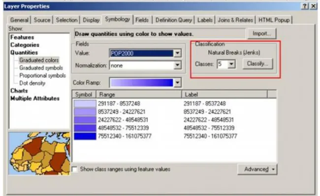
In the Layer Property dialog box we should choose Symbology “Quantities” and here we can indicate
“Graduated symbols”. In “Graduated symbols” context menu, we can define which attribute field we would like to acquire in the symbolization process, by clicking in the value field. We can select that how many classes we would like to apply and what the range of symbol size can be. Also we can decide which classification methods preferred. You will learn about classification method later.
Figure 6.7. Graduated symbols applied for the towns of Hungary
Graduated colours method is the most common one. This method displays features as shades in a range of colours that changes gradually. If we would like to symbolize the population of counties of Hungary, each
county would be drawn in different shades of colour according to its population. It is a cartographic convention also that bigger, higher, more, values get darker shades as smaller, lower, fewer values. Graduated colours are the most effectively used on polygon features. In the attribute table we have data about how many students had been coming to our faculty to learn surveying and geoinformatics from 1972 until now. We can visualize this data with graduated colour also.
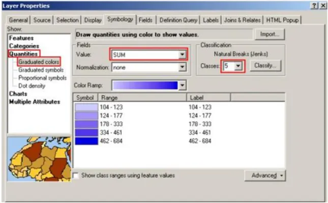
Figure 6.8. Graduated colours menu
In the “Graduated colours” menu we can define, which attribute value we would like to use in the symbolization process by clicking the field attribute. We can also select the colour ramps and the number of classes.
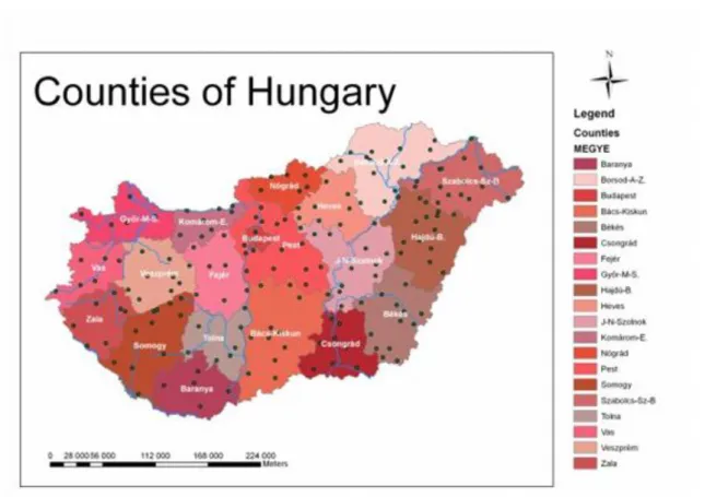
Figure 6.9. Graduated colours applied for the counties of Hungary
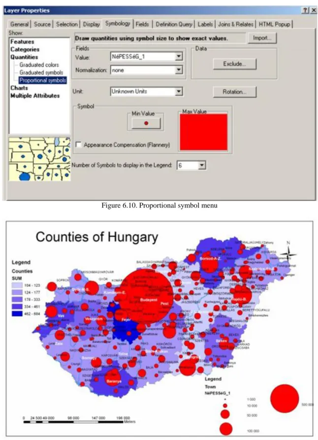
Proportional symbols vary in the size proportionally to the value symbolized. It means that the size of the symbol is dependant to the attribute value stored in the database. Proportional symbols are more effective when the range of values for an attribute is not too wide.
Figure 6.10. Proportional symbol menu
Figures 6.11. Proportional symbols applied for the population of Hungarian towns
The 6.11. Figure shows the proportion of population of the Hungarian towns. The problem is that the value range has quite big variance. The biggest town has much higher population than the average Hungarian towns.
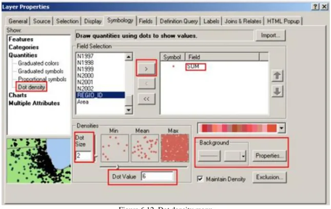
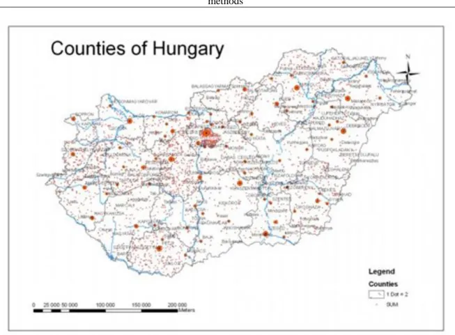
Dot density can be applied to polygon layers only. This method represents quantities by random patterns of dots.
The greater the value, the more dots are appearing on the surface on the polygon. Dot density maps refer to the quantities precisely because there is a fixed relationship between the number of dots and the attribute symbolized.
Figure 6.12. Dot density menu
In the dot density menu we can define the attribute field which we would like to symbolize. We can change the size of the dots, the background and the value of one dot. In the 6.12. Figure you can see that the actual dot value is six. In the menu we can make some exclusion and we have the possibility to edit the background also.
Figure 6.13. Thematic map with dot density method
There is some problem with dot density, because it can be misleading. In this method, the random distribution of dots may be different from the actual distribution of values. If we visualize with this method for example the countries of Africa by their population, the result is surely false.
Figure 6.14. Dot density applied for Egypt, and the reality
In the 6.14. Figure we can see that the real distribution of the population is connected to River Nile and the seaside, but ArcGIS dot density was applied also to the deserted areas as well. In this case we should apply the Use Masking check box to edit the territory within the map to which this method can be applied
2.3. 6.2.3 Classifications methods
The most GIS software has built-in classification methods. It is very important to know what the differences are between them, unless we can use the inappropriate method and reach a misleading result on our thematic maps.
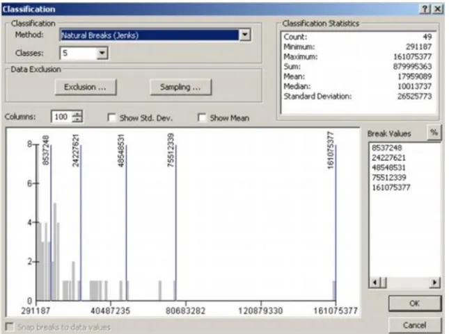
In understanding the differences between the classification methods the usage of the histogram can help us. The
x-axis of histograms shows the range of values in the fields, the y-axis is a count of features. The vertical blue lines in the histogram are class-breaks. The grey column refers to the percentage of the value range. The default number of grey columns is one hundred, it can be modified from 10 till 100. If there is no grey column in a value range it means no feature falls within it.
ArcGIS has six classification methods. (Ormsby et al, 2004). You can access the classification methods through Layer Properties Symbology and Classification. We will show the impact of the different classification methods with the help of Africa dataset. We will use in the classification of the attribute of the population of the African countries in 2000.
Figure 6.15. Classification method option in the Symbology menu
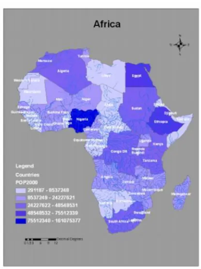
The mostly common classification method is Natural Breaks. Natural Breaks was developed by the cartographer George Jenks. This method creates classes according to clusters and gaps in the data. The greater a country’s population the darker its colour is. In this kind of classification is not possible that in a class interval there is no feature. The number of features in each class is different, in one class there is only one county.
Figure 6.16. Histogram of Natural Breaks method
Figure 6.17. Method of Natural Breaks with five classes
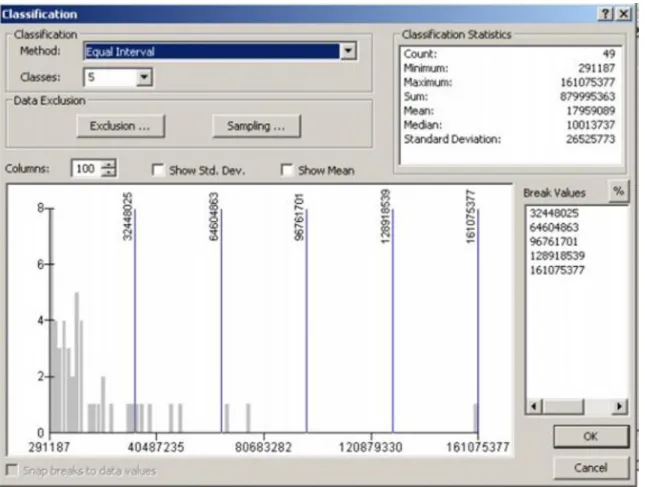
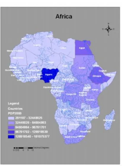
Equal interval creates classes of equal values ranges. It means that the program will consider the smallest and the biggest value and divide the sum in the way that value ranges will be the same. The number of features in each class is different, but it can happen that there is no feature class in a value range. If we have a look at the Africa map, we will have a false interpretation of the data. We think that those countries which have similar colours have similar population.
Figure 6.18. Histogram of Equal Interval method
Figure 6.19. Method of Equal Interval with five classes
Defined interval is similar to Equal Interval except that the interval defines the number of classes. In the 6.20.
Figure, you can see that we choose for the interval 30000000. With this interval the result is very similar to the Equal Interval method. The program created 6 classes for this interval.
Figure 6.20. Histogram of the method of Defined Interval
Figure 6.21. Thematic map created with the method of Defined Interval
Quantile method counts the number of features and creates classes which contain equal number of features.
Figure 6.22. The histogram in case of Quantile method
In the thematic map we can see that this method can be misleading. There are countries with very different population can be classified in the same group, even the difference between their populations can be twice as much.
Figure 6.23. Thematic map created with Quantile method
Standard deviation creates classes according to a specified number of standard deviations from the mean value.
(Ormsby, 2004) Standard deviation has a default symbolizing option. Also the possible number of the classes is predefined. We can determine the classes with giving how many the average standard deviation of the interval size is.
Figure 6.24. The histogram of the Standard Deviation
Figure 6.25. Thematic map showing standard deviation The Manual method gives the opportunity to set optional class breaks by ourselves.
2.4. 6.2.4 Symbolizing quantitative attribute with charts
Usually we use the four Quantities options for symbolizing quantitative attributes, but we can also use Charts.
The advantage of charts is that we can symbolize several attribute value by once. In ArcGIS three types of charts exist: pie, bar, stacked bar.
Pie charts symbolize the percentage of various attributes which are the part of the total value.
We use bar charts when we would like to compare attributes which don’t make the whole. It can be attribute data which are referring for different years, etc.
Stacked bar charts contribute to the cumulative effect of attributes. For example if we would like to symbolize the total number of crimes the height of the bar would be proportional to the total amount, the different parts would be proportional to the different types of crime.
If we would like to create thematic map with pies chart, we should choose in the Layer Properties Symbology context menu the Charts and Pie.
Figure 6.26. The context menu of Pie Charts
The 6.26.Figure shows that we should choose from the different field, which fields would be used in the pie chart. Here we can define a colour ramp or a separate colour for each item.
Figure 6.27. Chart symbol editor
In the Pie Chart menu we click on the Properties button and we have more options to edit the charts. We can alter the tilt and thickness of the chart here.
The 6.28. Figure represents the percentage of the different age groups of Africa population. It is clearly seen that the percentage of the younger generation is the highest, and the percentage of the oldest age group is very small.
Though the map is not yet ready, because the size of each chart is equal.
Figure 6.28. Thematic map with Simple Pie chart
Figure 6.29. Pie Chart Size editor options.
We can reach other important options clicking on the Size button in the main chart menu. Here we can adjust the size of the charts to the total amount of the symbolized fields; we can define also the minimum size of the charts.
Figure 6.30. Thematic map with Pie Chart according to the total amount
Comparing the 6.30. Figure to the 6.28 charts we can see that it gives more information for us, because we can observe not only the percentage of the different age groups, but the differences in the total population among the countries.
Figure 6.31. Thematic map with Bar Charts
On the 6.31. Figure we can see the usage of Bar Charts. We can perceive the variation of the population of the different countries in the years 1980, 1994, 1998 and 2000.
3. 6.3 Querying data
Although visualization gives GIS an immense strength, but there is information, which can’t be retrieved with only symbolizing the attribute data.
3.1. 6.3.1 Select by Attribute
In GIS we have the possibility to use the attributes to write a query, and the software automatically selects features which meet the criteria of the query. We call this method “Selecting Feature by Attribute”. In the simplest query we find an attribute (population), a value (such as 1 million) and a relationship between them (such as greater than or, equal to). We can find in complex query simple queries connected with terms like
“and”, “or”. We call relationships and connecting terms operators. (Ormsby, 2004). In queries we use Structured Query Language (SQL). The query wizard helps us to create our query.
Figure 6.32. Select by Attributes menu
In the Select by Attribute menu we can define the attribute, the value and we can find options that make us easier to create a query.
3.2. 6.3.2 Select by Location
In GIS the spatial attributes are very important, so we have the possibility also to select features according to their location. These spatial relationships can be defined in the same layer or between different layers. There are four types of spatial relationships: distance, containment, intersection and adjacency (Ormsby, 2004). ArcGIS defines eleven spatial relationships, each of them are a variation of the above mentioned four.
Figure 6.33. Select by Location menu
4. 6.4 3D Visualization
For 3D Visualization You can use ArcScene in ArcGIS. First of all it is very important in visualizing DDM, but we can visualize our attribute data as well.
Figure 6.34. Defining Base heights
It is very important to defining base height, because we can visualize the heights stored in the database with this tool only. This function is the same option that we call “drape”.
Usually the height differences can’t be visualized very clearly, so we can exaggerate our data. We can reach these options from the Scene Layers, Scene Properties menu.
Figure 6.35. Option of Exaggeration
If we created our 3D model we can drape over other features as well, using the same base heights.
Figure 6.36. 3D model of Vértes
We can visualize other data apart from elevation as well. We have the possibility to make some extrusion with the help of the query wizard.
Figure 6.37. Extrusion
The result is an imaginary map showing the highest value with the greatest height.
Figure 6.38. Height created by the help of attribute value.
5. 6.5 Summary
In this module you learnt the different method of creating thematic maps. You are able now to choose the appropriate visualization method according to the characteristics of the features (qualitative, quantitative). You learnt about the possible classification and categorization methods in ArcGIS. You learnt that the specific method of classification that you choose can lead to very different displays of data on maps.
With this knowledge you are able to create thematic maps and use 3Dvisualization.
Self controlling questions:
1. How can you visualize qualitative data?
2. How can you visualize quantitative data?
3. What are the possible classification methods, you learnt in this module?
4. How can you visualize a DDM in ArcScene?
5. What is a histogram, why is it useful?
Literature
Zentai L.: Számítógépes térképészet, ELTE Eötvös Kiadó, Budapest, 2000.
Ormsby, T, Napoleon E., Burke R., Groessl, C, Feaster, L.: GTK ArcGIS, ESRI Press, Redlands, California, 2004.
http://serc.carleton.edu/eyesinthesky2/week8/getting_to_know_gis.html