Building geodatabase 5.
Using the geodatabase
Pődör, Andrea
Building geodatabase 5.: Using the geodatabase
Pődör, Andrea
Lector: Mihály , Szabolcs
This module was created within TÁMOP - 4.1.2-08/1/A-2009-0027 "Tananyagfejlesztéssel a GEO-ért"
("Educational material development for GEO") project. The project was funded by the European Union and the Hungarian Government to the amount of HUF 44,706,488.
v 1.0
Publication date 2010
Szerzői jog © 2010 University of West Hungary Faculty of Geoinformatics Kivonat
In this module, we will outline the first steps, how to examine a geodatabase before visualize it. We will envisage what the possible usage of the simple symbol selector is in vector and raster datasets. At the end of the module the usage of label and annotations will be clarified.
The right to this intellectual property is protected by the 1999/LXXVI copyright law. Any unauthorized use of this material is prohibited. No part of this product may be reproduced or transmitted in any form or by any means, electronic or mechanical, including photocopying, recording, or by any information storage and retrieval system without express written permission from the author/publisher.
Tartalom
5. Using the geodatabase ... 1
1. 5.1 Introduction ... 1
2. 5.2 Analyzing the geodatabase ... 1
3. 5.3 Symbolizing features and rasters ... 8
3.1. 5.3.1 Single symbol visualization ... 8
3.2. 5.3.2 Simple visualization of rasters ... 14
3.3. Labelling features ... 16
4. 5.4 Summary ... 21
5. fejezet - Using the geodatabase
1. 5.1 Introduction
In the previous modules you learnt about the different methods of building geodatabases. In this module you will acquire the knowledge how to investigate the geodatabase to visualize its content properly. In this module, we will present different solutions by one software, ArcGIS 9.3, because in the courses of GIS during the practices we are using this software. As demonstration, we will use two different vector dataset. One dataset is containing the South-western Vértes mountain geographic region of Hungary, the other one contains a dataset of the countries of Africa. We would also use a raster dataset, which is in the region of Lake Velence, it is an SRTM model.
The south-western Vértes is consists of fourteen feature classes: Agriculture, bridge, canal, contour, lake, lake2, main_roads, major_roads, railroad, river, road, street, village, water network.
The Africa database consists of three feature classes: countries, rivers and towns.
2. 5.2 Analyzing the geodatabase
If we would like to choose the proper cartographic visualization sign system for the given database first we should investigate the content of the geodatabase. If we don’t have any knowledge of the given geodatabase, at the first sight we can clearly define the geometric characteristics (like polygon, line, point) of the feature classes contained by the geodatabase. In ArcCatalog, where we can create geodatabase and different feature classes, we can also investigate our data as well.
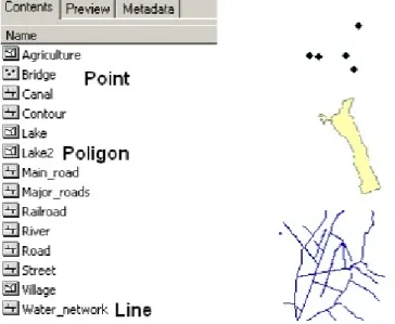
First we will examine our dataset about SW Vértes. The name of the personal geodatabase is Vértes and it is containing several feature classes.
Figure 5.1. Geodatabase
Figure 5.2. Feature classes with different geometry
Among the feature classes we can find point, line and polygon features. If we know the geometry of the different feature classes, we should investigate the attributes of the given feature classes to be able to choose the perfect visualization method.
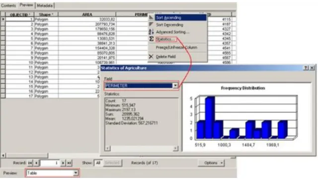
In ArcCatalog we have the possibility to preview the geometry of the feature classes and also the attribute data by changing the preview. You can change with different previews with the help of the preview toolbar.
Figure 5.3. The geometry preview of the feature classes “Agriculture”
The attribute table contains as many data as geometry the feature class has. Here we can find some functionality of sorting the attribute data by columns. In the function of “Statistics” we can examine the minimum, maximum and mean value of our dataset. Also we can change between the attribute field properties.
Using the geodatabase
Figure 5.4. The attribute table of the same feature class “Agriculture”
This function is very important in deciding how we can classify our dataset, and what kind of visualization methods we can choose. We should explore the dataset first and then we can find out what kind of characteristic the attributes have. For later visualization it is very important that we should build a proper geodatabase, where the nature of the attribute information is established. These attributes can show the visible (e.g. lake) and the invisible (temperature) characteristics of the objects. The objects or phenomena have four different characteristics (Klinghammer, 1985):
1. Discrete or continuous: Discrete objects or phenomena can be bordered on all sides, these border lines can be made explicit by coordinates. (Some examples are: houses, parcels etc.) Continuous objects are considered to change non-incrementally in value. (Some examples are precipitation, yearly average temperature, relief)
2. Qualitative and quantitative: Qualitative characteristics of the objects can refer to its name, type (e.g. soil type). Quantitative property of the data is a number. This number can refer also to an absolute or a relative value. These characteristics are usually distinguished on a number of measurements scale. (Kraak, 2003) a. Nominal scale:”Attribute values are different in nature, without one aspect being more important than the
other”. (Kraak, 2003)
b. Ordinal scale: Attribute values are different from each other, but there is a single way to order them. (e.g.
warm)
i. Interval scale: Attribute values are different, can be ordered and the distance between the different data can be determined with measurement. (e.g. Temperature)
a. Ratio scale: Attribute values are different and can be ordered. The distance between the different data can be determined with measurement and these measurements can be related to each other.
3. Static or dynamic: Those objects which are static in their location and attributes for their monitoring period can be seen as permanent, but those objects and phenomena which location and attributes value are changing for the monitoring period are dynamic.
4. Original or deduced: Those objects which were retrieved from a primary data acquisition process, such as survey, remote sensing are original, but those data which were already processed and categorized and generalized are the result of some deduction.
Another important property of the data is the so called time stamp. Time stamp can refer the exact date when the data was retrieved or the time schedule during the object changed their variables. There are different concepts of time in the literature. The most accepted are the world time (the moment when an event takes place), database
time (the moment when the event is captured in the database) and display time (the moment when an event appears on a map, Kraak, 2003).
Figure 5.5. The different characteristics of the attributes
As you see in the attribute table we have attributes which depict quantitative and qualitative data. If we properly examined our dataset, we can visualize them in ArcMap. Visualizing of the dataset means, that we use a cartographic sign system to show and to explain the characteristics of the objects and the different spatial patterns of phenomena.
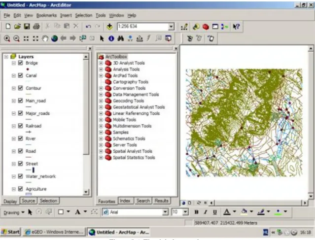
If we open our dataset in ArcMap first, we should reorganize the order of the different feature classes or layers, in the “Table of Contents”. We must put the point features on the top, than line features can follow and in the end there are polygon features.
Using the geodatabase
Figure 5.6. The right layer order
If we add data to our ArcMap, the software orders automatically symbols to the different objects on the map.
Symbolizing features means that we chose appropriate colours, markers, sizes, width, patterns, transparency to the different objects to appear on a map.
As you probably heard about that there are some conventions in cartography, that we should exclude them only in very special cases. The most significant example is when we draw rivers, streams, watercourses with blue colours on maps. Another rule is that we symbolize hot temperatures with “warm colours”. We call this process as symbolization.
The definition of symbolization:
“Symbolization is an important skill in cartography, or map making. It is the process of choosing an appropriate representation for specific features on a map. We can symbolize point features as dots, squares, triangles, flags, or other shapes and we can symbolize line features using solid, dashed, or other patterns. The symbols we choose should help describe additional information about the features on the map. Poor symbolization leads to inaccurate, misunderstood, or even deceptive information, while effective symbolization helps to communicate information quickly and clearly.
In general, we associate large size with greater numerical values and intense colour with strong events. For example, when symbolizing earthquakes on a map, using dots that are all of the same colour highlights the locations of the individual earthquakes. To emphasize the difference in distribution between high magnitude and low magnitude earthquakes, we can symbolize those using dots of varying sizes, with the largest dots representing the highest magnitude earthquakes. We can use colour in a similar manner, symbolizing the higher magnitude earthquakes with intense shades, such as dark red and lower magnitude earthquakes with lighter, pastel shades, such as pink. Symbolization in a GIS can be a very powerful analysis technique, helping us to more easily see geographic patterns. However, when applied haphazardly, it can lead to misinformation and
misleading interpretation of the underlying patterns.” (Source:
http://serc.carleton.edu/eyesinthesky2/week8/getting_to_know_gis.html)
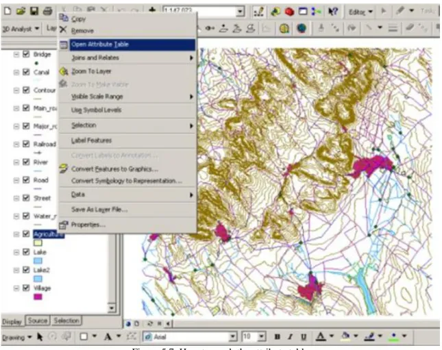
We can symbolize our data in ArcMap. As we have seen above using ArcCatalog, we can investigate our data in ArcMap as well. Each layer of a GIS project includes a database of information about its features. This information is presented in an Attribute Table, which is linked to the map features associated with that layer.
Right click the given layer in the Table of Contents and choose Open Attribute Table from the menu. Scroll through the fields (columns) and the data records (rows) in the Attribute Table.
Figure 5.7. How to reach the attribute table
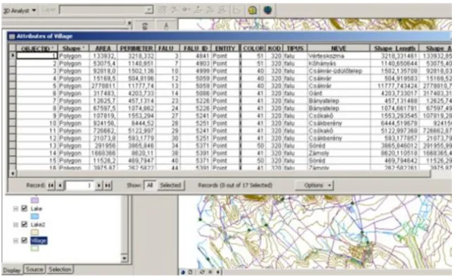
The Attributes of villages window opens. We should drag the horizontal scroll bar to examine the different fields (columns) in the Attributes of villages table and the vertical scroll bar to see information for the different villages (records).
Using the geodatabase
Figure 5.8. Attribute properties of “Villages”
The village’s database includes the following fields.
Objected ID (features Identity), Shape (point, line or polygon) in this case polygon. Area, Perimeter; FALU (it contains the identity of the villages),COLOR(shows the colour code); TIPUS is type of the village; NEVE is the name of the village.
Figure 5.9. The attribute table of layer “countries”
The countries of Africa database include the following fields:
FID (Feature ID); Shape (geometry type is polygon); Kilometres (area of the countries); pop1989, pop1994, pop1980, pop2000 (population in different years), age0to14, age15to64, ageover64 (different age groups).
Most GIS data files that you can download come with a special file that holds the information about the data itself and includes things like who created the data and how, such as if it was derived from other datasets. The metadata file is also the place to find field definitions that tell you what data was collected for each field.
3. 5.3 Symbolizing features and rasters
When you add a layer to your ArcMap file, you may have noticed that it was automatically assigned a colour.
This initial colour choice for the data is random. It may be necessary to change the colour of your layers. So if we add a layer with water network, the assigned colour can be green, red, etc. but the cartographic convention tells us that we should change it to blue. The symbols used to represent features in a layer can be modified in that Layer's Properties window.
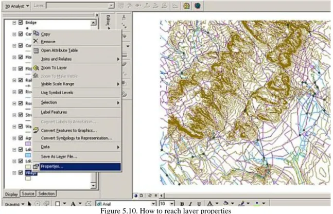
Figure 5.10. How to reach layer properties
We can reach a layer’s property window with right-clicking on the layer and an additional context menu appears. Here we can choose properties.
3.1. 5.3.1 Single symbol visualization
Single symbol visualization is the simplest way GIS software can offer for map making. In GIS we can use basic graphic variables in symbolization. These variables are colours, size, and symbol type. In ArcGIS in the Layer Properties window, click on the Symbology button. In the Symbology window we can choose the Single Symbol option.
Using the geodatabase
Figure 5.11. Symbology option
If we have polygon features, we can change the colour of the fill and the outline of the polygon and the size of the outline. If we would like to use some other graphic variables we can click on the Properties menu.
Figure 5.12. Symbol property editor
In the Symbol Property Editor, we can create a more complex symbol for the features, with indicating another fill type as simple fill symbol and adding additional layer to the recent fill type.
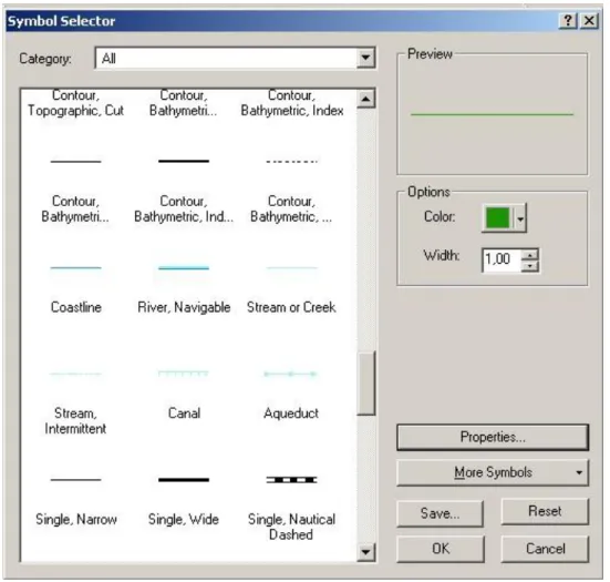
In the case of features with line geometry in Symbol Selector we can change the colour of line, we can give the width also and we can use one of the different predefined symbols. If we would like to create another symbol we have also the possibility to use again the Symbol Property Editor.
Figure 5.13. Symbol Selector of line geometry features
The functions of the Symbol Selector in the case of features with point geometry is very similar to the above one, one exception is that we can alter the size of the symbol not the width.
Using the geodatabase
Figure 5.14. Symbol selector of point geometry features
In the Symbol Selector menu we have the possibility to choose the More Symbols options. In this menu there are specialized symbology sets for different scientific and expert fields, even this function offers the option to upload the symbology created by ourselves.
Figure 5.15. More symbols option
If we click on this option the program adds the selected symbol set in the end of the predefined symbols. In 5.14. Figure you can see that symbology of “weather” was included at the end of the other listed and predefined symbols.
Using the geodatabase
Figure 5.16. Symbology of “Weather” was included
Another chance to implement of predefined symbology set is available in the Layer Properties window, Symbology button. Here there is an Import button, by clicking on the button another menu appears and we can import *.avl files or symbology definition of another layer.
Figure 5.17. Import options of symbology.
When we have worked out a correct symbology definition of a layer we may wish to use the created set of symbology again. In this case we can save the symbology as a layer file (*.lyr). Layer files store symbology information for a spatial data set.
Figure 5.18. Creating layer files
3.2. 5.3.2 Simple visualization of rasters
Using the geodatabase
By default, rasters are drawn in shades of grey; we can choose a different colour ramp for the raster.
Figure 5.19. Raster data about Lake Velence and surroundings
If we right-click the raster layer and chose the properties from context menu, we can change the colour of our raster in the layer properties/symbology menu.
Figure 5.20. Layer properties of raster layer
In the layer properties dialog box we can define which kind of symbolization method we would prefer. The default method is stretch which means that the software makes subtle transitions along the selected colour ramp, but doesn’t give precise information that which value is associated with which height. In classified method we can see exactly which value ranges corresponds to which heights (or shades). In the BGD6.module you can
learn more about classification. In the unique values method a different colour is assigned to each value in the raster dataset. In the colour ramp drop-down list we can inactivate graphic view and we are able to find
“elevation” to our dataset.
Figure 5.21. Elevation is applied to Lake Velence raster layer
3.3. Labelling features
In the database usually we are storing the names of the different features classes. In ArcMap we can label features. We can add other text to our map as well, but these types of text don’t behave like labels. If we right- click on the layers we can dynamically label them by Label Features option.
Figure 5.22. Labelling features In the properties dialog box we can alter the parameters of the label.
Using the geodatabase
Figure 5.23. Label properties in Layer Properties dialog box
In this tool we can change a lot of attributes of the text. First we can change the font type and the style of the text. By clicking on Symbol button we can reach a lot of predefined text style also. In the label field we can choose the attribute table used for labelling.
Figure 5.24. Expression tool
Here we can have an opportunity to use some expression, for labelling. A very important option is the Placement Properties button.
Using the geodatabase
With the help of this button, we can choose an optimal arrangement of our labels. With these functions we can modify which placement would be favorized. The position of this kind of labels is relative to features and can change while we are zooming into the map.
Figure 5.26. Adjustment of the Scale range of labels
Another important tool is the Scale Range, because this tool can control in which scale range the labels would appear on the map.
Dynamically placed labels can be converted into Annotations. Annotations give us the freedom to individually edit each text.
Figure 5.27. Converting labels to annotations
Annotations can be connected to a geodatabase. In the case we don’t have geodatabase, it can be stored only within the map.
Figure 5.28. We can choose where the annotations can be stored.
Figure 5.29. Annotations can be moved separately
Annotations can be placed optional. Usually we use annotations at the end of the mapmaking phase.
Using the geodatabase
Figure 5.30. Label tool in the Drawing toolbar
4. 5.4 Summary
In this module you learnt about how you can investigate the database, and you learnt also about the different characteristic of the objects and phenomena appearing on the map and stored in the database. Now you have a basic knowledge about how to visualize in a simple way these objects on a map, how you can label them and how you can transform labels into annotations and how you can edit them.
With this knowledge you are able to use basic cartographic conventions on map, and the single symbol menu of ArcGIS. You had the possibility also to see the method how you can make the visualization of raster dataset more effective.
Self controlling questions:
1. How can you investigate a geodatabase?
2. What are the characteristics of objects and phenomena?
3. How can you visualize different feature classes in a simple way?
4. What is a cartographic convention?
5. How can you visualize more effectively a raster dataset?
Literature
Kraak, M.J. - Ormeling, F.J: Cartography:visualization of geospatial data.2nd edition, Pearson Education Limited, Harlow, 2003.
Klinghammer I. - Papp-Váry Á.: Tematikus kartográfia., Egyetemi jegyzet, Budapest, 1985.
Zentai L.: Számítógépes térképészet, ELTE Eötvös Kiadó, Budapest, 2000.
Ormsby, T, NApoleon E., Burke R., Groessl, C, Feaster, L.: GTK ArcGIS, ESRI Press, Redlands, California, 2004.
http://serc.carleton.edu/eyesinthesky2/week8/getting_to_know_gis.html