Geo-Information
Article
Beyond Spatial Proximity—Classifying Parks and Their Visitors in London Based on Spatiotemporal and Sentiment Analysis of Twitter Data
Anna Kovacs-Györi1,* , Alina Ristea1 , Ronald Kolcsar2, Bernd Resch1,3 , Alessandro Crivellari1and Thomas Blaschke1
1 Department of Geoinformatics—Z_GIS, University of Salzburg, 5020 Salzburg, Austria;
mihaela-alina.ristea@sbg.ac.at (A.R.); bernd.resch@sbg.ac.at or bresch@fas.harvard.edu (B.R.);
alessandro.crivellari@sbg.ac.at (A.C.); thomas.blaschke@sbg.ac.at (T.B.)
2 Department of Physical Geography and Geoinformatics, University of Szeged, 6722 Szeged, Hungary;
kolcsar@geo.u-szeged.hu
3 Center for Geographic Analysis, Harvard University, Cambridge, MA 02138, USA
* Correspondence: anna.gyori@sbg.ac.at; Tel.: +43-662-8044-7555
Received: 17 August 2018; Accepted: 11 September 2018; Published: 14 September 2018 Abstract: Parks are essential public places and play a central role in urban livability. However, traditional methods of investigating their attractiveness, such as questionnaires and in situ observations, are usually time- and resource-consuming, while providing less transferable and only site-specific results. This paper presents an improved methodology of using social media (Twitter) data to extract spatial and temporal patterns of park visits for urban planning purposes, along with the sentiment of the tweets, focusing on frequent Twitter users. We analyzed the spatiotemporal park visiting behavior of more than 4000 users for almost 1700 parks, examining 78,000 tweets in London, UK. The novelty of the research is in the combination of spatial and temporal aspects of Twitter data analysis, applying sentiment and emotion extraction for park visits throughout the whole city. This transferable methodology thereby overcomes many of the limitations of traditional research methods. This study concluded that people tweeted mostly in parks 3–4 km away from their center of activity and they were more positive than elsewhere while doing so. In our analysis, we identified four types of parks based on their visitors’ spatial behavioral characteristics, the sentiment of the tweets, and the temporal distribution of the users, serving as input for further urban planning-related investigations.
Keywords: urban parks; urban green areas; spatial analysis; GIS; sentiment analysis; temporal analysis; livability; social media analysis; accessibility analysis; urban planning
1. The Importance of Urban Green Areas and Ways to Analyze Their Role or Characteristics in the Urban System
While every city is unique in its characteristics, the universal aspect of all cities is their complexity [1]. One element of this complexity is the constant movement of hundreds of thousands or even millions of people, who also spend time in public places, such as in parks. Parks are essential public places and play a central role in a city’s livability, primarily because of their role in offering social contact, exercise and restorative recreation. Furthermore, urban green areas have various effects on humans [2], partially as ecosystem services [3]. It is proven that access to green spaces is directly related to well-being through the influence of these areas on physical and mental health [4–11]. This influence is discernible mostly on changes in air quality [6,7,12,13], land surface temperature [6,14], physical activity [6,8,10,12], social cohesion [7,12], community identity [15,16], and stress reduction [7,8,12,17].
ISPRS Int. J. Geo-Inf.2018,7, 378; doi:10.3390/ijgi7090378 www.mdpi.com/journal/ijgi
Therefore, analyzing the various effects of parks and how they are perceived is gaining increasing interest among researchers from different fields [18,19]. For instance, a growing body of literature deals with the analysis of factors determining urban green space use among the residents. The most relevant factors for parks are the functionality and facilities [7,20–24], safety and access [11,20,23,24] or even size or perceived greenness [25,26]; whereas, from the park visitors’ side there are many personal characteristics ranging from age or ethnicity to health conditions that are determinant when selecting a park to visit [12,20,21,24,26].
Good access to urban green spaces is of increasing relevance in the design of livable, healthy and sustainable cities [7,27]. Having a park within 10–15 min walking distance from the residents’ homes is also often considered as a factor of livable cities. However, in the literature, there are contradictory observations regarding the distance to a park from home and its relevance in people’s decisions regarding which park to go to. There are studies that completely neglect spatial aspects (mostly when using Twitter data and performing sentiment analysis) [7,28–30], or, on the contrary, studies that only consider spatial aspects of park visits but not the functionality or other attracting factors [31–33].
In some other studies, either only the closest green area is considered, or the results show that having the park within less than a kilometer is more important than other factors [20,34], also for improving health [35]. However, there are also results showing that people visited parks that are further away, even if they had green areas nearer to their home, partially due to the differences between perceived and real distances [29,36,37]. Also, if the purpose of the park visit is performing physical activity, distance might be less likely to be a predictor of choice [38]. Only a limited number of studies focused on the issue of accessibility in a holistic way [39,40] even analyzing its direct effect on physical activity or health [41,42].
Most of the decision makers and urban planners intend to make public places livable [43–45].
However, livability strongly depends on the people’s values and, therefore, their expectations, which means that planners should try to explore these expectations on an individual scale [46]. Asking people directly about their trips’ characteristics or, for example, their expectations when visiting a park—as a traditional method in the form of questionnaires, which may even be combined with in situ observations—might be time- and resource-consuming while providing less transferable and only site-specific results. Also, the information produced as a result of such investigations still only represents a subset of temporal and spatial characteristics. At the same time, Twitter data analysis is mostly limited in data accessibility, thereby, once the required data is available, the analysis can be performed on scales ranging from intra-urban to even global for any period ranging from a few hours to several years. Recent developments in Geographic Information Systems (GIS)-based social media analysis offer the possibility to explore spatial, temporal and even affective aspects of users’
behavior, even for public spaces and park visits [28–30,47,48]. However, some of these analyses still have limitations due to the manual interpretation of only a relatively low number of social media posts.
Several analysis efforts have used social media data for urban planning purposes over the last years, and the field of application is diverse and growing, ranging from more straightforward tasks to rather complex analysis, e.g., the detection of urban form and function [49]. In general, Twitter and other social media platforms are often used to analyze human activity and mobility on scales ranging from intra-urban to global [50–58], because these two phenomena are almost impossible to trace on finer spatial and temporal scales by using traditional methods such as questionnaires or quantitative observations (e.g., population counts). Furthermore, social media data can be used for socio-spatial analysis [59], for instance, by extracting the content of the tweets [60–63] or by investigating emotions and how they vary over space and time [64–68] also considering health factors such as diet or physical activity [65,69]. Campagna [70] proposed the concept of “Social Media Geographic Information”
(SMGI) as a way of investigating “people[’s] perceptions and interest in space and time” and thereby supporting spatial planning and geodesign, also by means of Spatial-Temporal Textual Analysis (STTx).
Combined with other sources of data, such as mobile phone data, spatiotemporal characteristics of the urban environment can be described even more accurately [71]. Due to their fine spatial and temporal
scale, another great potential of social media data is the detection [72] and analysis of events [73–77], or disasters [78,79], and their effect on daily urban planning routines [80].
The goal of our analysis—similarly to SMGI—was to illustrate the possibilities of using social media (Twitter) data to extract spatial and temporal patterns of park visits for urban planning purposes, along with the sentiment of the tweets to represent how positive or negative a given post was, focusing on frequent Twitter users. Thereby, we intended to answer the following research questions:
1. Spatial aspects:What are the spatial characteristics of the selected users’ tweeting behavior and how do these characteristics relate to their park visits? In terms of parks, how far do the visitors travel on average to visit a given park from their center of activity?
2. Content aspects:Are tweets in parks more positive than in other urban areas? What feelings do the visitors have when spending time in a park? How does this vary between parks?
3. Temporal aspects:How do the spatial and sentiment characteristics vary over time? Are there any significant differences during the day, week or year?
4. Profiles: What types of parks and park visitors can we classify based on the identified spatial, temporal, and sentiment characteristics? What do we learn about them?
Indubitably, every park and park visitor can be unique, and, in a large city, it is hard to answer these questions for every individual. Compared to traditional questionnaires where most of the focus is on only one or a few locations, big data or social media data allows every park and thousands of visitors to be considered within the city—not only as individual entities in isolation but also as a set of comparable characteristics. To overcome some of these limitations, a combined approach has emerged in planning, which can use the advantages of both quantitative and qualitative data analysis to some degree. Geo-questionnaires and public participatory GIS (PPGIS) has been developed over the past decade and has advanced our understanding of public preferences or even legitimizing decisions [81–84]. At the same time, we must recognize that, depending on the purpose of the study, social media analysis may not reach accuracies comparable to individual on-site studies [25], but can still produce valuable input or added value as an overview of the general patterns. In that sense, social media analysis should be considered a complement to, not a replacement of, on-site field studies [85].
In this paper, we analyzed the spatiotemporal park visiting behavior of more than 4000 Twitter users for almost 1700 parks along with users’ feelings extracted from over 78,000 tweets posted in London, UK. The novelty of our research is the combination of spatial and temporal aspects of Twitter data analysis for park visits in a transferable way while applying sentiment and emotion extraction to also explore the content of the tweets, to overcome the limitation of traditional methods. In summary, the findings are aggregated to identify different types of parks and their visitors, serving as an input for further investigations.
2. The Core Data Sets of the Analyses
2.1. Input Data Sets
Our analysis is based on 11,372,967 tweets from Greater London for the year 2012. All tweets are geolocated, i.e., they have latitude and longitude coordinates to identify the location at which they were posted. The data are accessed through the Twitter Streaming Application Programming Interface (API) [86], using a bounding box around the Greater London (Table1). In addition to the coordinates, the data set contains the user ID, the text, and the timestamp of each tweet as attributes.
Table 1.General overview of the Twitter data set.
Value
Bounding box (WGS84) 51.225808,−0.560455; 51.734863, 0.319181
Total tweets 11,372,967
Total unique users 374,700
Temporal extent 1 January 2012–31 December 2012
The polygons representing areas of interest (parks, urban green spaces) are defined using OpenStreetMap, which is globally available—an important criterion for the possible transferability of the presented methods. Unfortunately, there is no single tag or keyword to extract the required polygons, so a combination of tags is used containing the words “park”, “green”, “garden” or even
“forest” for the fields “natural”, “amenity”, “landuse” and “leisure”. The query resulted in a total of 5007 polygons for the same spatial extent as our tweets. For the sake of simplification and clarification, we will refer to any type of urban green space or area as “park” throughout the rest of the paper.
2.2. Preprocessing of the Data
Figure1provides an overview of our data preprocessing workflow. The first step was to define our study area by performing a spatial query, selecting a subset of elements from both input data sets (tweets, polygons) located in Inner London (surrounded by a 5 km buffer to reduce the edge effect of the administrative boundary). We then joined the two data sets spatially to identify “park tweets”.
These tweets, according to their coordinates, were posted from one of the green areas we identified.
This resulted in 341,888 park tweets.
ISPRS Int. J. Geo‐Inf. 2018, 7, x FOR PEER REVIEW 4 of 25
The polygons representing areas of interest (parks, urban green spaces) are defined using OpenStreetMap, which is globally available—an important criterion for the possible transferability of the presented methods. Unfortunately, there is no single tag or keyword to extract the required polygons, so a combination of tags is used containing the words “park”, “green”, “garden” or even
“forest” for the fields “natural”, “amenity”, “landuse” and “leisure”. The query resulted in a total of 5007 polygons for the same spatial extent as our tweets. For the sake of simplification and clarification, we will refer to any type of urban green space or area as “park” throughout the rest of the paper.
2.2. Preprocessing of the Data
Figure 1 provides an overview of our data preprocessing workflow. The first step was to define our study area by performing a spatial query, selecting a subset of elements from both input data sets (tweets, polygons) located in Inner London (surrounded by a 5 km buffer to reduce the edge effect of the administrative boundary). We then joined the two data sets spatially to identify “park tweets”.
These tweets, according to their coordinates, were posted from one of the green areas we identified.
This resulted in 341,888 park tweets.
Figure 1. Overview of the data preprocessing workflow.
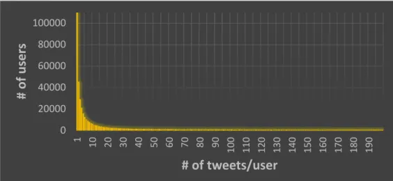
Figure 2 shows the long‐tailed distribution of tweet frequency per user. Around 70% of the users posted less than ten tweets in 12 months, which would make the analysis of their behavioral patterns less reliable. In fact, 50% of all tweets were posted by only 2.2% of all users.
Figure 2. Frequency of tweet count per user.
Furthermore, there is a general difference in the park visiting activity of residents compared to tourists. We take this into account to restrict our analysis to only presumable residents. Therefore, we apply further filters based on the number of tweets per user and the temporal distribution of the tweets throughout the year to identify frequently tweeting users. Some of these users might not be residents in an administrational sense but, using our filters, we can select those who tweet in a larger temporal range. By combining the temporal filter with a higher number of tweets per user, we have more information to characterize more representatively the (possible) residents’ park visiting
0 20000 40000 60000 80000 100000
1 10 20 30 40 50 60 70 80 90 100 110 120 130 140 150 160 170 180 190
# of user s
# of tweets/user
Figure 1.Overview of the data preprocessing workflow.
Figure2shows the long-tailed distribution of tweet frequency per user. Around 70% of the users posted less than ten tweets in 12 months, which would make the analysis of their behavioral patterns less reliable. In fact, 50% of all tweets were posted by only 2.2% of all users.
ISPRS Int. J. Geo‐Inf. 2018, 7, x FOR PEER REVIEW 4 of 25
The polygons representing areas of interest (parks, urban green spaces) are defined using OpenStreetMap, which is globally available—an important criterion for the possible transferability of the presented methods. Unfortunately, there is no single tag or keyword to extract the required polygons, so a combination of tags is used containing the words “park”, “green”, “garden” or even
“forest” for the fields “natural”, “amenity”, “landuse” and “leisure”. The query resulted in a total of 5007 polygons for the same spatial extent as our tweets. For the sake of simplification and clarification, we will refer to any type of urban green space or area as “park” throughout the rest of the paper.
2.2. Preprocessing of the Data
Figure 1 provides an overview of our data preprocessing workflow. The first step was to define our study area by performing a spatial query, selecting a subset of elements from both input data sets (tweets, polygons) located in Inner London (surrounded by a 5 km buffer to reduce the edge effect of the administrative boundary). We then joined the two data sets spatially to identify “park tweets”.
These tweets, according to their coordinates, were posted from one of the green areas we identified.
This resulted in 341,888 park tweets.
Figure 1. Overview of the data preprocessing workflow.
Figure 2 shows the long‐tailed distribution of tweet frequency per user. Around 70% of the users posted less than ten tweets in 12 months, which would make the analysis of their behavioral patterns less reliable. In fact, 50% of all tweets were posted by only 2.2% of all users.
Figure 2. Frequency of tweet count per user.
Furthermore, there is a general difference in the park visiting activity of residents compared to tourists. We take this into account to restrict our analysis to only presumable residents. Therefore, we apply further filters based on the number of tweets per user and the temporal distribution of the tweets throughout the year to identify frequently tweeting users. Some of these users might not be residents in an administrational sense but, using our filters, we can select those who tweet in a larger temporal range. By combining the temporal filter with a higher number of tweets per user, we have more information to characterize more representatively the (possible) residents’ park visiting
0 20000 40000 60000 80000 100000
1 10 20 30 40 50 60 70 80 90 100 110 120 130 140 150 160 170 180 190
# of user s
# of tweets/user
Figure 2.Frequency of tweet count per user.
Furthermore, there is a general difference in the park visiting activity of residents compared to tourists. We take this into account to restrict our analysis to only presumable residents. Therefore, we apply further filters based on the number of tweets per user and the temporal distribution of the tweets throughout the year to identify frequently tweeting users. Some of these users might not be residents in an administrational sense but, using our filters, we can select those who tweet in a larger temporal range. By combining the temporal filter with a higher number of tweets per user, we have more information to characterize more representatively the (possible) residents’ park visiting behavior.
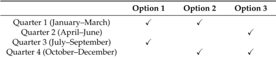
Tourists tend to have a different park visiting pattern and motivation than residents, as they usually have just a few tweets in a short period throughout the whole year, mostly from the popular parks that are considered to be tourist attractions. This different nature of park visits between residents and tourists is a relevant aspect in urban planning, and therefore, we intended to focus only on presumable residents in our analysis. We only consider users with at least 12 tweets (1 tweet/month on average) within at least two non-consecutive quarters of the year (Table2). Every quarter is three months long (e.g., 1 April–30 June), so a user is selected for further analysis if they have a tweet, for example, from May and another one from October (Table2—Option 3), also to represent various seasons.
Table 2. Minimum requirement for the temporal distribution of the user’s tweets (X= At least one tweet in that period. Tweeting activity in the other two quarters of the year are optional).
Option 1 Option 2 Option 3
Quarter 1 (January–March) X X
Quarter 2 (April–June) X
Quarter 3 (July–September) X
Quarter 4 (October–December) X X
This method has some limitations, as it will not identify less-active Twitter users who still could be residents. However, using a data set where only one city is represented instead of each city where the user tweeted in the given period, it would require more complex methods to extract residents with high accuracy, which is beyond the scope of our paper. At the same time, using only (geolocated) tweets to represent a person’s spatial behavioral pattern adequately requires larger number of tweets.
Thereby, we can rely on the results of the method by excluding less-active residents. Recurring tourists with an interval of three months at least, cannot be excluded either but their contribution to the overall data set might be low. The selection of presumable residents resulted in 41,967 users with 157,760 park tweets out of 4,502,364 total tweets by these users.
In 2012 the Olympic Games were held in London. The main venue of the event (Queen Elizabeth Olympic Park) is also part of our study area, and during the Olympic Games (and the Paralympics) extraordinary Twitter activity was observable, which could distort our results. To avoid the bias, we excluded tweets from the Olympic Park from 24 July–13 August (Olympics) and 29 August–9 September (Paralympics). After this filtering, we checked the above-mentioned criteria for residents, to exclude users who no longer fulfilled the defined requirements. In the end, we obtained 141,542 park tweets.
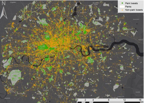
Finally, we also set up a threshold for the proportion of park tweets per user, to be more representative of users’ behavior. Due to the high variance of users’ tweet frequency, we set a minimum of four park tweets (1/3 of the overall minimum tweet count for a user) or if someone has more than 80 tweets in total, then at least 5% should be park tweets to represent park visiting behavior on an individual level. Consequently, our pre-processed data set, ready for spatiotemporal and content analysis, as well as for defining user and park profiles, consisted of 78,597 park tweets out of 636,917 tweets, from 1754 parks and posted by 4337 unique users (Figure3).
ISPRS Int. J. Geo‐Inf. 2018, 7, x FOR PEER REVIEW 6 of 25
Figure 3. Map of tweets and parks (input data sets of the analysis).
3. Methodology
3.1. Overview
As an overview, Figure 4 shows the main components of our analysis. After the preprocessing of the data, the first group of analyses is performed to study the spatial characteristics of park visitors’
behavior. In a second step, the content of the tweets is analyzed to provide a general interpretation of the mood of the people while tweeting in a park. This comprises sentiment and emotion extraction, and then an aggregation of the gathered information on park level for both steps (sentiments, emotions). Regarding the temporal variability of both park visits and the sentiment of the tweets, we also analyze how the results of the previous analyses vary over time. The analysis of daily, weekly and seasonal trends are essential characteristics for the study of park visits. These temporal patterns are not only relevant for studying the number of visitors per hour, day or season, but also to trace the changes in the sentiment of the tweets or the emotions of the users accordingly. In summary, the results of the spatial, temporal and content analyses are combined to identify different user and park profiles.
Figure 4. Methodology overview.
Figure 3.Map of tweets and parks (input data sets of the analysis).
3. Methodology
3.1. Overview
As an overview, Figure4shows the main components of our analysis. After the preprocessing of the data, the first group of analyses is performed to study the spatial characteristics of park visitors’
behavior. In a second step, the content of the tweets is analyzed to provide a general interpretation of the mood of the people while tweeting in a park. This comprises sentiment and emotion extraction, and then an aggregation of the gathered information on park level for both steps (sentiments, emotions).
Regarding the temporal variability of both park visits and the sentiment of the tweets, we also analyze how the results of the previous analyses vary over time. The analysis of daily, weekly and seasonal trends are essential characteristics for the study of park visits. These temporal patterns are not only relevant for studying the number of visitors per hour, day or season, but also to trace the changes in the sentiment of the tweets or the emotions of the users accordingly. In summary, the results of the spatial, temporal and content analyses are combined to identify different user and park profiles.
ISPRS Int. J. Geo‐Inf. 2018, 7, x FOR PEER REVIEW 6 of 25
Figure 3. Map of tweets and parks (input data sets of the analysis).
3. Methodology
3.1. Overview
As an overview, Figure 4 shows the main components of our analysis. After the preprocessing of the data, the first group of analyses is performed to study the spatial characteristics of park visitors’
behavior. In a second step, the content of the tweets is analyzed to provide a general interpretation of the mood of the people while tweeting in a park. This comprises sentiment and emotion extraction, and then an aggregation of the gathered information on park level for both steps (sentiments, emotions). Regarding the temporal variability of both park visits and the sentiment of the tweets, we also analyze how the results of the previous analyses vary over time. The analysis of daily, weekly and seasonal trends are essential characteristics for the study of park visits. These temporal patterns are not only relevant for studying the number of visitors per hour, day or season, but also to trace the changes in the sentiment of the tweets or the emotions of the users accordingly. In summary, the results of the spatial, temporal and content analyses are combined to identify different user and park profiles.
Figure 4. Methodology overview.
Figure 4.Methodology overview.
3.2. Spatial Analysis
In this part of the analysis, we had two goals:
1. To describe the main characteristics of the relevant users’ spatial behavior: Where is their main center of activity based on their tweets? What is the average distance between this center and each tweet from the same user?
2. To measure the average distance between a park visitor’s main activity center and a given park:
What is the median and mean distance from the activity center of the users who tweeted from the given park?
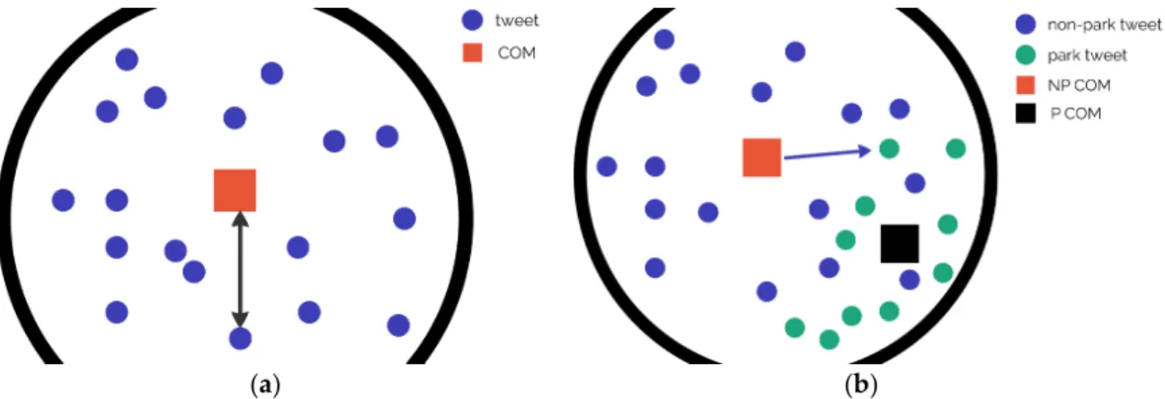
As the home location or any other reliable information is not available for the users, we use the centroid of their tweets as the main attribute to investigate a user’s spatial behavior [57]. This centroid or “center of mass” (COM) is the coordinate of the users’ main center of activity representing the average of each unique tweet by a user (Figure 5a). As a result, of the preprocessing, we can distinguish park tweets from non-park tweets, which is an important aspect for the investigation of users’ spatial behavior. Thereby, the COM is also calculated only for the park tweets of a user. Figure5b illustrates how the average and median distance from the users’ COM (for all tweets) to park tweets was calculated.
ISPRS Int. J. Geo‐Inf. 2018, 7, x FOR PEER REVIEW 7 of 25
3.2. Spatial Analysis
In this part of the analysis, we had two goals:
1. To describe the main characteristics of the relevant users’ spatial behavior: Where is their main center of activity based on their tweets? What is the average distance between this center and each tweet from the same user?
2. To measure the average distance between a park visitor’s main activity center and a given park:
What is the median and mean distance from the activity center of the users who tweeted from the given park?
As the home location or any other reliable information is not available for the users, we use the centroid of their tweets as the main attribute to investigate a user’s spatial behavior [57]. This centroid or “center of mass” (COM) is the coordinate of the users’ main center of activity representing the average of each unique tweet by a user (Figure 5a). As a result, of the preprocessing, we can distinguish park tweets from non‐park tweets, which is an important aspect for the investigation of users’ spatial behavior. Thereby, the COM is also calculated only for the park tweets of a user. Figure 5b illustrates how the average and median distance from the users’ COM (for all tweets) to park tweets was calculated.
(a) (b)
Figure 5. The illustration of how COM is interpreted (a) and how it is used to measure the average distance between COM and a park tweet (b).
For both centroids (park, non‐park), the average and median distance to each tweet are calculated, which shows some general insights as to whether the users are more mobile in terms of their tweeting behavior. The median is used to offset the negative effect of outlier tweets with very high distances. The shift between the two types of COM coordinates also provides valuable information: if the shift and the average distance for park tweets are relatively low, we can conclude that the user mostly visits parks closer to their main center of activity. Table 3 summarizes all the derived variables for the user‐specific spatial behavior. The values of these variables are then visualized on histograms to represent trends in their distributions (see Section 4.1). All the distances calculated in this section are Euclidian distances.
Table 3. Derived spatial variables for each user.
Variable Description
COM_all Center of the coordinates of all tweets (per user) COM_park Center of the coordinates of all park tweets (per user)
COM shift Distance between the two different COMs
COM to all distance Distance between COM and all the tweets (average and median) COM to park distance Distance between COM and park tweets (average and median)
Figure 5.The illustration of how COM is interpreted (a) and how it is used to measure the average distance between COM and a park tweet (b).
For both centroids (park, non-park), the average and median distance to each tweet are calculated, which shows some general insights as to whether the users are more mobile in terms of their tweeting behavior. The median is used to offset the negative effect of outlier tweets with very high distances.
The shift between the two types of COM coordinates also provides valuable information: if the shift and the average distance for park tweets are relatively low, we can conclude that the user mostly visits parks closer to their main center of activity. Table3summarizes all the derived variables for the user-specific spatial behavior. The values of these variables are then visualized on histograms to represent trends in their distributions (see Section4.1). All the distances calculated in this section are Euclidian distances.
Table 3.Derived spatial variables for each user.
Variable Description
COM_all Center of the coordinates of all tweets (per user) COM_park Center of the coordinates of all park tweets (per user)
COM shift Distance between the two different COMs
COM to all distance Distance between COM and all the tweets (average and median) COM to park distance Distance between COM and park tweets (average and median)
3.3. Semantic Content Analysis
In the first step, we create the tweets’ corpus from the text which we clean in a few preprocessing steps, including tokenization, removal of stop words, anything other than Latin characters, URLs, numbers and punctuation symbols, a procedure also suggested by Steiger et al. [87].
After the preprocessing, we apply two sentiment analysis methods to extract polarity followed by emotion extraction.
3.3.1. Sentiment Scores
To define sentiment values for each tweet’s text, we use the lexicon by Hu & Liu [88], which contains positive and negative words. The polarity value shows the difference between the data set’s negative and positive attributions. If the difference value is higher than zero, the tweet is assumed to have an overall “positive sentiment”, while below zero, it is considered “negative”, and when it equals zero, then the text message is “neutral”. To avoid possibly misclassified tweets (difference score is close to zero), we define “positive sentiment” by a score equal or higher than two and “negative sentiment” by a score equal or lower than minus two, thus excluding weak and potentially unreliable sentiment scores of [–1,1] which is in line with previous research [89].
3.3.2. Emotion Detection
To determine emotions included in written text, we use the National Research Council Canada Emotion Lexicon (NRC Emolex) [90,91] through the Syuzhet package in R [92]. This lexicon includes a list of 14,182 unigrams and their associations with eight emotions (anger, fear, anticipation, trust, surprise, sadness, joy, and disgust) and polarities (negative and positive). The words were manually annotated through Amazon’s Mechanical Turk that is a crowdsourced marketplace, where users sign up for simple tasks that gives them small rewards. At least three annotators annotated every word.
This procedure helps to define a scale of association between emotions or sentiments and the tweet text (not associated, weakly, moderately, or strongly associated), all of which are used in this study except for “not associated”.
3.4. Temporal Analysis
Using the timestamps of each tweet, we divided them into different temporal categories to trace changes in the number of tweeting visitors and how the sentiments and emotions of their tweets vary over time. Daily patterns show the hourly distribution of the tweets during the day. We aggregated them on the park level, to determine whether the park is more popular and “positive” in the morning, throughout the day, or the evening. On the other hand, the main advantage of the weekly pattern is to distinguish which parks are more favorable at the weekends than during the week or on what days they have more tweets that are positive. Seasonal patterns can reflect the effect of climatic factors along with the functionality of a park. Especially the winter trends are interesting because a park functions well if it can also attract people during the colder periods of the year. In our analysis, we did not define seasons by precise dates (e.g., equinox to solstice) but rather used simpler groupings of months: spring was defined as March to May; summer as June to August; fall as September to November; and winter as December to February.
3.5. Profiles
The Partitioning Around Medoids (PAM) clustering algorithm was used in R (RStudio) to combine and interpret the results of all the analysis steps discussed above. Compared to the traditional K-means clustering algorithm, PAM is more robust to noise and outliers [93]. The number of clusters was defined by using thefviz_nbclust(https://www.rdocumentation.org/packages/factoextra/versions/1.
0.5/topics/fviz_nbclust) R package as a starting point, and complemented by manual interpretation if the R tool provided no clear suggestion. The spatial, temporal, and content analysis each represents
one important attribute of parks or user behavior. Our analysis is mainly done on tweet or user level, which is then aggregated on park level as well. For example, the COM is calculated for each user considering all their tweets. However, to derive the average distance from a park to its visitors’ COM we need to consider individual tweets to select which users were tweeting from the park to measure the distance to their COM. After we have all the required distances to a park (for each user tweeting from there), we can calculate the average value for the whole park.
Regarding the users, we consider the spatial tweeting behavior to be the most relevant aspect in accordance with the aim of this paper, especially park tweets and their distance from the users’ activity center. We extracted clusters of users based on the factors described in Table3. In terms of sentiments and emotions, we compared non-park and park tweets for every user, to see if a user is more positive while in a park.
For parks, all three types of analysis were considered to be of equal importance. Therefore, parks were clustered according to their visitors’ spatial characteristics (how “mobile” they are for parks and in general), how positive or negative the tweets were in that given park along with which emotions are present or more prevailing, and how the frequency of visits and the content of the tweets varies over time.
4. Results
To synthesize the results for all our investigated aspects (spatial, temporal, content) we cluster similar features into groups. Identifying different types of parks and visitors is not just useful to represent vast amounts of information, but it also aids planning, as similar types of parks might face similar problems and thereby require similar actions. Park types can also help to define a hierarchy among different urban green areas based on the distances users travel to them or the time of the day/week when a peak in the number of visitors occurs.
4.1. Spatial Profiles
As shown in Table3, we calculated the average and median distances from COM to each tweet both for only park tweets and for all tweets. Every user had one value for each calculation; Figure6 shows the frequency of these distances.
ISPRS Int. J. Geo‐Inf. 2018, 7, x FOR PEER REVIEW 9 of 25
calculated for each user considering all their tweets. However, to derive the average distance from a park to its visitors’ COM we need to consider individual tweets to select which users were tweeting from the park to measure the distance to their COM. After we have all the required distances to a park (for each user tweeting from there), we can calculate the average value for the whole park.
Regarding the users, we consider the spatial tweeting behavior to be the most relevant aspect in accordance with the aim of this paper, especially park tweets and their distance from the users’
activity center. We extracted clusters of users based on the factors described in Table 3. In terms of sentiments and emotions, we compared non‐park and park tweets for every user, to see if a user is more positive while in a park.
For parks, all three types of analysis were considered to be of equal importance. Therefore, parks were clustered according to their visitors’ spatial characteristics (how “mobile” they are for parks and in general), how positive or negative the tweets were in that given park along with which emotions are present or more prevailing, and how the frequency of visits and the content of the tweets varies over time.
4. Results
To synthesize the results for all our investigated aspects (spatial, temporal, content) we cluster similar features into groups. Identifying different types of parks and visitors is not just useful to represent vast amounts of information, but it also aids planning, as similar types of parks might face similar problems and thereby require similar actions. Park types can also help to define a hierarchy among different urban green areas based on the distances users travel to them or the time of the day/week when a peak in the number of visitors occurs.
4.1. Spatial Profiles
As shown in Table 3, we calculated the average and median distances from COM to each tweet both for only park tweets and for all tweets. Every user had one value for each calculation; Figure 6 shows the frequency of these distances.
Figure 6. (A) Average distance to each tweet from COM—all tweets; (B) Average distance to each park tweet from park COM; (C) Median distance to each tweet from COM—all tweets; (D) Median distance to each park tweet from park COM.
The graphs show that most of the people tweeted around 3–4 km away from their main activity center (Figure 6A,C). However, if we only consider park tweets, most users have rather small distances between the park COM and each park tweet, which means they mostly tweeted from parks close to each other (Figure 6B,D) or even from the same park. Furthermore, it is very interesting to
Figure 6.(A) Average distance to each tweet from COM—all tweets; (B) Average distance to each park tweet from park COM; (C) Median distance to each tweet from COM—all tweets; (D) Median distance to each park tweet from park COM.
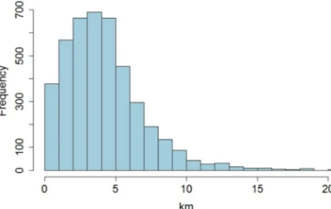
The graphs show that most of the people tweeted around 3–4 km away from their main activity center (Figure6A,C). However, if we only consider park tweets, most users have rather small distances between the park COM and each park tweet, which means they mostly tweeted from parks close to each other (Figure6B,D) or even from the same park. Furthermore, it is very interesting to see the average distances between park tweets and the COM of all tweets (Figure7). The results show that people were not tweeting very close to their COM. For those Twitter users, who live closer to the city center or at least, not too close to the edges of the study area, the COM can serve as an approximation for their home location [94]. Thereby, this distance between park tweets and the COM of all tweets and can reflect the average home-park distance for the given user. Most users tweeted in a park around 3–4 km away from their COM (of all tweets) on average.
ISPRS Int. J. Geo‐Inf. 2018, 7, x FOR PEER REVIEW 10 of 25
see the average distances between park tweets and the COM of all tweets (Figure 7). The results show that people were not tweeting very close to their COM. For those Twitter users, who live closer to the city center or at least, not too close to the edges of the study area, the COM can serve as an approximation for their home location [94]. Thereby, this distance between park tweets and the COM of all tweets and can reflect the average home‐park distance for the given user. Most users tweeted in a park around 3–4 km away from their COM (of all tweets) on average.
Figure 7. Frequency of average distances from COM (of all tweets) to park tweets.
This is where one of the limitations of social media analysis becomes obvious, as we are not able to identify or verify the causal relationship for this trend. The observed higher distance could have various explanations, but without a further in‐depth investigation, we can only hypothesize them.
However, some of the hypotheses can also be rejected by the combination and cross‐checking of results. The distribution of the parks in the study area regarding accessibility can be considered good, as from almost any point of the city there is a park within 500 m of walk. This means that it is not necessary for someone to visit a park 3–4 km away from their home/COM because they have parks closer to them. However, the case might simply be that the closest park is not adequate for their needs. Another explanation is that due to self‐imposed privacy constraints or some other reasons they would not tweet near their home. Also, the motivation behind posting a tweet is often to report something extraordinary, so when a user regularly visits a nearby park, it is not something that they would tweet about, but when visiting an unfamiliar location further away they might do so.
In Section 1 we pointed out the ambiguous role of spatial factors in park visits based on existing research. Although social media data analysis by itself cannot reveal direct motivation behind visiting a given park over other parks, the observed trends in distances between COM and park tweets along with accessibility imply that short distance (especially visiting the closest park to home/COM) has no primary importance. Perceived distances and accessibility might still be relevant in the overall decision but other factors (such as functionality, perception of safety/beauty, etc.) can have a more significant influence in selecting a park for visit, which can serve as an input for further research.
If we aggregate the user‐specific measurements on the park level, we can see the average distances traveled (as network distances) to a given park by the users who tweeted from there (Figure 8). Only parks with tweets from at least ten different users are visualized. There is a clear concentric trend observable; the further away from the city center a park is, the bigger the average traveled distances.
This means that parks in the outer parts of the city are visited not just by people living nearby but really by visitors from all over the city.
Figure 7.Frequency of average distances from COM (of all tweets) to park tweets.
This is where one of the limitations of social media analysis becomes obvious, as we are not able to identify or verify the causal relationship for this trend. The observed higher distance could have various explanations, but without a further in-depth investigation, we can only hypothesize them. However, some of the hypotheses can also be rejected by the combination and cross-checking of results. The distribution of the parks in the study area regarding accessibility can be considered good, as from almost any point of the city there is a park within 500 m of walk. This means that it is not necessary for someone to visit a park 3–4 km away from their home/COM because they have parks closer to them. However, the case might simply be that the closest park is not adequate for their needs.
Another explanation is that due to self-imposed privacy constraints or some other reasons they would not tweet near their home. Also, the motivation behind posting a tweet is often to report something extraordinary, so when a user regularly visits a nearby park, it is not something that they would tweet about, but when visiting an unfamiliar location further away they might do so.
In Section1we pointed out the ambiguous role of spatial factors in park visits based on existing research. Although social media data analysis by itself cannot reveal direct motivation behind visiting a given park over other parks, the observed trends in distances between COM and park tweets along with accessibility imply that short distance (especially visiting the closest park to home/COM) has no primary importance. Perceived distances and accessibility might still be relevant in the overall decision but other factors (such as functionality, perception of safety/beauty, etc.) can have a more significant influence in selecting a park for visit, which can serve as an input for further research.
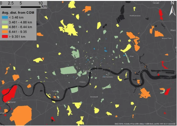
If we aggregate the user-specific measurements on the park level, we can see the average distances traveled (as network distances) to a given park by the users who tweeted from there (Figure8).
Only parks with tweets from at least ten different users are visualized. There is a clear concentric trend observable; the further away from the city center a park is, the bigger the average traveled distances.
This means that parks in the outer parts of the city are visited not just by people living nearby but really by visitors from all over the city.
ISPRS Int. J. Geo‐Inf. 2018, 7, x FOR PEER REVIEW 11 of 25
Figure 8. Average distance from users’ COM to the park, aggregated on park level based on the tweets posted from a given park.
As stated above, considering the analyzed spatial aspects, we clustered users and parks according to their characteristics. Among users, we identified four groups (Figure 9). The users in the first group have low values for each distance category, which means that based on their tweeting activity they are not so mobile compared to other groups. Their movements in general, not just for park visits, is constrained to a relatively small area within the city. The second group is quite similar, except that they have the highest value among all groups for the average and median distance between the park COM and park tweets. Interestingly, their median value is even higher than the average. This high value means that these users usually move around in a small area, except for when visiting parks. The third group is exactly the opposite of the previous one—they have relatively high values for each variable except for the park COM to park tweets. This means that these users travel large distances in the city; however, when it comes to visiting parks, they opt for parks that are close to each other (or even only one park) and usually not close to the visitors’ COMs. Finally, the fourth group is similar to the first one, they have very similar values for each variable, but they are higher than in the first group. These users are mobile, they visit and tweet from various places around the city both in parks and for other activities.
Figure 9. Medoid values of user clusters.
Figure 8.Average distance from users’ COM to the park, aggregated on park level based on the tweets posted from a given park.
As stated above, considering the analyzed spatial aspects, we clustered users and parks according to their characteristics. Among users, we identified four groups (Figure9). The users in the first group have low values for each distance category, which means that based on their tweeting activity they are not so mobile compared to other groups. Their movements in general, not just for park visits, is constrained to a relatively small area within the city. The second group is quite similar, except that they have the highest value among all groups for the average and median distance between the park COM and park tweets. Interestingly, their median value is even higher than the average. This high value means that these users usually move around in a small area, except for when visiting parks.
The third group is exactly the opposite of the previous one—they have relatively high values for each variable except for the park COM to park tweets. This means that these users travel large distances in the city; however, when it comes to visiting parks, they opt for parks that are close to each other (or even only one park) and usually not close to the visitors’ COMs. Finally, the fourth group is similar to the first one, they have very similar values for each variable, but they are higher than in the first group. These users are mobile, they visit and tweet from various places around the city both in parks and for other activities.
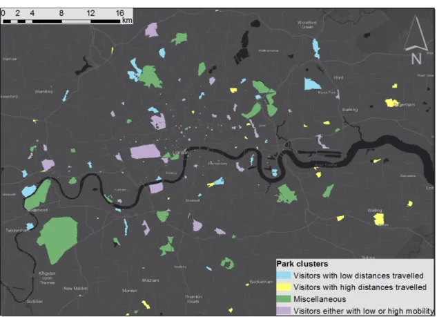
Figure10shows park types based on the proportion of different user types visiting a given park.
There were four types of park according to which user cluster their visitors mostly belong to. Parks in the first category are mostly visited by users from Cluster 1, indicating visitors who generally traveled short distances (blue), while the second category with users from Cluster 4 represents large distances (yellow). The third group of parks is exactly the opposite of the second one as those parks have visitors from all user clusters except for Cluster 4 (green). The last park category also has multiple user types, dominantly from Cluster 1 and 4 (purple). If we investigate the spatial distribution of different park types, we can see that the parks in the first group (blue) are mostly outside the city center, which indicates that most of the visitors live close to the park and residents of the inner city visit them less frequently. The second group (yellow) contains smaller parks, which means that they might provide some specialized functionality and therefore people might also visit them from larger distances. Parks in the third group (green) are on average larger in extent and visited by all types
ISPRS Int. J. Geo-Inf.2018,7, 378 12 of 26
of users. The reason for this is probably quite the opposite as it is for the second group, as a bigger park would provide various functionalities and thereby attract different people. The last group of parks (purple) also has visitors from a wider range according to their spatial behavior. These parks are (except for a few) closer to the city center so people living closer to the city center will visit them, but the parks can also attract visitors from larger distances. Parks located next to each other but belonging to different groups (especially blue or yellow) represent interesting scenarios, the cause of which can be investigated in further studies.
Figure 8. Average distance from users’ COM to the park, aggregated on park level based on the tweets posted from a given park.
As stated above, considering the analyzed spatial aspects, we clustered users and parks according to their characteristics. Among users, we identified four groups (Figure 9). The users in the first group have low values for each distance category, which means that based on their tweeting activity they are not so mobile compared to other groups. Their movements in general, not just for park visits, is constrained to a relatively small area within the city. The second group is quite similar, except that they have the highest value among all groups for the average and median distance between the park COM and park tweets. Interestingly, their median value is even higher than the average. This high value means that these users usually move around in a small area, except for when visiting parks. The third group is exactly the opposite of the previous one—they have relatively high values for each variable except for the park COM to park tweets. This means that these users travel large distances in the city; however, when it comes to visiting parks, they opt for parks that are close to each other (or even only one park) and usually not close to the visitors’ COMs. Finally, the fourth group is similar to the first one, they have very similar values for each variable, but they are higher than in the first group. These users are mobile, they visit and tweet from various places around the city both in parks and for other activities.
Figure 9. Medoid values of user clusters.
Figure 9.Medoid values of user clusters.
ISPRS Int. J. Geo‐Inf. 2018, 7, x FOR PEER REVIEW 12 of 25
Figure 10 shows park types based on the proportion of different user types visiting a given park.
There were four types of park according to which user cluster their visitors mostly belong to. Parks in the first category are mostly visited by users from Cluster 1, indicating visitors who generally traveled short distances (blue), while the second category with users from Cluster 4 represents large distances (yellow). The third group of parks is exactly the opposite of the second one as those parks have visitors from all user clusters except for Cluster 4 (green). The last park category also has multiple user types, dominantly from Cluster 1 and 4 (purple). If we investigate the spatial distribution of different park types, we can see that the parks in the first group (blue) are mostly outside the city center, which indicates that most of the visitors live close to the park and residents of the inner city visit them less frequently. The second group (yellow) contains smaller parks, which means that they might provide some specialized functionality and therefore people might also visit them from larger distances. Parks in the third group (green) are on average larger in extent and visited by all types of users. The reason for this is probably quite the opposite as it is for the second group, as a bigger park would provide various functionalities and thereby attract different people. The last group of parks (purple) also has visitors from a wider range according to their spatial behavior. These parks are (except for a few) closer to the city center so people living closer to the city center will visit them, but the parks can also attract visitors from larger distances. Parks located next to each other but belonging to different groups (especially blue or yellow) represent interesting scenarios, the cause of which can be investigated in further studies.
Figure 10. Park categories based on the spatial characteristics of their visitors’ behavior.
4.2. Sentiments and Emotions
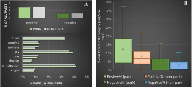
In this part of the analysis, positive and negative sentiments along with eight different emotions were extracted for each tweet. After the algorithm assigned a value to each of these new attributes, we compared whether there is a difference between park tweets and non‐park tweets. Based on previous studies (e.g., [47]) the hypothesis was that park tweets could be more positive. However, our results only partially confirm this. If we consider all the tweets (Figure 11A), not distinguishing them based on users, the proportion of positive non‐park tweets (among all non‐park tweets) is higher than the proportion of positive park tweets among park tweets. However, if we first calculate
Figure 10.Park categories based on the spatial characteristics of their visitors’ behavior.
4.2. Sentiments and Emotions
In this part of the analysis, positive and negative sentiments along with eight different emotions were extracted for each tweet. After the algorithm assigned a value to each of these new attributes,
we compared whether there is a difference between park tweets and non-park tweets. Based on previous studies (e.g., [47]) the hypothesis was that park tweets could be more positive. However, our results only partially confirm this. If we consider all the tweets (Figure11A), not distinguishing them based on users, the proportion of positive non-park tweets (among all non-park tweets) is higher than the proportion of positive park tweets among park tweets. However, if we first calculate the user-level proportions of positive and negative sentiments for park and non-park tweets, we get exactly the opposite results (Figure11B). The proportion of positive tweets in the parks is higher than the proportion of other positive tweets posted outside the parks. This means that, in general, Twitter users are more positive while being in a park.
ISPRS Int. J. Geo‐Inf. 2018, 7, x FOR PEER REVIEW 13 of 25
the user‐level proportions of positive and negative sentiments for park and non‐park tweets, we get exactly the opposite results (Figure 11B). The proportion of positive tweets in the parks is higher than the proportion of other positive tweets posted outside the parks. This means that, in general, Twitter users are more positive while being in a park.
Figure 11. Percentage of sentiments and emotions for park tweets and non‐park tweets ((A) all tweets considered in one step; (B) aggregated user‐level values).
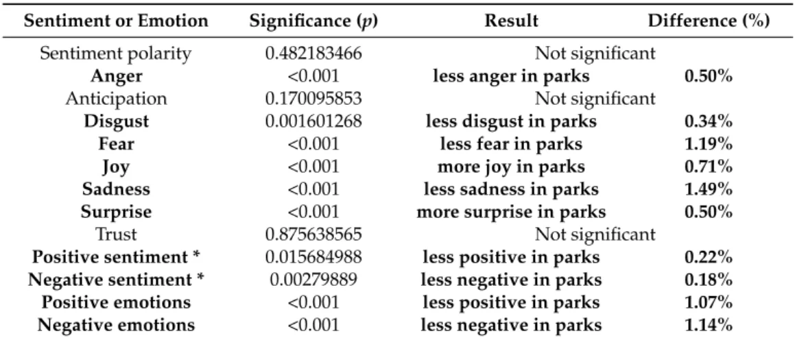
Regarding the emotion categories; surprise, joy, and anticipation are higher in proportion for park tweets than among non‐park tweets (Figure 11). We used a one‐factor ANOVA (Analysis Of Variance) test to compare park and non‐park tweets to determine whether this difference is statistically significant (Table 4). Bold font denotes significant differences between the two data sets.
Polarity means that all sentiment values were considered (negative sentiments got a negative sign).
Except for the polarity, anticipation, and trust, all other differences are significant between the two data sets. However, the values representing differences are relatively low.
Table 4. Difference between park tweets and non‐park tweets for sentiments and emotions.
Sentiment or Emotion Significance (p) Result Difference (%) Sentiment polarity 0.482183466 Not significant
Anger <0.001 less anger in parks 0.50%
Anticipation 0.170095853 Not significant
Disgust 0.001601268 less disgust in parks 0.34%
Fear <0.001 less fear in parks 1.19%
Joy <0.001 more joy in parks 0.71%
Sadness <0.001 less sadness in parks 1.49%
Surprise <0.001 more surprise in parks 0.50%
Trust 0.875638565 Not significant
Positive sentiment * 0.015684988 less positive in parks 0.22%
Negative sentiment * 0.00279889 less negative in parks 0.18%
Positive emotions <0.001 less positive in parks 1.07%
Negative emotions <0.001 less negative in parks 1.14%
* were considered as binary value (1 = sentiment identified, 0 = no sentiment).
Figure 12 shows the polarity on park level. Polarity represents the overall sentiment, which means that the percentage of tweets with negative sentiments is subtracted from the percentage of positive tweets. For example, if 6% of the tweets in a park are positive and 2% are negative, the overall score will be 4%. In this way, we can see that there are parks with more negative than positive
A B
Figure 11.Percentage of sentiments and emotions for park tweets and non-park tweets ((A) all tweets considered in one step; (B) aggregated user-level values).
Regarding the emotion categories; surprise, joy, and anticipation are higher in proportion for park tweets than among non-park tweets (Figure11). We used a one-factor ANOVA (Analysis Of Variance) test to compare park and non-park tweets to determine whether this difference is statistically significant (Table4). Bold font denotes significant differences between the two data sets. Polarity means that all sentiment values were considered (negative sentiments got a negative sign). Except for the polarity, anticipation, and trust, all other differences are significant between the two data sets.
However, the values representing differences are relatively low.
Figure12shows the polarity on park level. Polarity represents the overall sentiment, which means that the percentage of tweets with negative sentiments is subtracted from the percentage of positive tweets. For example, if 6% of the tweets in a park are positive and 2% are negative, the overall score will be 4%. In this way, we can see that there are parks with more negative than positive sentiments in the tweets posted from there (blue color in the map). Parks tend to have a higher overall sentiment (=considerably higher number of positive tweets than negative, orange and red polygons) south of the river Thames; however, the parks with the highest overall sentiment (red) are mostly located in the inner city, on the opposite side of the river. A detailed analysis including a more in-depth content analysis, which is beyond the scope of the present study, can investigate whether the high number and proportion of negative tweets reflect some serious issues regarding those parks or there are different reasons for it.
Table 4.Difference between park tweets and non-park tweets for sentiments and emotions.
Sentiment or Emotion Significance (p) Result Difference (%)
Sentiment polarity 0.482183466 Not significant
Anger <0.001 less anger in parks 0.50%
Anticipation 0.170095853 Not significant
Disgust 0.001601268 less disgust in parks 0.34%
Fear <0.001 less fear in parks 1.19%
Joy <0.001 more joy in parks 0.71%
Sadness <0.001 less sadness in parks 1.49%
Surprise <0.001 more surprise in parks 0.50%
Trust 0.875638565 Not significant
Positive sentiment * 0.015684988 less positive in parks 0.22%
Negative sentiment * 0.00279889 less negative in parks 0.18%
Positive emotions <0.001 less positive in parks 1.07%
Negative emotions <0.001 less negative in parks 1.14%
* were considered as binary value (1 = sentiment identified, 0 = no sentiment).
ISPRS Int. J. Geo‐Inf. 2018, 7, x FOR PEER REVIEW 14 of 25
sentiments in the tweets posted from there (blue color in the map). Parks tend to have a higher overall sentiment (=considerably higher number of positive tweets than negative, orange and red polygons) south of the river Thames; however, the parks with the highest overall sentiment (red) are mostly located in the inner city, on the opposite side of the river. A detailed analysis including a more in‐
depth content analysis, which is beyond the scope of the present study, can investigate whether the high number and proportion of negative tweets reflect some serious issues regarding those parks or there are different reasons for it.
Figure 12. Overall sentiment scores in parks with at least 100 tweets.
4.3. Temporal Variability of the Results
4.3.1. Number of Tweets
As a first step, the absolute number of tweets was grouped to yearly, seasonal, weekly, and daily periods (Figure 13). The yearly and seasonal distribution clearly reflects a higher proportion of tweets occurring in parks during spring and summer, in accordance with similar research (e.g., [28]).
Interestingly, there are slightly fewer tweets during fall than winter, reflected by the high number of tweets in January and February. Considering the weather conditions in January and February, it is surprising that these two winter months have almost the same amount of park tweets as some periods during the spring. The weekly pattern is quite regular with almost the same number of park tweets on every weekday, while at weekends the numbers are slightly higher than during the week but still almost identical on Saturday and Sunday. The daily trend follows an obvious, ordinary pattern with almost no tweets during the night, one peak in the afternoon at 2:00 p.m. and another relative peak in the evening around 9:00 p.m.
Parks were also clustered according to the temporal characteristics in terms of visits (Figure 18).
The daily pattern was divided into four groups, one where the proportion of tweets is almost constant and the other three with a peak for each temporal unit (morning, afternoon, evening). The results were similar for the seasons as well—one group with a clear peak in spring and another in winter—
whereas the other two groups have similar values in spring‐summer or spring‐fall. The weekly pattern is not shown; there were two groups, in both of which the proportion of weekday tweets was
Figure 12.Overall sentiment scores in parks with at least 100 tweets.
4.3. Temporal Variability of the Results
4.3.1. Number of Tweets
As a first step, the absolute number of tweets was grouped to yearly, seasonal, weekly, and daily periods (Figure 13). The yearly and seasonal distribution clearly reflects a higher proportion of tweets occurring in parks during spring and summer, in accordance with similar research (e.g., [28]).
Interestingly, there are slightly fewer tweets during fall than winter, reflected by the high number of tweets in January and February. Considering the weather conditions in January and February, it is surprising that these two winter months have almost the same amount of park tweets as some periods during the spring. The weekly pattern is quite regular with almost the same number of park tweets