Article
Success or Waste of Taxpayer Money? Impact Assessment of Rural Development Programs in Hungary
Zoltán Bakucs1,2,* , Imre Fert ˝o1,3and Zsófia Benedek1
1 Centre for Economic and Regional Studies, Hungarian Academy of Sciences, Budapest H-1097, Hungary;
imre.ferto@krtk.mta.hu (I.F.); zsofia.benedek@krtk.mta.hu (Z.B.)
2 Corvinus University of Budapest, Budapest H-1093, Hungary
3 Kaposvár University, Kaposvár H-7400, Hungary
* Correspondence: zoltan.bakucs@krtk.mta.hu
Received: 8 March 2019; Accepted: 5 April 2019; Published: 11 April 2019 Abstract:The effectiveness of support directed to less developed regions is a timely question more than halfway through the 2014–2020 programming period. We present an analysis of the impact of rural development support on the well-being of Hungarian LAU1 regions between 2008 and 2013.
The aim was to measure the overall impact of all of the Rural Development Funds, covering all measures within the program. Two indices of local well-being were used: the multi-dimensional, local-variables-based Regional Development Index that measures the overall level of regional development and a simple, migration-based index as a proxy for perceived quality of life. Generalized propensity score matching, and difference-in-differences estimation techniques were employed to evaluate the impact of subsidies. Irrespective of how the amount of support was calculated, the measure of local well-being, or the methodology employed, the impact was not significant, and was sometimes even negative. This casts doubt on the effectiveness of Rural Development Policy in Hungary.
Keywords: Rural Development Policy; impact assessment; LAU1 regions; generalized propensity score matching; difference in differences
1. Introduction
After agricultural transfers, the second largest share of European Union’s (EU) budget is dedicated to the funding of the Regional Policy. With a share of 40% of EU budget, Regional Policy aims for sustainable local development of EU regions. For this purpose, 347 billion Euros were spent in the 2007–2013 programming period and 347 billion euros are foreseen for the 2014–2020 programming period. Several funds are used for this purpose. European Regional Development Fund “aims to strengthen economic and social cohesion in the European Union by correcting imbalances between its regions” (https://ec.europa.eu/regional_policy/en/funding/), focusing on investments into research and innovation, support for small- and medium-sized enterprises, the digital agenda and the low-carbon economy. The Cohesion Fund supports large infrastructural investments such as energy and transport investments that benefit the environment in Bulgaria, Croatia, Cyprus, the Czech Republic, Estonia, Greece, Hungary, Latvia, Lithuania, Malta, Poland, Portugal, Romania, Slovakia and Slovenia, i.e., in Member States where Gross National Income per capita is less than 90% of the EU average. The European Social Fund “invests in people, with a focus on improving employment and education opportunities across the European Union. It also aims to improve the situation of the most vulnerable people at risk of poverty” (https://ec.europa.eu/regional_policy/en/funding/).
Sustainability2019,11, 2158; doi:10.3390/su11072158 www.mdpi.com/journal/sustainability
Sustainability2019,11, 2158 2 of 23
In the 2007–2013 programming period, Hungary received some 25 billion euros from these funds. Relatively small compared to these interventions, the European Agricultural Fund for Rural Development provides the means of Rural Development Policy. Within the EU, Hungary is one of the biggest beneficiaries of Rural Development Program (RDP) payments—at least as far as per-capita transfers are considered. In the 2007–2013 programming period, EUR 3.8 billion was spent, while, in the 2014–2020 period, EUR 4.2 billion (of which EUR 740 million in the form of national co-funding) is earmarked for this purpose. The question that naturally arises is: Do these substantial transfers make a difference? The European Commission’s mandatory ex-ante, mid-term and ex-post program evaluations—based on the monitoring of a set of (partial) indicators and qualitative assessment—fail to provide an answer because of the need for uniformity and comparability across Member States.
Papers generally focus on the impact of Structural Funds, more precisely on the impact of Objective 1 programs (Objective 1 programs are the largest measure within the EU cohesion policy, targeting regions with GDP (evaluated at Purchasing Power) less than 75% of the EU average) upon European regions. Several strands of literature may be identified. The first one analyzes to which extent the main goal of the Regional Policy, i.e., the convergence of European regions was achieved [1–3].
A second group of papers focus on the impact of structural funds on the economic—most often GDP per capita—growth [2,4–9], or employment growth [4,5,10] of regions. Reference [11] focused on the impact of Cohesion Policy on the economic performance of the most disadvantaged regions (NUTS3 level), while the effect of European Structural and Investment Fund payments on the performance of local governments in Portugal were assessed by Caldas et al. [12]. Further, [13] analyzed the impact of Cohesion Policy on regional productivity growth, and [14] examined the territorial impacts of EU development policy. The work of Michalek and Zarnekow [15] is the only paper to describe the Central and Easter European space from this perspective.
Some academics use firm level data for impact evaluation. Thus, [16] quantified the impact of Rural Development subsidies upon the productivity, profitability and efficiency of Czech meat processing industry, [17,18] analyzed the effect of innovation subsidies in Sweden and East German territories, respectively, [19] analyzed a unique firm level dataset of 2 million projects funded by structural and cohesion funds over the 2007–2013 period for EU 25 countries, and [20] employed meta-regression to analyze the results of 17 papers providing 323 estimates on the impact of Structural Funds upon growth.
Note, there is a lack of papers focusing on RDP rather than impact of Structural and Cohesion Funds. Policy evaluation or impact assessment of RDP is a rather complicated issue since such complex notions are hard to quantify, while all relevant components of the impact should be captured in a transparent and easy-to-handle fashion. Two notable issues add complexity to any impact analysis.
First, the use of partial indicators such as increases in local GDP levels, decreases in unemployment rate, the value of program-generated investment, and the number of programs (or area) supported (see, e.g., [15] for a detailed discussion). Moreover, GDP data are not available at a disaggregated level, thus analysts are constrained by a lack of data concerning potential indicators. The second issue is the problem of constructing the appropriate counterfactual situation for impact analysis. More exactly, program impact evaluation cannot correctly be undertaken unless the impact is measured by comparing actual and counterfactual outcomes. However, the counterfactual situation may not be observed. Thus, the main challenge of impact analysis is to construct a convincing and reasonable comparison group (counterfactual) for beneficiaries in the absence of data. The very recent paper by Castaño et al. [21] explores in detail the use of counterfactuals in the ex-post evaluation of 2007–2013 RDP. Using the example of seven evaluations employing rather different empirical methodologies, the authors highlighted the difficulties with respect to data needs and limiting methodological assumptions.
They did, however, “recommend the use of advanced counterfactual approaches to provide evidence of programme impacts”. The often-employed naïve approaches to the impact evaluation of RDP (case studies or partial-indicator-based approaches) completely neglect this second issue [22]. The most important weakness of partial indicators is that they may not be treated as exogenous to
levels of development. It follows that, in these analyses, there is no clear unidirectional causality between RDP and local development. The use of a complex Rural Development Indicator (RDI), as originally proposed by Michalek and Zarnekow [15] and later employed in the Hungarian context by Bakucs et al. [23], combined with propensity score matching methodology, allows the creation of a counterfactual and thus solves problems with endogeneity.
In this study, we followed this approach and constructed a synthetic development index, complemented by an internal-migration-based index, assuming that, regardless of computed local development scores, people tend to migrate to areas where perceived quality of life is higher. In contrast to [24], who investigated only the impact of the SAPARD programs in Poland and in Slovakia between 2002 and 2005, we focused on the 2008–2013 period and cover all rural development policy measures.
We addressed the following simple question: Has the significant amount of Rural Development funds that have been distributed had any measurable impact? We went beyond estimating the causal effects of RDP and the use of a simple binary treatment indicator by estimating propensity score matching difference-in-differences (PSM-DID) models and using parametric and semiparametric generalized propensity score matching approaches (GPS). Estimating a dose–response function in the framework of GPS provides more information regarding the effectiveness of a program by uncovering heterogeneities in the effects of RDP at different treatment levels. In doing this, we built on recent advances in the applied econometrics of impact evaluation, as well as recent empirical studies using GPS. For example, highly disaggregated (firm-level) data was used by Bia and Mattei [25] to evaluate the effect of financial support allocated to Piedmont enterprises upon employment growth, while [26] analyzed the impact of product innovation intensity upon European companies—both approaches employ generalized propensity score matching. Closer to the present topic is research by Michalek and Ciaian [27], who used generalized propensity score methods to evaluate the capitalization of farm single payments into the land value in the EU and the research of Esposti [28], who used generalized propensity score matching to identify and estimate the response of farms to decoupling policy as a treatment effect.
We contribute to the impact assessment literature in several ways. First, in a time when politicians and the general public in Old Member States increasingly question the necessity of transfers towards New Member States, we focused on Hungary, a country with a deteriorating Corruption Perception Index (Hungary’s PCI decreased from 55 in 2012 to 48 in 2016 [29]) and mounting evidence of flawed public procurement system along with high ranked corruption [30,31]. Second, by using a territorially disaggregated dataset, on Local Administrative Unit (LAU1) level, we had sufficient observations to analyze the impact of RDP in a single country context, minimizing the heterogeneity of unobservable variables thus increasing the validity of counterfactual ([10]). Third, we used a spatial spillover panel model to derive the synthetic Rural Development Indicator, thus we avoided the potential bias due to unaccounted spatial variables. Finally, in line with the most recent literature, after estimating PSM-DID models, we shifted from the binary definition of treatment and use Generalized Propensity Score matching eliminating the subjective bias of defining treated and non-treated regions.
The rest of the paper is organized as follows. In Section2, we present the data and a description of the methodological approach. In Section3, we focus on empirical results. Discussion and some conclusions are provided in the last two sections.
2. Materials and Methods
Hungary, a Central-European Country, acceded to the European Union in 2004. It covers an area of 93,000 km2with an approximate population of 9.8 million. At NUTS (Nomenclature des Unités Territoriales Statistiques—nomenclature of territorial units for statistics) 1 level, there are three, at NUTS 2 six, and at NUTS 3 twenty regions (nineteen counties plus the capital city, Budapest). At the Local Administrative Unit level (LAU1, formerly NUTS4), there are 174 small regions composed of 3164 administratively independent settlements. We employed a highly disaggregated dataset of yearly data with respect to these administratively independent settlements, which we believe contributes to the unique nature of this research. The T-STAR database of the Hungarian Central Statistical Office
Sustainability2019,11, 2158 4 of 23
was obtained from the CERS-HAS databank (http://adatbank.krtk.mta.hu/adatbazisok___tstar). The related data are designed for use in spatial studies and consist of several hundred variables relating to demographics, public health, education, pollution, unemployment, social care, economic entities, infrastructure, commerce and hospitality, tourism, culture, housing stock, municipal aid, municipal budgets, agriculture and personal income tax. These variables are available for the 2007–2013 period for all 3164 administratively independent Hungarian settlements. An internal migration database was provided by the Hungarian Central Statistical Office. Data about development funds for the period 2008–2013 were taken from the Information Systems of National Regional Development. Using total payments per locality, we created three support indicators: total subsidy, subsidy per km2, and subsidy per capita in LAU1 regions. The descriptive statistics for the development subsidies (years 2008–2013, total per region, per capita and per square km) presented in Table1emphasize the uneven distribution of funds.
Table 1.Descriptive statistics for subsidies for the period 2008–2013.
Variable Obs. Mean Std. Dev. Min. Max.
T. subsidy (k. HUF *) 1044 780,185.1 814,366.4 −36,435 7,111,930
Subsidy/cap (k. HUF) 1044 19.707 17.077 −2.106 126.25
Subsidy/km2(k. HUF) 1044 1386.61 1209.213 −95.581 13,203.6 Source: Own calculations. * EUR 1 = HUF 315 (as of 8 March 2019).
The average value of support per LAU1 region amounted to HUF 780 Million, but there were regions with very low levels of support, while in some regions the maximum value of support reached HUF 7.1 billion. This uneven distribution is also reflected in the extremely high standard deviations.
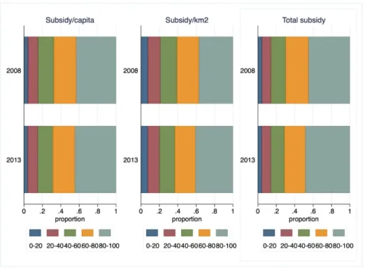
The negative minimum numbers in the table are due to two regions that had to repay RDP funds. The picture is made more nuanced by the last two rows in Table1(per capita and per square km subsidy), in which the inequality of distribution is less prominent. [23] found an increase in the concentration of subsidies awarded between 2002 and 2008. Figure1suggests that the concentration of subsidies further increased in the period under examination.
Sustainability 2019, 11, x FOR PEER REVIEW 4 of 24
(http://adatbank.krtk.mta.hu/adatbazisok___tstar). The related data are designed for use in spatial studies and consist of several hundred variables relating to demographics, public health, education, pollution, unemployment, social care, economic entities, infrastructure, commerce and hospitality, tourism, culture, housing stock, municipal aid, municipal budgets, agriculture and personal income tax. These variables are available for the 2007–2013 period for all 3164 administratively independent Hungarian settlements. An internal migration database was provided by the Hungarian Central Statistical Office. Data about development funds for the period 2008–2013 were taken from the Information Systems of National Regional Development. Using total payments per locality, we created three support indicators: total subsidy, subsidy per km2, and subsidy per capita in LAU1 regions. The descriptive statistics for the development subsidies (years 2008–2013, total per region, per capita and per square km) presented in Table 1 emphasize the uneven distribution of funds.
Table 1. Descriptive statistics for subsidies for the period 2008–2013.
Variable Obs. Mean Std. Dev. Min. Max.
T. subsidy (k. HUF*) 1044 780185.1 814366.4 −36435 7111930 Subsidy/cap (k. HUF) 1044 19.707 17.077 −2.106 126.25 Subsidy/km2 (k. HUF) 1044 1386.61 1209.213 −95.581 13203.6
Source: Own calculations. * EUR 1 = HUF 315 (as of 8 March 2019).
The average value of support per LAU1 region amounted to HUF 780 Million, but there were regions with very low levels of support, while in some regions the maximum value of support reached HUF 7.1 billion. This uneven distribution is also reflected in the extremely high standard deviations. The negative minimum numbers in the table are due to two regions that had to repay RDP funds. The picture is made more nuanced by the last two rows in Table 1 (per capita and per square km subsidy), in which the inequality of distribution is less prominent. [23] found an increase in the concentration of subsidies awarded between 2002 and 2008. Figure 1 suggests that the concentration of subsidies further increased in the period under examination.
Figure 1. Distribution of subsidies (2008 and 2013). Source: Own calculations.
This concentration was more prominent for total subsidy and subsidy per capita, and somewhat less for subsidy per km2. Figure A1 in Appendix depicts the box plot graphs of total, per capita and per km2 subsidies; here, we focus on the yearly average and median values of all subsidy variables (Table 2).
Figure 1.Distribution of subsidies (2008 and 2013). Source: Own calculations.
This concentration was more prominent for total subsidy and subsidy per capita, and somewhat less for subsidy per km2. FigureA1in AppendixAdepicts the box plot graphs of total, per capita and per km2subsidies; here, we focus on the yearly average and median values of all subsidy variables (Table2).
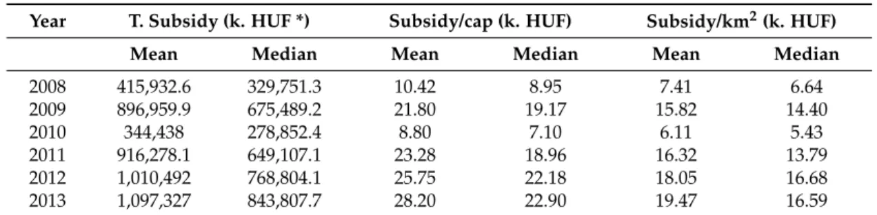
Table 2.Yearly average and median value of subsidy variables (2008–2013).
Year T. Subsidy (k. HUF *) Subsidy/cap (k. HUF) Subsidy/km2(k. HUF)
Mean Median Mean Median Mean Median
2008 415,932.6 329,751.3 10.42 8.95 7.41 6.64
2009 896,959.9 675,489.2 21.80 19.17 15.82 14.40
2010 344,438 278,852.4 8.80 7.10 6.11 5.43
2011 916,278.1 649,107.1 23.28 18.96 16.32 13.79
2012 1,010,492 768,804.1 25.75 22.18 18.05 16.68
2013 1,097,327 843,807.7 28.20 22.90 19.47 16.59
Source: Own calculations. * EUR 1 = HUF 315 (as of 8 March 2019).
The interesting numbers are the average subsidies paid in 2009 and 2010. National elections were held in 2010, thus in 2009 the distribution of payments was sped up (see the doubled mean and median values) by the government—which ultimately lost the election. The newly elected Government in 2010 completely reorganized the system and agency of payments, thus the means of subsidy variables for 2010 were almost three times lower than those of earlier years.
Our empirical strategy consisted of three steps. First, we calculated the region- and year-specific net migration rate variable as a proxy indicator for quality of life in a given region (Equation (1)):
NMR = (inmigr-outmigr)/pop (1)
where inmigr is the inflow of people into a LAU1 region, outmigr is the outflow and pop is the local population. Since the seminal article of [32], the “voting by foot” theory has often been used to proxy the perceived quality of life in a region. In its simplest way it states that people move to locations where they are better off, and thus analyzing regional migration rates may approximate local development levels ([33–35] or more recently [36,37]).
Second, we composed a local, composite development indicator based on the wealth of variables available in the T-STAR database. There are several potential approaches to this. One common approach is to manually select variables of importance and use various weighting schemes to compose the indicator. Obviously, this approach is highly subjective and the weighting formula is often questionable at best. The most often used methods, however, involve factor/principal component analysis (i.e., “let the data choose”) and the construction of indicators based on selected variables.
Factor and Principal Component Analysis was used by Michalek and Zarnekow [15] to evaluate the SAPARD program in Poland and Slovakia. In the Hungarian context, references [38,39] used factor and PCA analysis and employed the same T-STAR dataset as used in this paper to compute regional competitiveness indices. Further, [23] employed similar techniques to derive the dominant factors responsible for regional development levels for the 2002–2008 period. We used all 170 variables expressed as natural units of measurement (number of, quantity of, length of, etc.) that were available for all years and all 3164 administratively independent Hungarian localities. These describe local statistics with respect to demographics, health services, business units, tourism and catering, retail sector, transport and infrastructure, environment, education, culture unemployment, social security, number of dwellings, personal income tax collected, rank (village town, county seat) of the locality, and distance to nearest county seats. The complete list of variables is available upon request. We then summarized local data into 174 LAU1 Hungarian regions and normalized them according to the population of these regions. PCA and factor analysis then followed to reduce the number of
Sustainability2019,11, 2158 6 of 23
variables. Data were first tested to determine the applicability of PCA (Kaiser–Meyer–Olkin’s measure and Bartlett’s test), followed by a rotation algorithm (Varimax). Finally, we used Kaiser selection criteria to retain factors with Eigen values larger than one. The resulting 29 factors could then be used to compose the RDI. A key issue, however, was determining the weight of each factor that was incorporated into the RDI. These weights may be perceived as relative social values attached to each factor, thus the RDI may be biased if equal or other subjectively determined weights are applied.
Following the theory presented in [32], later applied by a great number of researchers (e.g., [35,40–42]) and the methodology suggested by Michalek and Zarnekow [15], we used within-country migration flows to estimate the social weight of each factor. The underlying idea is simple: individuals implicitly evaluate the importance of local living conditions when deciding to migrate (Equation (2)).
mpit=α0+βkFikt+ vi+εit (2)
where mpitis net migration into region I normalized by the total population of the region i,α0is a constant, and Fiktis the value of factor k in region i, at time t. Thus,βkaccounts for the impact of factor k (Fk) upon net migration, and was used as a weight in the construction of RDI. Finally, viis the region-specific residual andεitis the residual with the usual white noise properties. Given the panel structure of data and the strict underlying assumptions of panel models, various models were estimated using specification and diagnostic tests to facilitate selection of the best one (see, for example, a handbook by Baltagi [43]). The RDI index takes the following form:
RDIit= h(βkt,Fikt) =
∑
kβk×Fikt (3)where RDIitis the Rural Development Index in region i and year t, Fiktis the factors as defined under Equation (2), andβktis the weights for each factor specific to region i and time t resulting from the estimation of the migration function (2). That is, Equation (3) calculates the RDI as the proportion of migration flows explained by local characteristics represented by the factors.
Third, we evaluated the impact of RDP on LAU1 regions (see the textbook of Cerulli [44] for a detailed discussion on impact evaluation). While in standard policy analysis settings, sample-average treatment effects cannot be calculated because only one of the two possible outcomes for each region can be observed, this issue was solved by the estimated indicators that allowed the creation of the counterfactual. The counterfactual analytical framework developed by Rosenbaum and Rubin [45] and the employment of propensity score matching enabled us to predict the probability of a region being subsidized on the basis of observed covariates for both subsidized and non-subsidized regions. The method balances the observed covariates between the subsidized and non-subsidized regions based on the similarity between the predicted probabilities of a region being selected as a treated region. The most common evaluation parameter of interest is the Average Treatment Effect on the Treated (ATT), defined in Equation (4) as:
ATT = E(Y1−Y0|D = 1) = E[Y1|D = 1)−(Y0|D = 1)] (4) where Y0and Y1are the outcomes in the non-treated and treated states, respectively. Estimating the treatment effects based on Propensity Score Matching (PSM) requires making two assumptions. First, the Conditional Independence Assumption (CIA) states that for a given set of covariates participation is independent of potential outcomes. The second condition is that the ATT is only defined within the region of common support. For a more comprehensive discussion of the econometric theory behind this methodology, we refer the reader to the works of Imbens and Wooldridge [46] and Guo and Fraser [47].
For the empirical analysis, we employed two approaches: difference-in-differences treatment effect estimations combining PSM, and generalized propensity score matching. The advantage of the first approach is that it can evaluate treatment effects in a dynamic setting, making full use of
our panel dataset. Having data about subsidized and non-subsidized regions over time can also help with accounting for some unobserved selection bias by combining PSM and the Difference-in Differences estimator (conditional DID estimator). The conditional DID estimator (e.g., [48]) is very applicable in the case that the outcome data about program participants (i.e., subsidized regions) and nonparticipants (non-subsidized regions) are available for both “before” and “after” periods (2008 and 2013, respectively). In our study, PSM-DID measured the impact of the subsidies by using the differences in selected outcome indicator (ATE or ATT) between subsidized (D = 1) and non-subsidized sub regions (D = 0) in the before and after situations. The main advantage of the PSM-DID estimator is that it can relax the assumption of unconfoundedness.
All LAU1 regions in our study received some support. Thus, in the binary PSM framework, the treated/non-treated division of the regions may only be done using arbitrary thresholds. Recent developments in applied econometrics, however, allowed us to implement Generalized Propensity Score Matching, as originally proposed by Gelman and Meng [49] for continuous treatment effects. As the second approach to evaluation described in this paper, GPS eliminates the subjectivity that can occur when classifying regions into treated and non-treated ones. While in a binary PSM setting logit or probit is used to estimate the probability of a unit (region) being treated conditioned on covariates X, with continuous treatment parametric generalized linear models are used to estimate GPS using alternative distributional assumptions. More specifically, it is assumed that:
g(Ti|Xi) ∼ψn
h(γ, Xi),σ2o
(5) where g is a link function (e.g., logarithm),ψis the probability density function (e.g., normal, gamma, igamma, or beta), h is a flexible, X covariate vector and unknownγparameter dependent function, and σ2is a scale parameter. Tiis the treatment variable. Following the estimation by maximum likelihood of the treatment conditional distribution parametersγandσ2, the GPS is estimated:
GPSˆ = √ 1
2πσˆ2exp[− 1
2 ˆσ2{g(Ti)−h(γ, Xˆ i)}] (6) Similar to the PSM method, GPS also requires that covariates are sufficiently balanced across units with different treatment levels. [50] implemented the method developed by Flores et al. [51]
using likelihood ratio tests. This consists of estimating three regressions (the dependent variable is the continuous treatment variable): one unrestricted which includes both the X covariates and GPS scores, and two restricted ones, one including X covariates only, and one including GPS terms only.
Dose–response and average treatment effect functions are then derived. For the research described in this paper, we employed the semi-parametric approach using Inverse Weighting Kernel, Second-Order Penalized Spline, and Radial Spline methods developed by Bia et al. [50].
For robustness, we complemented our estimations with the (parametric) generalized linear model approach suggested by Guardabascio and Ventura [52]. Within the parametric dose–response estimations, the balancing property is checked by dividing the treatment sample into subsamples and testing whether pre-treatment variables given a GPS score are significantly different in individual treatment intervals. The conditional expectation of outcomes is estimated using parametric methods, similar to Equation (7):
Yi=β0+ β1Ti+β2T2i +β3GPSi+β4GPS2I +β5TiGPSI (7) 3. Results
3.1. Estimation of the Rural Development Index
Equation (2) was first estimated as a fix and random effects panel model; the Hausman test, however, rejected the random-effects model (chi2(29) = 114.6; p = 0.000). Further, the
Sustainability2019,11, 2158 8 of 23
homoscedasticity assumption in the fixed-effects model was rejected by the modified Wald test for group heteroscedasticity (see [53], p. 58) at chi2(174) = 3730.3; (p= 0.000). In addition, the Wooldridge ([54,55]) test for first-order autocorrelation in panel data also rejected the null assumption (F(1173) = 34.96;p= 0.000). Considering the results of these statistical tests, linear regression methods with panel-corrected standard errors that allow for heteroscedastic and contemporaneously correlated disturbances across panels were employed (we used the xtpsce routine available in Stata). The estimation results of Equation (2) using panel-corrected standard errors model are presented in the first two columns of Table3.
Table 3.Migration function models (dependent variable net migration into a region, normalized by population).
Non-Spatial Model Spatial Durbin Model
Var. Coeff. Var. Coeff. Var. Coeff.
f1 0.00376 *** f1 0.00363 *** w_f1 −0.00038
f2 0.00273 *** f2 0.00390 *** w_f2 0.00003
f3 0.00101 *** f3 0.00061 *** w_f3 0.00241
f4 0.00010 f4 0.00020 w_f4 −0.00103
f5 0.00063 *** f5 0.00048 *** w_f5 −0.00030
f6 −0.00036 ** f6 −0.00072 *** w_f6 0.00046 f7 −0.00013 f7 0.00022 w_f7 0.00088
f8 0.00055 *** f8 0.00040 *** w_f8 0.00220 *
f9 0.00004 f9 0.00004 w_f9 −0.00173
f10 −0.00054 *** f10 −0.00035 *** w_f10 −0.00109
f11 0.00000 f11 0.00002 w_f11 0.00006
f12 −0.00000 f12 0.00006 w_f12 −0.0020 **
f13 0.00093 *** f13 0.00070 *** w_f13 0.00126
f14 −0.00031 ** f14 −0.00021 w_f14 0.00221 *
f15 0.00016 ** f15 0.00032 *** w_f15 −0.00107
f16 −0.00094 *** f16 −0.00031 * w_f16 0.00005
f17 0.00004 f17 −0.00006 w_f17 0.0036 **
f18 0.00021 f18 −0.00052 *** w_f18 −0.00114
f19 0.00143 *** f19 0.00054 *** w_f19 0.0032 ***
f20 −0.00006 f20 −0.00003 w_f20 0.00414***
f21 −0.00002 f21 −0.00005 w_f21 0.00151
f22 0.00019** f22 0.00030 *** w_f22 0.00115
f23 0.00053 *** f23 0.00030 *** w_f23 −0.00073
f24 0.00008 f24 0.00032** w_f24 0.00319 ***
f25 0.00003 f25 −0.00013 w_f25 −0.0029***
f26 0.00039 ** f26 0.00031 * w_f26 −0.00201
f27 −0.00015 f27 0.00056 *** w_f27 −0.0026 ***
f28 −0.00020 f28 0.00004 w_f28 0.00083 f29 −0.00036 * f29 −0.00009 w_f29 −0.00115 **
cons −0.00275 *** cons −0.00282 ***
N 1044 1044
Cross-sections 174 174
R2a 0.5662 0.6162
ll 4308.04 4390.3
Wald (p) 0.0000 0.0000
Source: Own estimations. *, **, and *** denote 10%, 5% and 1% significance levels, respectively. N denotes the total number of observations, Cross-sections the number of cross sections, R2a the percentage of total variance explained by the model, ll the loglikelihood, and (p) the Wald regression significance.
Due to the use of spatially distributed data, we also faced the issue of spatial correlation (for an up-to-date discussion of spatial models, see [56]. Table4presents a wealth of spatial autocorrelation test results. Clearly, the non-spatial model (first two columns) suffered from rather severe spatial autocorrelation, all null hypotheses being rejected. We proceeded with the sequential estimation of various spatial models (Spatial Autoregressive Model, Spatial Error Model, and Spatial Durbin Model), using the linear-panel-corrected standard error estimator (the user written spregxt command in Stata was used for this purpose).
Table 4.Spatial autocorrelation test results (p-values reported).
Non-Spatial Model Spatial Durbin Model H0: Error has no Spatial Autocorrelation
Global Moran MI 0.0000 0.2697
Global Geary GC 0.0000 0.0616
Global Getis-Ords GO 0.0000 0.2697
Moran MI Error Test 0.0000 0.2562
LM Error (Burridge) 0.0000 0.2505
LM Error (Robust) 0.0000 0.3083
H0: Spatial lagged Dependent Variable has no Spatial Autocorrelation
LM Lag (Anselin) 0.0000 0.2453
LM Lag (Robust) 0.0000 0.3017
H0: No General Spatial Autocorrelation
LM SAC (LMErr+LMLag_R) 0.0000 0.3031
Source: Own estimations.
The null hypothesis of no spatial autocorrelation of any form was not rejected by the Spatial Durbin Model only; thep-values of test statistics are presented in the last two columns of Table4.
Thus, the latter model was preferred. Column 4 in Table3lists the coefficients of factor variables, and Column 6 their spatial counterparts.
In total, 27 variables were significant, mostly at the 1% level, 17 from the factor variables and 10 from their spatial counterpart. The model explained 61% of the variation of internal net migration.
Thus, RDIs (Equation (4)) were estimated as fitted values of the Spatial Durbin Model, i.e. the proportion of net migration rate explained by local, objective factors.
Inspection of the ten highest and lowest RDI indices confirmed what seems intuitive: RDI is lowest in the northeast, east, and southwest of Hungary (e.g., theÓzd, Berettyóújfalú, and Fehérgyarmat regions) while the high RDI regions are clustered around the capital, Budapest (e.g., Gödöll˝o, Ráckeve, Dunakeszi, and Budapest regions) and in the northwest. The RDIs display high correlation indices across the timespan, suggesting the stability of development rankings over the years. Regional RDI levels for the beginning and end of the period under examination are presented in Figure2a. Regions are sorted into quantiles, coded from highest ranking (darkest shade) to lowest (lightest shade).
Results also confirm our intuition: LAU1 regions in the east/northeast and southwest (bordering Romania, Ukraine, Slovakia and Serbia/Croatia, respectively) are less developed, while the center of Hungary, and the west and northwest (bordering Austria, Slovakia, and, to some extent, Slovenia) are the most developed. Inspection of the graphs does not reveal the major changes that took place between the start and end of the programming period, albeit some regions changed their status.
Figure2B complements the picture of the development of Hungarian regions. It depicts internal migration flow relative to the size of local, LAU1, and population (NMR). The argument for also using relative migration is that the government, faced with the depopulation of areas, may choose to target with subsidies these areas, irrespective of the planned or objective level of development.
As expected, the maps in Figure2a,b are quite similar, yet the correlation indices between indicators emphasize non-trivial differences (see the correlation in TableA1in AppendixA). Thus, impact analysis should provide more robust results with both development indicators. To analyze the changes in the RDI throughout the period, Figure3a shows the change in RDI between 2008 and 2013.
As expected from a policy point of view, the largest changes (darkest shade) are indeed concentrated in the less developed regions, and the least in already developed Central and Western Hungary (lightest shade). Thus, it appears from an objective perspective that some convergence between Hungarian regions is happening.
Sustainability2019,11, 2158 10 of 23
Sustainability 2019, 11, x FOR PEER REVIEW 9 of 24
LM Error (Burridge) 0.0000 0.2505
LM Error (Robust) 0.0000 0.3083
H0: Spatial lagged Dependent Variable has no Spatial Autocorrelation
LM Lag (Anselin) 0.0000 0.2453
LM Lag (Robust) 0.0000 0.3017
H0: No General Spatial Autocorrelation
LM SAC (LMErr+LMLag_R) 0.0000 0.3031
Source: Own estimations.
The null hypothesis of no spatial autocorrelation of any form was not rejected by the Spatial Durbin Model only; the p-values of test statistics are presented in the last two columns of Table 4.
Thus, the latter model was preferred. Column 4 in Table 3 lists the coefficients of factor variables, and Column 6 their spatial counterparts.
In total, 27 variables were significant, mostly at the 1% level, 17 from the factor variables and 10 from their spatial counterpart. The model explained 61% of the variation of internal net migration.
Thus, RDIs (Equation (4)) were estimated as fitted values of the Spatial Durbin Model, i.e. the proportion of net migration rate explained by local, objective factors.
Inspection of the ten highest and lowest RDI indices confirmed what seems intuitive: RDI is lowest in the northeast, east, and southwest of Hungary (e.g., the Ózd, Berettyóújfalú, and Fehérgyarmat regions) while the high RDI regions are clustered around the capital, Budapest (e.g., Gödöllő, Ráckeve, Dunakeszi, and Budapest regions) and in the northwest. The RDIs display high correlation indices across the timespan, suggesting the stability of development rankings over the years. Regional RDI levels for the beginning and end of the period under examination are presented in Figure 2a. Regions are sorted into quantiles, coded from highest ranking (darkest shade) to lowest (lightest shade).
(a)
(b)
Figure 2. Levels of rural development in 2008 and 2013 (RDI). Source: Own calculations, using spmap (Stata) (a). Levels of rural development in 2008 and 2013 (NMR). Source: Own calculations, using spmap (Stata) (b).
Figure 2. Levels of rural development in 2008 and 2013 (RDI). Source: Own calculations, using spmap (Stata) (a). Levels of rural development in 2008 and 2013 (NMR). Source: Own calculations, using spmap (Stata) (b).
Sustainability 2019, 11, x FOR PEER REVIEW 10 of 24
Results also confirm our intuition: LAU1 regions in the east/northeast and southwest (bordering Romania, Ukraine, Slovakia and Serbia/Croatia, respectively) are less developed, while the center of Hungary, and the west and northwest (bordering Austria, Slovakia, and, to some extent, Slovenia) are the most developed. Inspection of the graphs does not reveal the major changes that took place between the start and end of the programming period, albeit some regions changed their status.
Figure 2B complements the picture of the development of Hungarian regions. It depicts internal migration flow relative to the size of local, LAU1, and population (NMR). The argument for also using relative migration is that the government, faced with the depopulation of areas, may choose to target with subsidies these areas, irrespective of the planned or objective level of development.
As expected, the maps in Figure 2a,b are quite similar, yet the correlation indices between indicators emphasize non-trivial differences (see the correlation in Table A1 in Appendix A). Thus, impact analysis should provide more robust results with both development indicators. To analyze the changes in the RDI throughout the period, Figure 3a shows the change in RDI between 2008 and 2013. As expected from a policy point of view, the largest changes (darkest shade) are indeed concentrated in the less developed regions, and the least in already developed Central and Western Hungary (lightest shade). Thus, it appears from an objective perspective that some convergence between Hungarian regions is happening.
Graphical evidence suggests that less-favored regions have increased their relative levels of development more (on average) than already developed regions; this is presumably in line with policy aims. The situation, however, is less positive if we look at the change between relative migration (Figure 3b) between 2013 and 2008. The map emphasizes that development policy did not put a halt to outmigration from the poorest Hungarian regions; indeed, the rate accelerated between 2008 and 2013.
(a)
(b)
Figure 3 (a) Change in regional development between 2008 and 2013 (RDI). Source: Own calculations, using spmap (Stata); (b) Change in regional development between 2008 and 2013 (NMR). Source:
Own calculations, using spmap (Stata).
Now, turning our attention to the impact of development funds, in our analysis, we specifically focused on rural development subsidies, 75% of which are paid by the EU, and 25% by Hungary in
Figure 3.(a) Change in regional development between 2008 and 2013 (RDI). Source: Own calculations, using spmap (Stata); (b) Change in regional development between 2008 and 2013 (NMR). Source: Own calculations, using spmap (Stata).
Graphical evidence suggests that less-favored regions have increased their relative levels of development more (on average) than already developed regions; this is presumably in line with policy aims. The situation, however, is less positive if we look at the change between relative migration (Figure3b) between 2013 and 2008. The map emphasizes that development policy did not put a halt to outmigration from the poorest Hungarian regions; indeed, the rate accelerated between 2008 and 2013.
Now, turning our attention to the impact of development funds, in our analysis, we specifically focused on rural development subsidies, 75% of which are paid by the EU, and 25% by Hungary in the form of co-financing. In the Introduction, we emphasize the magnitude and importance of these payments. With respect to subsidies, Figures4–6depict the regional intensity of total, per capita, and per square km subsidies received. Their geographical distribution is less obvious compared to that illustrated on the rural development maps. It can however be seen that less developed regions benefited most from support, especially in terms of per capita or per km2subsidies.
Sustainability 2019, 11, x FOR PEER REVIEW 11 of 24
the form of co-financing. In the Introduction, we emphasize the magnitude and importance of these payments. With respect to subsidies, Figures 4–6 depict the regional intensity of total, per capita, and per square km subsidies received. Their geographical distribution is less obvious compared to that illustrated on the rural development maps. It can however be seen that less developed regions benefited most from support, especially in terms of per capita or per km2 subsidies.
Figure 4. Total subsidies received in 2008 and 2013 Source: Own calculations, using spmap (Stata).
Figure 5. Per capita subsidies received in 2008 and 2013. Own calculations, using spmap (Stata).
Figure 6. Subsidies per square km received in 2008 and 2013. Own calculations, using spmap (Stata).
3.2. Difference in Differences Estimation Results
In line with the current literature, we analyzed the impact of regional development subsidies using PSM-DID estimations and generalized propensity score matching (we used the diff, gpscore, glmdose, and doseresponse Stata routines). The estimated propensity score is actually the probability of participation in a program (treatment), conditioned on control variables calculated for all regions.
We start with the results of PSM-DID,which can help overcome hidden bias, and generally may improve non-experimental program evaluation. We used a kernel matching algorithm for the PSM- DID estimations ([57,58]) while the balancing property was assessed using t-tests for covariate mean equality between treated and control regions.
There are two key issues here. The first is how the baseline and end periods were defined. Since we had data for six years, for robustness, three definitions were used: first, the two extreme years (2008 and 2013), followed by the first two and last two years, and finally, the first three and last three
Figure 4.Total subsidies received in 2008 and 2013 Source: Own calculations, using spmap (Stata).
Sustainability 2019, 11, x FOR PEER REVIEW 11 of 24
the form of co-financing. In the Introduction, we emphasize the magnitude and importance of these payments. With respect to subsidies, Figures 4–6 depict the regional intensity of total, per capita, and per square km subsidies received. Their geographical distribution is less obvious compared to that illustrated on the rural development maps. It can however be seen that less developed regions benefited most from support, especially in terms of per capita or per km2 subsidies.
Figure 4. Total subsidies received in 2008 and 2013 Source: Own calculations, using spmap (Stata).
Figure 5. Per capita subsidies received in 2008 and 2013. Own calculations, using spmap (Stata).
Figure 6. Subsidies per square km received in 2008 and 2013. Own calculations, using spmap (Stata).
3.2. Difference in Differences Estimation Results
In line with the current literature, we analyzed the impact of regional development subsidies using PSM-DID estimations and generalized propensity score matching (we used the diff, gpscore, glmdose, and doseresponse Stata routines). The estimated propensity score is actually the probability of participation in a program (treatment), conditioned on control variables calculated for all regions.
We start with the results of PSM-DID,which can help overcome hidden bias, and generally may improve non-experimental program evaluation. We used a kernel matching algorithm for the PSM- DID estimations ([57,58]) while the balancing property was assessed using t-tests for covariate mean equality between treated and control regions.
There are two key issues here. The first is how the baseline and end periods were defined. Since we had data for six years, for robustness, three definitions were used: first, the two extreme years (2008 and 2013), followed by the first two and last two years, and finally, the first three and last three
Figure 5.Per capita subsidies received in 2008 and 2013. Own calculations, using spmap (Stata).
Sustainability 2019, 11, x FOR PEER REVIEW 11 of 24
the form of co-financing. In the Introduction, we emphasize the magnitude and importance of these payments. With respect to subsidies, Figures 4–6 depict the regional intensity of total, per capita, and per square km subsidies received. Their geographical distribution is less obvious compared to that illustrated on the rural development maps. It can however be seen that less developed regions benefited most from support, especially in terms of per capita or per km2 subsidies.
Figure 4. Total subsidies received in 2008 and 2013 Source: Own calculations, using spmap (Stata).
Figure 5. Per capita subsidies received in 2008 and 2013. Own calculations, using spmap (Stata).
Figure 6. Subsidies per square km received in 2008 and 2013. Own calculations, using spmap (Stata).
3.2. Difference in Differences Estimation Results
In line with the current literature, we analyzed the impact of regional development subsidies using PSM-DID estimations and generalized propensity score matching (we used the diff, gpscore, glmdose, and doseresponse Stata routines). The estimated propensity score is actually the probability of participation in a program (treatment), conditioned on control variables calculated for all regions.
We start with the results of PSM-DID,which can help overcome hidden bias, and generally may improve non-experimental program evaluation. We used a kernel matching algorithm for the PSM- DID estimations ([57,58]) while the balancing property was assessed using t-tests for covariate mean equality between treated and control regions.
There are two key issues here. The first is how the baseline and end periods were defined. Since we had data for six years, for robustness, three definitions were used: first, the two extreme years (2008 and 2013), followed by the first two and last two years, and finally, the first three and last three
Figure 6.Subsidies per square km received in 2008 and 2013. Own calculations, using spmap (Stata).
3.2. Difference in Differences Estimation Results
In line with the current literature, we analyzed the impact of regional development subsidies using PSM-DID estimations and generalized propensity score matching (we used the diff, gpscore,
Sustainability2019,11, 2158 12 of 23
glmdose, and doseresponse Stata routines). The estimated propensity score is actually the probability of participation in a program (treatment), conditioned on control variables calculated for all regions.
We start with the results of PSM-DID, which can help overcome hidden bias, and generally may improve non-experimental program evaluation. We used a kernel matching algorithm for the PSM-DID estimations ([57,58]) while the balancing property was assessed using t-tests for covariate mean equality between treated and control regions.
There are two key issues here. The first is how the baseline and end periods were defined. Since we had data for six years, for robustness, three definitions were used: first, the two extreme years (2008 and 2013), followed by the first two and last two years, and finally, the first three and last three years of our panel. The second issue—since all regions received some support in all periods—is how the treated and non-treated regions are defined. We employed two approaches here. First, similar to [15,23], we used an arbitrary threshold to define the binary subsidy variables: areas where support intensity was more than two-thirds of the yearly median subsidy were qualified as treated. We then complemented the previous approach and overcame the subjectivity of threshold choice by splitting the sample into five quantiles. The lower two quantiles were considered as not-supported and the upper two as supported, while the middle quantile was omitted from the analysis. Thus, we were able to directly compare the performance of low support with high support intensity regions. Tables5 and6display the results of the PSM-DIDs estimated for the three subsidy variables, two outcomes, and three definitions of baseline–end periods using the threshold and quantile treatment definition approaches, respectively.
Table 5.Diff-in-diff treatment effect (PSM-DID) results for total subsidy, subsidy per cap. and subsidy per km2—threshold approach.
Total Subsidy Subsidy/Cap Subsidy/km2
Coeff. Prob. No#. Coeff. Prob. No#. Coeff. Prob. No#. Baseline period: 2008, end period: 2013
RDI −0.004 0.084 8 0.000 0.981 17 −0.004 0.046 12
NMR −0.001 0.733 8 0.003 0.253 17 −0.002 0.739 11
baseline period: 2008–2009, end period: 2012–2013
RDI −0.004 0.012 17 −0.004 0.048 16 −0.003 0.037 7
NMR −0.003 0.122 18 −0.002 0.272 14 −0.000 0.904 5
baseline period: 2008–2010, end period: 2011–2013
RDI −0.003 0.045 18 −0.003 0.006 12 −0.002 0.137 7
NMR −0.002 0.456 17 0.000 0.890 12 −0.002 0.209 3
Source: Own estimations. # indicates the number of unmatched covariates (total number of covariates is 29).
p-values were calculated using bootstrapped standard errors. Coefficients in bold denote a 10% significance level.
Common support was imposed.
For each subsidy and outcome category, we present the coefficient of the ATT (see Equation (4)), its significance (calculated with 200 bootstrap replications) and the number of unmatched covariates (significant t-test results at a 5% level of significance). The matching results are quite mixed. The number of unmatched covariates varied between three, or 10% (quantile approach, subsidy/cap, baseline 2008, end period 2013 and threshold approach, subsidy/km2, baseline 2008–2010, end 2011–2013) and 68% (quantile approach, total subsidy, baseline 2008–2010, end period 2011–2013).
However, even if we only considered best matching results (for example, where more than half of covariates were matched between treated and non-treated groups), all results point in the same direction: there were mostly insignificant treatment effects, regardless of outcome or support definition.
Even more surprisingly is that where effects were significant (30% of all cases), they were small and negative.
Table 6.Diff-in-diff treatment effect (PSM-DID) results for total subsidy, subsidy per cap. And subsidy per km2—quantile approach.
Total Subsidy Subsidy/cap Subsidy/km2
Coeff. Prob. No#. Coeff. Prob. No#. Coeff. Prob. No#. baseline period: 2008, end period: 2013
RDI 0.001 0.634 9 0.001 0.592 4 0.003 0.290 12
NMR −0.001 0.869 9 0.002 0.456 3 0.004 0.287 12
baseline period: 2008–2009, end period: 2012-2013
RDI −0.003 0.089 17 −0.004 0.037 18 −0.002 0.185 6
NMR −0.002 0.358 17 −0.006 0.027 18 −0.003 0.100 5
baseline period: 2008–2010, end period: 2011–2013
RDI −0.003 0.550 19 −0.001 0.360 14 −0.003 0.137 11
NMR −0.001 0.686 20 −0.005 0.088 16 0.001 0.721 12
Source: Own estimations. # indicates the number of unmatched covariates (total number of covariates is 29).
p-values were calculated using bootstrapped standard errors. Coefficients in bold denote a 10% significance level.
Common support was imposed.
3.3. Generalized Propensity Score Matching Results
Next, we discuss the results obtained using generalized propensity score matching methods.
Earlier researchers were forced to apply Box-Cox transformation to render the treatment variables normal. Newer GPS routines now allow a wider class of distributions. In our case, the distribution of treatment variables clearly does not follow a normal distribution (for simple graphical evidence of this, see FigureA2in AppendixA), thus we used a gamma distribution with a logarithmic link function in the GPS estimations. The per capita and per km2subsidy variables were divided by 1000, and the total subsidy by 1,000,000 for the empirical analysis. GPS estimations required us to define treatment intervals. For semiparametric estimations, the dose–response and average treatment effect functions were evaluated at each level of the vectors: Total subsidy (million HUF): 200, 300, 400, 500, 600, 800, 1000, 1400, 2000, and 3000; Subsidy per capita (thousand HUF): 3, 5, 8, 10, 13, 16, 20, 25, 35, and 50;
Subsidy per km2(thousand HUF): 4, 6, 8, 10, 12, 15, 20, 25, 35, and 50. While these levels are arbitrary, but based on the distribution of treatment variables (see also FigureA3in AppendixA), it should be noted that using 10 evenly spaced values to cover the range of the treatment or using 10 percentiles to cover the empirical distribution of the treatment variables leads to qualitatively the same results.
Table7presents the balancing tests of semiparametric models.
Table 7.Assessment of balancing property of GPS–Likelihood Ratio tests, semiparametric approach.
Total Subsidy Subsidy/Cap Subsidy/km2 Restricted LL
(covariates X) −6825.18 −3435.99 −3475.80
Unrestricted LL −6815.67 −3424.69 −3463.51
Test statistic 19.02 22.59 24.57
p-value 0.920 0.794 0.700
N. of restrictions 29 29 29
Restricted LL
(GPS terms) −6929.93 −3498.55 −3534.69
Unrestricted LL −6815.18 −3424.69 −3463.51
Test statistic 228.53 147.72 142.34
p-value 0.000 0.000 0.000
N. of restrictions 3 3 3
N. obs. dropped# 133 167 56
Source: Authors’ calculations.#number of observations dropped after imposing common support.
Sustainability2019,11, 2158 14 of 23
The unrestricted model is the GLM regression of each treatment variable on the X covariates and GPS score, including their square and cubic terms (unrestricted and restricted model estimations are available upon request). The null hypothesis that covariates may be excluded was not rejected, while the null hypothesis that GPS terms may be excluded was rejected atp= 0.000 for all treatment variables.
These results emphasize that subgroups were correctly matched. In addition, Table7emphasizes that, by imposing the common support condition, 133, 167 and 56 observations were omitted for Total subsidy, Subsidy per capita and Subsidy per km2models, respectively. Turning our attention to the parametric estimations, four treatment intervals were defined for each subsidy variable: Total subsidy (million HUF): [0, 250), [250, 500), [500, 1000) and [1000, 7112); Subsidy per capita (thousand HUF): [0, 10), [10, 20), [20, 40) and [40, 127); and Subsidy per km2(thousand HUF): [0, 8), [8, 12), [12, 20) and [20, 132). As described in the Methodology Section, balancing tests were conducted for each treatment interval. Table8includes a summary of these tests (complete results are available upon request).
Table 8.Assessment of balancing property of GPS–t-tests#, parametric approach.
Total Subsidy Subsidy/Cap Subsidy/km2 number of significant test statistics (out of 29)
Treatment interval 1 5 7 3
Treatment interval 2 1 2 2
Treatment interval 3 5 4 3
Treatment interval 4 5 4 1
Source: Authors’ calculations.#“Test that the conditional mean of the pre-treatment variables given the generalized propensity score is not different between units who belong to a particular treatment interval and units who belong to all other treatment intervals” [52].
The worst balancing results are for the subsidy per capita variable in the first treatment interval, where 7 of the 29 covariates were not balanced. The rest of the number of rejections varied between one and five; overall, the subsidy per km2variable was the most balanced after accounting for GPS scores. With the wealth of covariates that was available (a total of 29), we may cautiously consider the balancing requirement satisfied. Note that this partial result is in line with the results of likelihood ratio tests for the semi-parametric approach. The most important results are depicted in the figures below. Figures7–12depict dose–response functions and average treatment effects (derivatives) using the Inverted Weighted Kernel, second order Penalized Spline, and Radial Penalized Spline methods, respectively, for the three treatment variables and two outcome variables.
Sustainability 2019, 11, x FOR PEER REVIEW 14 of 24
conducted for each treatment interval. Table 8 includes a summary of these tests (complete results are available upon request).
Table 8. Assessment of balancing property of GPS–t-tests #, parametric approach.
Total Subsidy Subsidy/Cap Subsidy/km2 number of significant test statistics (out of 29)
Treatment interval 1 5 7 3
Treatment interval 2 1 2 2
Treatment interval 3 5 4 3
Treatment interval 4 5 4 1
Source: Authors’ calculations. # “Test that the conditional mean of the pre-treatment variables given the generalized propensity score is not different between units who belong to a particular treatment interval and units who belong to all other treatment intervals” [52].
The worst balancing results are for the subsidy per capita variable in the first treatment interval, where 7 of the 29 covariates were not balanced. The rest of the number of rejections varied between one and five; overall, the subsidy per km2 variable was the most balanced after accounting for GPS scores. With the wealth of covariates that was available (a total of 29), we may cautiously consider the balancing requirement satisfied. Note that this partial result is in line with the results of likelihood ratio tests for the semi-parametric approach. The most important results are depicted in the figures below. Figures 7–12 depict dose–response functions and average treatment effects (derivatives) using the Inverted Weighted Kernel, second order Penalized Spline, and Radial Penalized Spline methods, respectively, for the three treatment variables and two outcome variables.
Figure 7. Semiparametric dose–response functions and average treatment effects with 95% confidence intervals (outcome is RDI, treatment is Total subsidy). Source: Own calculations using drf (Stata).
Figure 7.Semiparametric dose–response functions and average treatment effects with 95% confidence intervals (outcome is RDI, treatment is Total subsidy). Source: Own calculations using drf (Stata).
Figure 8. Semiparametric dose–response functions and average treatment effects with 95% confidence intervals (outcome is NMR, treatment is Total subsidy). Source: Own calculations using drf (Stata).
Figure 9. Semiparametric dose–response functions and average treatment effects with 95% confidence intervals (outcome is RDI, treatment is Subsidy per capita). Source: Own calculations using drf (Stata).
Figure 10. Semiparametric dose–response functions and average treatment effects with 95%
confidence intervals (outcome is NMR, treatment is Subsidy per capita). Source: Own calculations using drf (Stata).
Figure 8.Semiparametric dose–response functions and average treatment effects with 95% confidence intervals (outcome is NMR, treatment is Total subsidy). Source: Own calculations using drf (Stata).
Sustainability 2019, 11, x FOR PEER REVIEW 15 of 24
Figure 8. Semiparametric dose–response functions and average treatment effects with 95% confidence intervals (outcome is NMR, treatment is Total subsidy). Source: Own calculations using drf (Stata).
Figure 9. Semiparametric dose–response functions and average treatment effects with 95% confidence intervals (outcome is RDI, treatment is Subsidy per capita). Source: Own calculations using drf (Stata).
Figure 10. Semiparametric dose–response functions and average treatment effects with 95%
confidence intervals (outcome is NMR, treatment is Subsidy per capita). Source: Own calculations using drf (Stata).
Figure 9.Semiparametric dose–response functions and average treatment effects with 95% confidence intervals (outcome is RDI, treatment is Subsidy per capita). Source: Own calculations using drf (Stata).
Sustainability 2019, 11, x FOR PEER REVIEW 15 of 24
Figure 8. Semiparametric dose–response functions and average treatment effects with 95% confidence intervals (outcome is NMR, treatment is Total subsidy). Source: Own calculations using drf (Stata).
Figure 9. Semiparametric dose–response functions and average treatment effects with 95% confidence intervals (outcome is RDI, treatment is Subsidy per capita). Source: Own calculations using drf (Stata).
Figure 10. Semiparametric dose–response functions and average treatment effects with 95%
confidence intervals (outcome is NMR, treatment is Subsidy per capita). Source: Own calculations using drf (Stata).
Figure 10.Semiparametric dose–response functions and average treatment effects with 95% confidence intervals (outcome is NMR, treatment is Subsidy per capita). Source: Own calculations using drf (Stata).