Income inequality
Keywords: income inequality, opportunity inequality, inequality measures, Kuznets theory, Lewis theory, elephant curve
Introduction
Inequality is now at the forefront of public debate. Inequality of any kind is a widely argued and debated topic that fuel many political decisions and inspires even more academic work.
Although inequality is used in a wide variety of contexts, the distribution of income within the population of a country is the most common measure applied and the most conventional starting point in any debate over inequality. This article whilst focusing on income inequality, has three main parts and three main objectives. First, conceptual clarity and some narratives regarding the changing aspects of inequality are provided in order to place the term income inequality in a wider conceptual context. Second – after these conceptual intricacies are ironed out –different measurement and evaluation methodologies are introduced, whilst some tendencies in measurement over time and across nations are also presented. Third, the article elucidates some of the theoretical models focusing on the nexus between income inequality and growth, picking up three models from the broad array of theoretical work. In light of the broad scope of the topic, the article makes no attempt at being exhaustive. It aims only to provide a sample of recent researches, dominant concepts and measures used in this field.
Conceptual clarity: the place of the term “income inequality” within the contemporary prevailing framework of “equality of opportunity”
Any distributional analysis in the social sciences in general and in the field of economics in particular has traditionally been anchored on the welfarist paradigm, with the central question
of up to what degree the distribution of some individual achievements – such as welfare, utility or preference satisfaction – over the population are equal. A very influential approach within the welfarist tradition is the utilitarian view that is based on the additive aggregation of individual achievements as the social objective function (e.g. in Jeremy Bentham’s work).
Within the utilitarian approach, the use of economic metrics such as per-capita Gross Domestic Product (GDP) or per-capita income shows remarkable staying power. Inequality in income distribution is best understood as part of the utilitarian view and welfarism more broadly.
Nevertheless, the dominance of utilitarianism, as a set of guidelines for assessing social progress, has faded away in the last few decades. Mounting challenges and criticisms have been articulated (e.g.: Rawls, 1971, Dworkin, 1981a,b and Sen, 1980), claiming that income is best seen as a means to an end rather than an end per se. These criticisms primarily challenged the very basis of welfarism and raised the question of whether social justice is best defined on the basis of the distribution of individual preference satisfaction (Ferreira et al., 2015). A number of authors looked at the economic determinism of the utilitarian tradition in a new light, moving away from the realm of individual achievements and getting closer to the notion of opportunities.
Income and inequality in the distribution of income within a society per se does not tell us what an individual can really do and be, given his or her own characteristics. The same amount of income does not translate into an equal capacity to do the same set of activities.
Acknowledging this underlying criticism against the utilitarian tradition, first in 1971, Rawls focused on the problem of choosing the correct equalisandum and proposed the notion of primary goods. Primary goods such as basic liberties and rights, access to political and other offices, income and wealth should be distributed equally within the society. Albeit primary
fail at accounting for what an individual is capable of doing. Amartya Sen (1980, 1985, 1992) argues that instead of focusing on commodities and on the distribution of these commodities across individuals, functionings, defined as observable ‘doings and beings’ of persons should lie at the heart of our understanding. In a society, then, functions such as literacy, nutrition and health status should be promoted and equalized. Sen goes one step further and claims that societies should advocate the (positive) freedom a person may enjoy. Capabilities therefore should be seen as sets of attainable functionings, from which the individual is free to choose.
Sen’s view enriched our understanding of equality with concern about equity. In their papers, Dworkin (1981a,b), Arneson (1989) and Cohen (1989) echo similar sentiments and claim that equity requires that factors influencing the individual’s final achievement, for which he or she cannot be held responsible, should be equalized within the society.
In sum, these views all challenge the traditional welfarist paradigm and enrich our understanding concerning the context of the term “income inequality.” The rest of this section focuses on income inequality, but one should keep it in mind that the equity of a given distribution of income (or any other measures of achievements) cannot be judged by observing only the degree of inequality present in that distribution. When looking at tendencies and changes in income inequality, it is crucial to interpret these numbers in a comprehensive framework.
Measuring income inequality
Inequality in the utilitarian sense – or economic inequality – can be measured in various ways, using different indicators and different methods calculating them. Choices of indicators and the proper understanding of the mere face value of the numbers are crucial, given that different approaches might convey a completely different story.
Inequality of what?
Economists are usually interested in the distribution of income among households within a nation. Although this section is dedicated to income inequality, there are other dimensions of material inequality, which one might want to investigate. Instead of income, development economists often look at the distribution of household consumption, usually measured by household expenditures, whether in-kind or in money terms. Especially in case of poor countries, income is extremely difficult to measure. For instance, calculating with household consumption makes more sense in the case of subsistence farming households which consume, rather than market, most of what they produce. Consumption may be a more reliable indicator of welfare in developing countries than income, given that consumption tends not to fluctuate as much as income from one period to the next1.
Another aspect of economic inequality is the distribution of wealth, which usually shows an even more unequal pattern than the distribution of either income or consumption.
Distributions of factors of production – such as land or capital – are important determinants in terms of assessing the opportunities individuals have to be productive and to generate household income. Hence, the distribution of income depends on a handful of other factors – and on the distribution of those factors in the past, such as the ownership of factors of production or the broader macroeconomic context with its incentives and constraints.
An additionally important question, worth considering when assessing income inequality, is what the source of income is and how it affects the distribution of income. It is indeed critical to decompose total income into two categories of income flows: income from labor and income from capital. The World Economic Outlook published by the International Monetary Fund (IMF) in April 2017 elucidates that the percentage of labor income in the GDP has been
shrinking since the mid–1980s (IMF 2017). In developed countries, the decrease of labor income to GDP reached nearly 4 percentage points, falling from 55% in 1988 to 51% in 2015. The developing part of the world however witnessed a slight increase in the same ratio due to global commercial and financial integration as well as the deepening division of labor (Magas 2018). The percentage of labor income decreases in the GDP if the growth of nominal wages is steadily slower than the rate of productivity, and hence slower than output growth per working hours. The permanent difference between the growth of wages and the growth of productivity is unfavorable in the sense that any efficiency growth can be mainly attributable to increases in capital income. Owning capital is typical of upper income deciles, hence, the decreasing wage ratio and the increasing income from capital results in growing disparity in income distribution. Decrease in the wage ratio might be the consequence of technological changes or of the rise of automation and robotisation. The growing disparity is spread across the globe through the global value chains and the rise of multinational company networks, as labor-intensive sectors and industries moved to countries with a practically unlimited supply of labor.
This idea is echoed in Thomas Piketty’s famous book (2014) in which he claims that if the return to capital (r) used in production steadily exceeds the growth of total output (g), that is, when it is true that r >g on a permanent basis, the income and wealth inequalities will be destined to increase indefinitely over time.
Inequality as a matter of metrics
Whatever the source of data and the metric used to monitor income inequality, its measurement starts from the same basic input: a distribution. For any income, a distribution shows the number of individuals in the society and their share of the total income. The simplest way of depicting any distribution is to display its frequency distribution. Frequency
distributions show how many (or what percent of) individuals receive different amounts of income. Hence, it tells the percentage of individuals with different levels of annual income, from the lowest to the highest reported level.
Another simple way of depicting the distribution of income is size distribution which is based on the idea that distribution is best illustrated by breaking down the distributions into groups – for instance, the bottom 10% or the upper 1% of the population. Size distribution shows the share of total income received by different groups of households or individuals, ranked according to their income level. Households or individuals can be ranked by deciles or even by percentiles, yet the most conventional way is to report on quintiles.
Using such metrics, Figure 1 illustrates the top 10% income shares across the world in 2016, proving that inequality across world regions varies greatly. The share of total national income accounted for by the top richest 10% was 37% in Europe, 41% in China, 46% in Russia, 47%
in the US and Canada, and around 55% in Sub-Saharan Africa, Brazil and India. To have a closer look, in 2016, in the United States, an adult having earned more than $124,000 per year (approximately €95,000) would be placed in the top 10% income group. On average, the top 10% in the United States earn $317,000 per year (approx. €242 000). By contrast, the bottom half of the society make on average $16,000 per year (€ 13 000) (Alvaredo et al.
2018).
[PLEASE PLACE FIGURE 1 HERE]
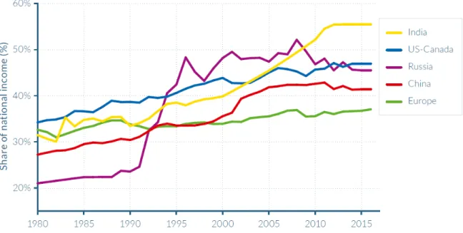
To see the tendencies in this measure over time, Figure 2 presents the top 10% income shares across the world between 1980 and 2016.
[PLEASE PLACE FIGURE 2 HERE]
Based on Figure 2 concerning the changes in income shares of the top 10% over time, the rising shares are quite striking in most regions, yet with very different magnitudes.
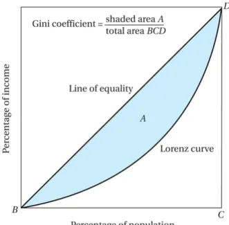
Nonetheless, the size distribution is an important start for introducing the most commonly used measures of income inequality, the Gini coefficient and its graphical representation, the Lorenz curve. Data from the size distribution are the basis of drawing the Lorenz curve.
Income recipients are arrayed from lowest to highest income along the horizontal axis, whilst the curve itself shows the share of total income received by any cumulative percentage of recipients (Pekins et al. 2013). In a perfectly equal society, the curve touches the 45-degree line at both the lower-left corner (0 percent of recipients must receive 0 percent of income) and the upper-right corner (100 percent of recipients must receive 100 percent of income). If only one household received income, and all other households had none, the curve would trace the bottom and right-hand borders of the diagram (perfect inequality). In all actual cases, the Lorenz curve lies somewhere in between. The further the Lorenz curve bends away from the 45-degree line of perfect equality (hence the larger the shaded area A in Figure 4), the greater the inequality (see Figure 3). The shape of the Lorenz curve indicates the degree of inequality in the income distribution.
Derived from the Lorenz curve, the Gini coefficient measures how far the income distribution of a country deviates from the perfectly equal distribution. The Gini coefficient is best understood as a ratio of the area that lies between the line of equality and the Lorenz curve (marked A in Figure 4) over the total area under the line of equality (marked BCD in Figure 4). The larger the share of the area between the 45-degree line and the Lorenz curve, the higher the value of the Gini coefficient and the more unequal the society is. The theoretical range of the Gini coefficient is from 0 (perfect equality) to 1 (perfect inequality). In practice, however, values measured in national income distributions have a much narrower range, ordinarily from about 0.25 to 0.65 (Perkins et al. 2013).
[PLEASE PLACE FIGURE 3 HERE]
[PLEASE PLACE FIGURE 4 HERE]
Figure 5 presents the most equal and most unequal societies in the world in 2016. Norway, Slovenia and Ukraine received the lowest Gini coefficients with values around 0.25, whilst South Africa, Namibia and Haiti got the highest Gini coefficients.
[PLEASE PLACE FIGURE 5 HERE]
Nonetheless, collapsing all the information contained in the frequency distributions into a single number inevitably results in some loss of information as no weights are attached to the lowest quintiles that might receive less income. Another criticism of the Gini coefficient is that it is more sensitive to changes in some parts of the distribution than in others. Despite these shortcomings, the Gini index, with its simplicity, including its graphical interpretation using Lorenz curves, remains the most widely used income inequality measure.
As an alternative to the Gini coefficient, the Palma ratio as a specific form of the so-called Decile Dispersion Ratio is also commonly used. Palma ratio focuses on the differences between those in the top and bottom income brackets. The ratio takes the share of the richest 10% of the population in gross national income (GNI) and divides it by the share of the poorest 40% of the population. This ratio is readily interpretable by expressing the income of the rich as a multiple of that of the poor. However, it ignores information about incomes in the middle of the income distribution, it is still a popular measure presenting well the growing divide between the richest and the poorest in the society.
[PLEASE PLACE FIGURE 6 HERE]
Income inequality and growth: Brief theoretical overview
Economists often look at the question of what income inequality implies for economic growth. This section aims at introducing some conventional and contemporary theoretical models which are important determinants in the inequality–economic growth nexus.
Nevertheless, this part does not intend to test whether there is actually a causal relation between inequality and growth, nor does it aim at introducing all influential theories.
In the 1950s, Simon Kuznets, one of the early Nobel Prize winners in economics and a pioneer of empirical work on the processes of economic growth and development, investigated patterns of inequality. He formulated a hypothesis about the relationship between per capita income and inequality across countries. He introduced the inverted-U hypothesis according to which inequality first rises and then falls as income per capita rises over time (Kuznets 1955). The economy is divided into two sectors; agriculture (traditional sector) and industry (modern sector), with relatively egalitarian income distribution within each sector, but a different mean income across them. If the population shifts from one sector to the other – which is best known as the structural transformation of the economy as GDP per capita rises – income inequality is first rising and then failing by time. The underlying mechanism for this rise in income inequality is the result of differences in the returns to factors of production between agriculture (where they are lower and less dispersed) and industry. In the initial phase, in which the whole population works in the agriculture sector, income is distributed relatively equally, but as industrialization and urbanization progress, inequality rises. Subsequently, the more factors of production make the transition from the traditional sector to the modern sector, the more likely it is that income inequality will start to fall (see Figure 7).
[PLEASE PLACE FIGURE 7 HERE]
Another well-known explanation for the association between growth and inequality is the Lewis’s surplus labor model which was proposed by W. Arthur Lewis (Lewis, 1954). His theoretical model predicts rising inequality followed by a ‘turning point’ which eventually leads to a decline in inequality. His model is based on two sectors, the traditional and the modern sectors, in which the modern sector faces unlimited supplies of labor as it is able to
draw workers with low or even zero marginal products from the traditional sector. Even though workers in the modern sector might be able to produce higher-value-added products, the wages cannot raise given the elastic supply of workers. Hence, modern sector growth is accompanied by a rising share of profits, but labor still receives a smaller share of the total, thereby further increasing inequality. The turning point is reached when all the surplus labor has been absorbed and the supply of labor becomes more inelastic. As a result, both wages and the share of income for labour start to rise and inequality falls (Lewis 1954). Hence, the underlying logic of the model is that inequality is not just a necessary effect of economic growth; it is also a cause of growth.
Conclusions drawn by Kuznets, Lewis, and others about growth and inequality are very powerful. Years after the publication of the original papers, many researchers armed with more data on inequality reexamined the relationship. Some found supporting evidence for this relationship (e.g.: Ahluwalia 1976), whilst others strongly criticize the validity of these theories (e.g.: Alvaredo et al. (2015) show that inequality in the US and in many other countries, both industrialised (UK and Canada and Australia) and developing (Argentina, Colombia, Indonesia, India, China and South Africa), followed a pattern inverse to Kuznets’
inverted-U curve).
Turning to a recent scholarly work, one of the most influential theoretical models, introduced in 2013, was the so called “elephant chart.” In 2013, Christoph Lakner and Branko Milanovic published a graph depicting changes in income distribution across the world between 1988 and 2008. The elephant chart (see Figure 8) indicates the income growth of each ventile of the global income distribution over the course of 20 years. The authors used this as evidence concerning the negative impact of globalisation on income inequality. They claim that the finds have four important messages. First, the global elite, placed in the top 1 percent, have
beneficiaries of globalisation with their income growth, coupled with a high initial share of income, continues to capture a large share of global income growth (represented as the
“trunk”). Second, the upper middle class has seen its income stagnate, with zero growth over two decades (seen as the elephant’s trough). Third, the income share of the global middle class has risen rapidly which is explained by the convergence of the selected developing countries to the developed countries (seen as the elephant’s torso). Finally, the extreme poor have largely been left behind, with several countries stuck in a vicious cycle of poverty and violence (seen as the elephant’s slumped tail).
[PLEASE PLACE FIGURE 8 HERE]
In sum, the main theoretical approaches assessing the determinants of inequality are the Kuznets curve and the Lewis model. These two models are important cornerstones in any academic debate concerning inequality and economic growth. At the same time, this section also introduced one of the most recent theoretical constructions, the so-called Elephant curve, with the aim of arriving at a comprehensive and global contemporary framework.
Nonetheless, the section only touched upon certain theories without being detailed and exhaustive.
Conclusion
The level of income inequality in a country is an important dimension of welfare, with significant implications for the long-term development of the country in general and for the ability of a country to reduce poverty in particular.
Distributional analysis in economics has traditionally been anchored in the welfarist paradigm in general and in the utilitarian tradition in particular, within which income inequality played a crucial role. The first part of this section explained the conceptual context within which income inequality is best understood with a special focus on the contemporary
terms and views regarding inequality. The second part of the section overviewed the most influential and widely used measures of income inequality, whilst section three aimed at introducing some theoretical models assessing the relationship between income inequality and growth.
It is important to acknowledge though that inequality in income earned tells only a part of the story regarding inequality. Hence, societies should not necessarily be concerned with decreasing income inequality but with securing for all of their members an equal chance to attain the outcomes they care about. Analysing income inequality is nevertheless a promising start, even as it tells us little about the question of how the observed outcomes derived from the choice sets available to individuals and from the income they earned.
Krisztina Szabó Central European University, Corvinus University of Budapest
This project has received funding from the European Union’s Horizon 2020 research and innovation program under grant agreement No. 822682.
References
Ahluwalia, M. S. (1976). Inequality, poverty and development. Journal of development economics, 3(4), 307-342.
Alvaredo, F., Chancel, L., Piketty, T., Saez, E., & Zucman, G. (Eds.). (2018). World inequality report 2018. Belknap Press of Harvard University Press.
Alvaredo, F., & Gasparini, L. (2015). Recent trends in inequality and poverty in developing countries. In Handbook of income distribution (Vol. 2, pp. 697-805). Elsevier.
Arneson, R. (1989). Equality of Opportunity for Welfare. Philosophical Studies, 56: 77-93.
Cohen, G. A. (1989). On the Currency of Egalitarian Justice. Ethics, 99, 906-944.
Dworkin, R. (1981a). What is equality? Part 1: Equality of welfare. Philosophy & Public Affairs, 10, 185-246.
Dworkin, R. (1981b). What is equality? Part 2: Equality of resources. Philosophy & Public Affairs, 10, 283-345.
Ferreira, F. H., & Peragine, V. (2015). Equality of opportunity: Theory and evidence. The World Bank.
Fitoussi, J. P., Sen, A., & Stiglitz, J. (2009). Report by the commission on the measurement of economic performance and social progress. The Commission on the Measurement of Economic Performance and Social Progress.
International Monetary Funds (2017). World Economic Outlook April 2017: Gaining Momentum? https://www.imf.org/external/pubs/ft/weo/2017/01/index.htm Accessed 20 May 2018.
Kuznets, S. (1955). Economic growth and income inequality. The American Economic Review, 1–28.
Lakner, C., & Milanovic, B. (2013). Global income distribution: from the fall of the Berlin Wall to the Great Recession. The World Bank.
Lewis, W. A. (1954). Economic Development with Unlimited Supplies of Labor. Manchester School.
Magas, I. (2018). Economic Growth and Changes in Capital and Labour Income in the USA (1988–2016). Public Finance Quarterly-Hungary, 63(1), 7-23.
O'Brien, D., & Oakley, K. (2016). Learning to labour unequally: understanding the relationship between cultural production, cultural consumption and inequality. Social Identities, 22(5), 471-486.
Perkins, D. H., Radlet, S., Lindauer, D. L., Block, S. A. (2013). Economics of Development.
WW Norton & Company, Inc.
Piketty, T. (2014). Capital in the Twenty-First Century. Harvard University Press.
Rawls, J. (1971). A theory of justice. Cambridge, MA: Harvard University Press.
Sen, A. (1980). Equality of what? In S. McMurrin (ed.), The Tanner Lectures on Human Values, Salt Lake City:University of Utah Press.
Sen, A. (1985). Commodities and Capabilities. North-Holland, Amsterdam.
Sen, A. (1992). Inequality Reexamined. Clarendon Press, Oxford.
odaro, M. P., & Smith, S. C. (2000). Economic Development. Harlow: Addison-Wesley.
World Bank (2018). Gini index. https://data.worldbank.org/indicator/SI.POV.GINI Accessed 25 June 2018.
Figures
Source: Alvaredo et al. 2018.
2. Figure – top 10% income shares across the world, 1980–2016 Source: Alvaredo et al. 2018.
4. Figure – Lorencz curve and the Gini coefficient Source: Todaro et al. 2000.
5. Figure – Top and bottom five countries according to the Gini coefficient in 2016 3. Figure – The Lorenz curve in a relatively equal (a) and in a relatively unequal (b) economy
Source: Todaro et al. 2000.
Source: World Bank 2018.
7. Figure – Kuznets curve Source: Todaro et al. 2000
6. Figure – Top and bottom five countries according to the Palma ratio in 2015 Source: World Bank 2018.
8. Figure – Elephant Curve as observed between 1988 and 2008 Source: Lakner et al. 2013.