Address for Correspondence: Đurđana Ozretić Došen, email: dozretic[at]efzg.hr
Article received on the 5th March, 2018. Article accepted on the 25th August, 2018.
Conflict of Interest: The author declares no conflict of interests.
Đurđana Ozretić Došen
1and Lidija Brkljačić
21University of Zagreb, Faculty of Economics & Business, Marketing Department, CROATIA
2 VidiNosi – Applied Arts & Craft, Zagreb, CROATIA
Abstract: Existing studies of newspaper design point to an interaction of form and content through the impact of visual format on the impression, perception, and understanding of the content. This paper aims to further explore the topic, i.e., the impact of design elements (layout, color, photographs, and front page) of the daily newspapers on the perception and visual impression of readers. The purpose of the paper is twofold. The first part briefly presents summarized theoretical considerations of newspaper design from a perspective of the marketing approach to the newspaper as a specific type of product. The second part is devoted to the primary research undertaken in order to explore and understand readers’ perceptions of design elements of the daily newspaper on the Croatian market. The research findings confirmed the assumptions about the link between layout style and photographs on the one hand and the perception of the content, the interaction and the effect of color on the perception of the product (newspapers) character on the other hand, and the assumption of the role of front page design as a sales argument. Findings add to the existing knowledge with insights from the new research context—Croatia, and as such might help in increasing the understanding about the visual perception and behavior of readers from the emerging European market. Also, findings might serve as the basis for future improvements in the visual ergonomics of newspapers.
Keywords: design, daily newspapers, perception, visual impression, Gestalt
Introduction
In the early 21st century, requirements of the media market brought about a large number of innovations in the newspaper industry, more than at any time before. What we are currently witnessing is a process of fresh newspaper creation and design which involves changes to the format, concept, and product approach (Gavranović, 2006), leading to conclusions about growing awareness of the importance of design as an element crucial to the survival in the market nowadays.
Recent premises about the importance of design in newspapers have been related to the thesis that "form follows function" in the sense of subordination with regard to the content, as
KOME − An International Journal of Pure Communication Inquiry Volume X Issue Y, p. x-x.
© The Author(s) 2018 Reprints and Permission:
kome@komejournal.com Published by the Hungarian Communication Studies Association DOI: 10.17646/KOME.75692.93
Key design elements of daily
newspapers: Impact on the
reader's perception and visual
impression
the standard product offering of newspapers, while competition and technology have for some time been regarded as the major catalysts of change in this sphere of economic activity.
Studies on newspaper design point to the interaction of form and content through the influence of visual format on the perception and interpretation of the content. More specifically, isolating and varying certain elements of design on the page may lead to changes in the way content is observed, perceived, and understood, resulting in a new, optimized order of noticing and viewing time, thereby also indirectly affecting the overall impression of the newspaper among readers.
As reported by Moses (2000), an average reader perceives 80% of graphic elements and 75% of photographs in newspapers and notices 56% of headlines while being aware of just 25% of the newspaper text, of which only 13% is read in detail. The text is the last thing being observed in a newspaper. All of this points to the conclusion that the reader's experience of newspapers is superficial and—to a large extent—visual.
Most of the existing academic research dedicated to the design and to the strategic role it has for the newspaper industry was conducted in developed markets. Studies aimed at researching readers’ perceptions and attitudes about newspapers and related topics in the context of emerging markets are still rare. Lincényi and Fabuš (2017), in one of the few studies devoted to the mentioned issues in the context of emerging markets, point to the necessity of survival and the irreplaceable role of newspapers, especially the daily newspapers, having an important influence on public opinion. Building on the aforementioned points, this paper aims to reduce the existing gap and to further spread the understanding of the actual issues related to the product design, existing in the field of newspaper strategic marketing management.
Interdisciplinary nature of design as a process of a product's (newspaper’s) visual creation
Rapid expansion of mass media in the late 20th century influenced a cultural transition from a verbal to a visual discourse, turning contemporary into a postmodernist visual culture (Boz, 2003). Visual messages possess a certain form, structure, convention, and their own syntax rules. Their understanding within a particular cultural context and syntax analysis, along with the evaluation of aesthetic criteria and intuitive understanding of the Gestalt, form the foundation of visual literacy (Messaris and Moriarty, 2005; Bamford, 2003; Chang, Dooley and Touvinen, 2002), where the familiarity with visual communication is crucial to a successful design of any visual form. According to Moriarty and Barbatsis (2005), the complex and abstract nature of the design is a methodological intersection of the disciplines belonging to the first and second generations of social and natural sciences.
The complexity of visual creation is manifested through design, assuming each idea and intellectual conceptualization of things, processes, and systems, while also taking into account social, cultural, psychological, environmental, ethical, and aesthetic aspects of the identity of the environment in which it arises. The impact of design is integral and interdisciplinary along the entire course of social reproduction and is valued according to rational criteria, such as functionality, cost-effectiveness as well as its technical and economic reliability and aesthetic sensibility (Kapetanović, 2005; Archer, 1984). Through contextuality and interdependence of various parts, i.e., elements of the visual field create an organized, meaningful whole while ambiguous elements are subconsciously perceived as the easiest, most correct and symmetrical structures in a given situation (law of Prägnanz) (Lidwell, Holden and Butler, 2006; Smith, 2005).
In addition, visual creation is based on the knowledge and appreciation of universal design principles which exist within a broader field of visual communication and culture, including visual rhetoric and semiotics, aesthetics, graphic and product design, and the Gestalt principles of visual organization. Actually, visual forms are a system of signs and symbols which gain their meaning in correlation with other objects. More specifically, in the presence of symbolism, human intervention, and audiences, they turn from a visual to a communication artifact (Foss, 2005).
Graphic design, as a separate sphere within the field of visual communication, is based on communication through signs and symbols aimed at constructing a functional message through a picture (as a simultaneous and spatially organized medium) and a written word—
language (as a sequential and temporally organized medium), creating visual harmony. It is the ultimate goal and challenge in graphic design to use visual communication tools effectively via identification, information, and presentation in order to contribute to the Gestalt effect, prompting a psychological and aesthetic response which might be greater than the sum of its parts (Pibernik, Brozović and Šimić, 2006). The main premise of graphic design is composition, so any change in size, color, positioning, etc., generates a different response among recipients.
Building on the previous, product (newspaper) design must use an optimal combination of structural, functional, and aesthetic features within the limits of end use, production materials, and production processes to clearly communicate the basic characteristics of the product (newspaper). The functional characteristic relates to the benefits expected from the product (newspaper) on the one hand, the structural ones to the possibility of fulfilling the functional promise on the other hand. The aesthetics are considered to be the "language" (in accordance with the semiotic principles), and its features are selected for the purpose of giving sensory appeal to the product (newspaper), more specifically the perception of style. Product (newspaper) acceptance depends to a large extent on the success it achieves in identifying the aesthetic and semantic code of the target audience (readers). This statement best describes the motivation for and the tendency toward a market-driven form, a common approach to the aesthetic factor in product (newspaper) development (Parr, 2004).
Newspaper design
A complex approach to designing a daily newspaper as a printed graphic product reflects a wider understanding and appreciation of the matter, method, and logic of its functioning—
starting from the history and symbolism of newspapers themselves via objective constraints (deadlines, format, type of paper and printing press, etc.) and production constraints (publication profile, frequency, rules of newspaper reporting) to the adherence to certain universal rules, i.e., design principles and the Gestalt principle, in order to achieve the main media function—that of easier readability, clarity, and visibility of information.
George-Palilonis (2004) observed the existence of a gap between the visual rhetoric and newspaper (graphic) design, stemming from a historic separation between words as a communication tool and design as the artistic effect, as well as a relative youth of the visual rhetoric and recent evolution of newspaper design as a visual language.
Visual culture and a visual orientation to new media—primarily television and the Internet—have led to new trends in newspaper design which, according to Garcia (2000; 2004), become more refined, direct, and visually focused. One may note a resizing of large formats, reduction of the amount of text along with an increase in the size of photographs and information graphics, an emphasis on the white space and turning toward a modular layout format. Furthermore, the influence of the Internet is noticeable in print through a sense of navigation, summarized information, and some kind of tabs. Cooke (2003) identifies the
changes in newspaper design which were induced by the continuous development of the media context (television news presentation) and those which were a result of the shift of newspapers' design management from editors to experts in the field of newspaper layout and design (who helped in understanding the newspaper design from a usability perspective). Recent comparative analysis of the front page elements of seven U.S. major metropolitan newspapers, conducted by Kim and Chung (2017), showed how different approaches in design are desirable, and individual newspapers should consider whether to adopt or not design hubs in order to better visually connect with the audience. De Vries (2008) argues that news publishers are still not sufficiently exploiting the potential of modern visual communication, despite the efforts of newspaper designers who point out visual communication as the underlying element of newspaper design.
Taking the 19th century as the onset of newspapers in the form we know them nowadays, one may conclude that the historical development of newspapers has undergone a long cultural transition from the Victorian style to modernism. From a vertical layout, which had symmetry but no hierarchy and was characterized by long, narrow columns, overcrowded by massive uppercase headlines, "screaming" the obtrusiveness of the content, to a clear, simple, and hierarchically functional modular design of the second half of the 20th century (Barnhurst and Nerone, 1995). According to Vizcaíno-Laorga and Jiménez Reusta (2018), design and redesigned features of the newspaper as product reflect the characteristics of the economic (competitive), political (ideological), cultural, and technical environment of the respective market through the various historical periods of the newspaper industry's development.
The newspaper page contains a certain number of graphic elements, which may tentatively be divided into mutable and immutable (Kosić, 2008), while Holmqvist and Wartenberg (2005) and Holmberg (2004) in identifying newspaper design elements use terms
“local and global elements.” Studies confirm that the size, positioning, object and photograph axiality, etc., for example, affect the visual behavior of readers; that is, they contribute to a quicker perception and cognition of the content. Visual behavior while reading newspapers is defined through a temporal order of observing individual components of the spread, dwell time on a particular area, reading depth, etc. (Holmqvist and Wartenberg, 2005).
A study by Garcia and Starck (cited in George-Palilonis, 2004; Holmqvist et al., 2003;
Johansson, 2004) yielded two key discoveries in the perception of newspapers: the first refers to the finding that people do not read but scan newspapers. The other is the existence of a so- called entry or access point—a dominant element on the page as the place of initial perceptual approach (reader's attention), more precisely, the point at which scanning stops and readers
"enter" the content more deeply.
Holmqvist and Wartenberg (2005) used an eye-tracking study to examine the perceptions of so-called local design factors on 34 spreads out of 17 newspapers. Its results showed that, on average, respondents first noticed the object on the right as expected, as a result of turning the pages with the right hand, the Western-style perceptual sequence from left to right and the Gestalt laws of optical weight. In his research, Holmberg (2004) confirmed the general dominance of the left over the right-hand side of the newspaper page with regard to the dwell time—61.3% vs. 38.6%.
In socio-semiotic and perceptual psychology, visual space is seen as a semiotic space, implying that the meaning is devised through the interaction of visual and verbal units as means of expression. Visual layouts form a kind of grammar in which left-right, up-down and center- margin positions are associated with other different information values: the most general information must be on top of the visual field, with more specific information at the bottom;
the most important information must be in the middle of the visual field and that which is less important "in the periphery"; in addition, the right-hand side is associated with new, yet
unknown information, and the left with that which is already known (Holmqvist et al., 2003;
Holsanova, Rahm, and Holmquist, 2006). Holmquist's et al. (2003) study confirmed that larger objects are noticed earlier (with longer viewing times compared to smaller ones) whereas the objects with axial (horizontal, vertical) characteristics are observed much earlier and viewed longer than those of undefined shape. However, there is no difference between vertically and horizontally laid out text (Holmqvist and Wartenberg, 2005). Thus, although images serve as a powerful initial element or point of entry in the text, the evidence (Holmberg, 2004) also shows that text and images are processed separately. That segregation occurs due to the different nature of information and to the different timing of its perception at the same time. Images are decoded in the early stage of the processing while, semantically, text processing occurs at a later stage. Evidence shows that images have a positive effect on the way in which readers create mental models of the text content.
In researching the contemporary newspaper design's contributions for sustainable development, Matos and Delfino (2014) have found how modern newspapers offer more pleasure and relaxation to their readers, because of being easy to read and persuasive, but most of that is achieved with the increased negative environmental impact.
The theoretical contributions presented here point to a complexity of the causal and reciprocal relationship among form, perception, and cognition of the content in a visual environment, stressing the importance of each detail and giving scope for further research and findings on it.
Primary research on the effect of newspaper design elements on readers' perception and visual impression
According to the behavioral paradigm, isolating and altering certain design elements of daily newspapers leads to changes in readers' observation and perception which, in turn, enables identifying an optimum order in which they will view the newspaper page and the time spent on it. This suggests that more research on the relationship between the visual format of daily newspapers and human perception is necessary.
Hypotheses development
A successful newspaper design concept respects the universal principles of balance, contrast, rhythm, unity, and harmony. Zappaterra (2007) elaborated on the direct factors of design which appear on newspaper pages: space, dominance by shape, form through color, tension, repetition and flow, variations in size, contrast, balance, and depth. The order of elements in design assumes a synergy of the innate unconscious Gestalt of human perception, rules of composition and rhetorical-semantic targets while also ensuring the integrity and visual recognition, achieved by a definition of major elements in the visual field that do not require frequent interventions. In newspaper design, according to Kosić (2008), these are immutable graphic elements (newspaper head, imprint, layout style, headline typography, etc.).
Readers' experience is largely visual, holistic; within their cognitive system, they use certain visual clues (design factors) which determine their movement in the visual-spatial environment (entry points). Their perceptual attention is initiated by the dominant picture (as an area with the highest concentration of ink) in as many as 90% of cases, followed by the main headline. Placing the visual element alongside text (e.g., picture caption) increases the chances that the text will be read three times (Holmqvist et al., 2003; Moses, 2000). In this research, we focus on these specific dimensions and propose the following research hypothesis:
H1: The elements of newspaper design, based on the universal principles of visual design and innate principles of visual organization, affect to a large extent the perception of daily newspapers and their overall visual impression among readers.
Color (Bohle and Garcia, 1986) makes a newspaper appear more interesting, pleasant, exciting, and powerful. Color is subliminal it its character; it arouses initial interest and serves to create a rapid emotional appeal and help orientation in the visual space. Newspaper color, from its initial appearance in the 19th century until the 1970s, was primarily related to entertainment and primitive simplicity, as the two concepts often associated with tabloids. Reputable newspapers contained no color in a bid to maintain the impression of seriousness and professionalism. Color causes an emotional rather than an intellectual response. Its rise in the print media occurred with the advent of USA Today in the early 1980s which, due to the abundant use of color, earned the disdainful nickname of "Technicolor Tabloid" (Rock and Hovland, 1995). Even though color is an integral part of newspapers and magazines, studies show that—as an element of design—it does not have a very high impact on readers. It serves largely as a quick emotional appeal, acting to stimulate the initial interest and capture the gaze while not really encouraging deeper interest in the content among readers (Holmqvist, and Wartenberg, 2005; Rock and Hovland, 1995). In addition to physical characteristics, the psychological values of color also affect the interpretation of the content/message and are conditioned by experience and socio-cultural learning. In line with the findings presented here, we propose the two following auxiliary hypotheses:
H1a: The presence of bright colors on newspaper pages contributes to the perception of a "newspaper for the masses.”
H1b: Newspapers with high-profile reading audiences use pastel colors on their pages.
Newspaper layout is a place in which the relationship between form and content becomes most prominent, and it determines the dynamics of the main elements on the page. Middlestadt and Barnhurst (1999) explored newspaper layout through the application of the main principles of art and design. News has a structure of points and lines that form the layout: vertical, horizontal or diagonal. While horizontal lines express stability, verticality in art expresses the dynamics, life, and achievement and diagonal lines add most visual energy. Vertical layout can express vitality, relevance, authority for so-called hard news related, for example, to politics or to the economy while horizontal layout can express calm and relaxation of so-called soft news related to arts and humanities, for example. Vertical layout aids one of the two innate tendencies of receiving textual information: top-down, which is achieved through long and closely spaced vertical columns, with headlines possibly placed within a single column and so on.
Characteristic of the Victorian era newspapers, it is also noticeable today in the renowned daily the New York Times (Kim and Chung, 2017). With photographs and headlines usually kept to a single or a minimum number of columns, the overall impression is intellectual, sophisticated, and serious, adhering to the Gestalt principle of continuation and running contrary to that of symmetry. Horizontal layout appeared in the 1970s and is quite the opposite of the vertical version. It panders to the other innate visual tendency: left-right, which is reflected by proper positioning of the elements—text, headlines, and images set in a maximum number of wide but short columns. The leading story is located in the upper left or right corner, with the multi- column text and headlines, large rectangular photographs, and white space. This layout contributes to the transparency and whiteness of the space, giving an overall impression of
simplicity, readability, and clarity. Horizontal layout is considered a textbook example of good Gestalt, of which symmetry is the strongest principle (Smith, 2005). Modular layout is based on the universal principle of design—modularity (Lidwell, Holden and Butler, 2006), a combination of horizontal shapes with vertical "entries" as a complementary element. More specifically, the content is located in squares, taking into account the sound Gestalt rule. White space gains special prominence in headlines and is used as a design element. This kind of layout is characterized by the dynamics of space, readability, and clarity. It is the most commonly used design today which also imposed a new trend in the size of photographs and the number of front page stories (Harrower, 2008). Building on the aforementioned, we hypothesize that:
H2: Newspaper layout style affects the reader's perception of the importance/credibility of the content.
As the newspaper layout can change the attitude of the newspaper toward content, so can the same effect be achieved by the photograph selection, content, juxtaposition, combination, and cropping. A magazine-style ideology of photograph treatment is a noticeable trend in newspaper design (Zappaterra, 2007). Due to its semantic-visual nature, photographs have the strongest impact on the readers' attention and is considered a dominant element of the newspaper design. A good photograph should effectively illustrate the content of the story, provoke an emotional appeal, foreshadow action, and allow the reader to identify with people in the story (Jurković, Jurković and Rončević, 2006). The position of the image, its size and content, in conjunction with the text, may contribute greatly to a powerful rhetorical-semantic echo of the content. There are five key functions of visualization as a text supplement:
decoration, representation, organization, interpretation, and transformation (Holsanova, Holmberg and Holmqvist, 2006). Newspapers rely increasingly on the photographic element as a narrator, with a notable decades-old global transition from a text-driven to an image-driven context.
Among other Gestalt principles, the principle of closure is very powerful from the aspect of content. In cropped photographs, showing an incomplete figure, people will complement the incomplete information themselves due to an innate tendency of Gestalt closure and will consequently see the figure as full (Ozerkan, Kartopu, and Ayar, 2006). The perception of a photograph as the primary element on the page may be explained by the Gestalt figure- background principle: readers unwittingly see the photograph as the largest element in the visual field (the largest concentration of ink) while anything else is perceived as background.
However, there is still insufficient empirically tested data to confirm the potential of the content and size of the photograph, which is why we propose to test the following research hypothesis:
H3: The content and size of the photograph accompanying the text contributes greatly to the observation of the respective story.
Strong expressive qualities are attributed to color which is among the most powerful elements of design and art. The understanding of color is crucial to an effective composition and spatial illusion. Color may stimulate the interest of potential customers (readers) and, ultimately, increase the appeal and purchasing power of the product (Funk and Ndubisi, 2006; Samara, 2005).
Color’s appearance and layout on the page have been proven to affect the reader's navigation through the newspaper and the dwell time on the page; color also provides aesthetic pleasure and serves as a landmark in a complex visual environment of the publication—
therefore, newspapers often base their content orientation on the so-called color coding (Holmqvist and Wartenberg, 2005; Samara, 2005). The prevailing Gestalt principles related to
color on the newspaper page are symmetry and similarity. Thanks to the principle of similarity, the use of one color in certain elements on the page and subsequently in various sections enables the reader to visually and cognitively link information, facilitating a visual orientation (Smith, 2005). On the basis of these observations, we posit that:
H3a: Color photographs leave a stronger impression than black and white photographs.
The front page of any publication, including newspapers, must be original, recognizable, informative, and distinctive at the same time (Zappaterra, 2007); it reflects the personality of the entire publication (Ames, 1989). A revolution in newspaper design, which culminated in the mid-1970s, had a particular impact on front page design (Barnhurst and Nerone, 1991) through the application of horizontal layout, smaller number of columns and articles, more simple headline typography, appreciation of the white space and the appearance of impressive, visually clearly organized elements. According to a study of the trends in the U.S. front page design authored by Utt and Pasternack (2003), the 1980s emphasized the color trend, modular design, and the arrival of large, dominant photographs while 1990s placed the focus on the integration of text and images. The simplicity of design and the clarity of navigation were another trend of the late 20th and the beginning of the 21st century. Most daily newspapers use color on a daily basis, with one dominant front page photo in most cases, with the 6-column page becoming almost a rule. López-Rabadán and Casero-Ripollés (2012) consider a front page to be the most relevant strategic issue in newspaper management and point to its ability to raise and steer readers’ attention towards chosen issues. Furthermore, they elaborate on the impact of the front page highlighting how other media (TV and radio) present reviews of the news appearing on the front pages of the most relevant and important newspaper. Thereby, the evidence reviewed here suggests that front page design is an important factor for newspapers’
sales, which is why we hypothesize that:
H4: Front page design is one of the main factors in deciding to buy a daily newspaper among readers.
Methodology
In order to obtain information concerning the status of the phenomena and to test the hypotheses about the effect of certain design elements on the visual impression and perception among readers on the Croatian market, the one time, descriptive research study was conducted. Data were collected through face-to-face interviews of a convenience sample of 40 respondents. The sample consisted of Croatian citizens, both male and female readers of daily newspapers with the reading frequency of several times a month (including regular and occasional readers), aged between 25 and 40, with academic qualifications as a minimum, residing in the City of Zagreb and the Zagreb County. The demographic characteristics of the respondents are shown in Table 1.
Table 1- Respondents' demographic characteristics according to gender, age, education, reading frequency, and place of residence
VARIABLE N %
SEX M 16 40,00%
F 24 60,00%
AGE 25-30 25 62,50%
31-40 15 37,50%
EDUCATION Univ. degree 37 92,50%
Ph.D./M.Sc. 3 7,50
READING FREQUENCY
every day/almost every day
(5-7 times a week )
24 60,00%
3-4 times a week 17 17,50%
1-2 times a week 4 10,00%
several times a month 4 10,00%
Rarely 1 2,5%
COUNTY City of Zagreb and the
Zagreb County 40 100%
Given the descriptive nature of the research, for the purpose of expressing attitudes and measuring visual impressions according to the proposed hypotheses, newspaper spreads and front page printouts of three foreign newspapers and the proposed design of a national daily were presented to respondents along with the questionnaire.1 The mixed questionnaire was structured relaying on the findings in previous research (e.g., Utt and Pasternack, 2003). Apart from five introductory questions related to the respondents' demographics, the questionnaire consisted of 28 questions. Of these, seven were dichotomous, four open, and eight closed multiple-choice questions. Nine questions were used to measure attitudes. Individual face-to- face interviews lasted 45 minutes on average. As recommended by Morgan (1998), in the research design with a mixed method approach (survey with included open-ended items), the results from two types of methods (quantitative and qualitative) were integrated. First, a simple statistical analysis (mean, standard deviation, and mode) of the quantitative data was made, and then the qualitative data was used to interpret those quantitative results.
Research results and discussion
The first main hypothesis assumed that isolating and altering the characteristics of certain design elements in the visual field, i.e., on a newspaper page, affects readers' visual impression and perception, as evidenced by a change in the temporal order of observing, dwell time and,
1 Front pages of USA Today, the New York Times, The Guardian, available at
http://www.newseum.org/todaysfrontpages/flash/; the spreads and front page of Večernji List were (based on the preliminary design guidelines, authored by local graphic designer Mirko Ilić - these materials were used solely for the purpose of scientific research
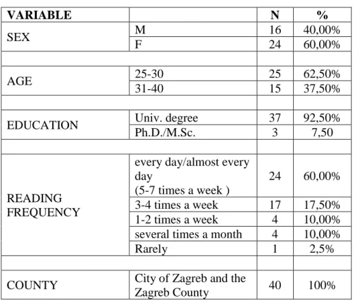
finally, by a change in the comprehension of the contextual content. Newspaper design was found to be considered an important or exceptionally important product characteristic by 36 out of 40 respondents. They were asked to give an opinion on the effect of each of the seven graphic elements on their impression of the daily newspaper, measured by statements on a Likert scale from 1 ("does not affect at all") to 4 ("affects completely"), where 5 related to the impossibility of giving an opinion ("I don't know/cannot evaluate"). Results are presented in Table 2 showing photographs as having the strongest impact on the overall impression of a newspaper among readers (mean 3.650, stand. dev. 0.622237), followed by the entire front page2 (mean 3.45, stand. dev. 0.814925) and color (mean 3.275000, stand. dev. 0.846940).
Then, headline font and layout follow, with (mean 3.225, stand. dev. 0.659740) and (mean 3.225000, stand. dev. 0.861945) respectively. Format’s impact on the impression of newspapers is penultimate (mean 3.100000, stand. dev. 0.900142). The newspaper head/logo ranked the lowest (mean 2.675, stand. dev. 0.858965).
Table 2 - The impact of elements of newspaper design to the perception and overall visual impression of daily newspapers among readers
Mean Median Mode Min Max Stand.
Dev FRONT PAGE 3.450000 4.000000 4.000000 1.000000 4.000000 0.814925 HEAD/LOGO 2.675000 3.000000 2.000000 1.000000 4.000000 0.858965 HEADLINE
FONT 3.225000 3.000000 3.000000 1.000000 4.000000 0.659740 PHOTOGRAPHS 3.650000 4.000000 4.000000 1.000000 4.000000 0.622237 COLOR 3.275000 3.500000 4.000000 1.000000 4.000000 0.846940 LAYOUT 3.225000 3.000000 4.000000 1.000000 4.000000 0.861945 FORMAT 3.100000 3.000000 3.000000 1.000000 4.000000 0.900142
These results corroborate the conclusions of previous research on the primary (and strongest) perception of the photographic element in the visual field of the newspaper page. The reason behind the order in which this one, and then the remaining elements, are perceived lies in the Gestalt figure-background principle. The newspaper head/logo has subliminal effects, and it scored lowest of all the elements in the survey, as expected, since it is considered an immutable graphic element which does not change on a daily basis (unlike, e.g., photographs), and serves for product identification at the point of sale. That is, one might attribute its (in)effectiveness on the respondents' general impression to the constant appearance of the newspaper head/logo, which the user does not perceive thanks to being used to it. Based on theoretical findings in the first part of the paper and the survey results presented above, the conclusion is that hypothesis H1 is confirmed.
Two auxiliary hypotheses are related to the element of color and its contribution to creating a certain perception of the product. Respondents were asked to state their associations at the mention of two groups of colors—those of the bright/warm and cool/pastel palette. For the most part, bright and warm colors are associated with summer, happiness, and joy. Cool and pastel colors are mostly associated with cold/winter, composure, and clothing.
Furthermore, respondents were presented two sets of color palettes, drawn from two front pages of USA Today and three from the New York Times. Isolated as an element, it was evident that
2 Front page is examined here as a design entity, rather than a set of elements (photographs and headlines).
the front page of USA Today was dominated by warmer and more intense colors, with lighter and cooler shades prevailing on the front pages of the New York Times. These two newspapers were selected as the extreme examples of different applications and approaches to color in the presentation of content. When asked on a scale of 1 to 5 to assess the degree of liking the color palette as a separate element of the corresponding front page with a visible contextual view (where 1 equaled total statement negativity ("I do not like it at all") and 4 total positivity ("I like it a lot") while 5 related to the impossibility of giving an opinion ("I don't know/cannot say"), 22 respondents (55%) said they liked the USA Today palette a lot, with 17 respondents (42.50%) saying that they somewhat liked the New York Times palette. In the introductory questions of the questionnaire, respondents were asked to express their perception of the profile of these two newspapers, where USA Today was described as a "political information newspaper for the masses" and the New York Times as a "corporate, conservative and serious"
newspaper. According to the respondents, colors correspond to newspaper profiles since the
"USA Today is for the masses, for everyone; colorful; television-like/possessing TV appeal"
while the New York Times' "color reveals the character of a serious conservative newspaper;
intended for older readers." In addition, respondents were asked to express their opinion on the matching (positive or negative) between the newspaper color palette and profile. According to the survey, 33 (82.50%) and 34 (85%) of the total number of respondents, respectively, perceived the two color palettes to be "highly appropriate" to the profile of newspapers such as the USA Today and the New York Times. When it comes to the USA Today, color is perceived as an element to attract attention; it is associated with warmth, joy, accessibility, and entertainment. As to the visual presentation, the content is secondary. In the case of the New York Times, visual presentation is secondary while the content takes the foreground since the use of cooler and pastel colors in the Gestalt sense implies coldness, aloofness, and seriousness, so the selection of such a color scheme emphasizes the seriousness of the content. These results are in accordance with previous theoretical considerations (e.g., in O’Connor, 2013). Color as a design element affects the perception of the profile of the newspaper, so auxiliary hypotheses H1A and H1B may be concluded to have been confirmed.
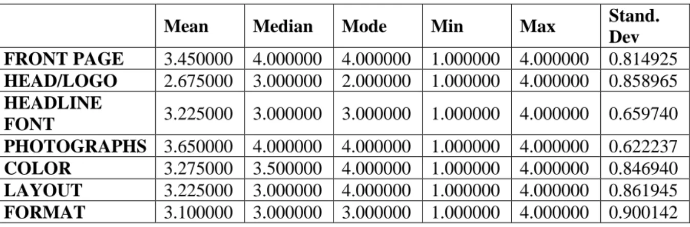
In order to test hypothesis H2, two Crna kronika (Crime and Calamity) section spreads—CK1 (horizontal) and CK2 (vertical)—from the Croatian daily Večernji List were presented to respondents. Identical in content, they differed only by the layout of the story headlined "Neighbors rescue ailing granny from a flaming house."3 Respondents were asked to scan both versions of the text briefly in order to gain insight into their content and to spot the differences on the proposed spreads. Furthermore, they were asked to look at each version as a separate entity (headline-picture-text) and, taking note of the story content, to choose one version in terms of the following dimensions: "impression of the content—impressive,"
"impression of the content—credible," "visibility of the elements," "clarity of the elements"
and "general impression." Survey results (presented in Table 3) showed respondents to be more inclined to the horizontal layout on as many as four out of the five dimensions. The first,
"impression of the content—impressive" dimension referred to the evaluation of the strength of the impression that the content left on the respondents; more precisely, which version presented a more stirring text. According to the results, 22 respondents (55%) decided that K1 (horizontal) was more impressive than CK2 (vertical). Unlike the first dimension, the second one showed the opposite result. It referred to the assessment of belief in the truth and meaning of the story. The same number—22 respondents (55%)—considered the vertical version (CK2)
3 CK1 (horizontal) version had a picture 18.5x9 cm in size, positioned along the entire headline, while the text below was broken into two columns 9 cm wide with justified body text (an intervention in the original layout, specifically for the purposes of this research); CK2 (vertical) version included a cropped 11x14 cm photo, zoomed in on the old woman and partly on one of the firefighters. It was positioned to the right of the body text and both appeared across two 3.5 cm wide columns; dimensions in the 1:1 scale; text justified.
to be more credible than CK1 in this case. The third and fourth dimensions related to the perception of design elements. In both cases, respondents chose the horizontal version (CK1) for better visibility (26 respondents – 65%) and clarity (22 respondents – 55%). Overall, the horizontal version also appeared more visually impressive in general (26 respondents – 65%).
Table 3 – Respondents’ choice and inclination towards dimensions of horizontal (CK1) and vertical (CK2) spreads
CK1 CK2 TOTAL
N % N % N
(CK1+CK2)
N (CK1+CK2) Impression of the content—
impressive 22 55 18 45 40 100
Impression of the content—
credible 18 45 22 55 40 100
Visibility of the elements 26 65 14 35 40 100
Clarity of the elements 22 55 18 45 40 100
General impression 26 65 14 35 40 100
Asked to comment on their selection, respondents said that the "photograph on CK1 is twice the size of CK2, which greatly contributes to the visibility, and also to the impression of content importance." The respondents favoring the vertical version described it as "clearer, journalistically more concise" and "dramatic," with the horizontal version appearing to be
"more tabloid-style, school-like, essayistic." This is largely due to the two-column layout as well as the blown-up picture. The respondents who were more inclined to the horizontal version described CK1 as an ergonomic version, whose layout enabled better readability, gazing from the picture to the headline and then the text, without breaks (as in CK2). In addition, they said that the horizontal version seemed "more serious and yielding to the perception that there is more content." From the above results, it can be concluded that the choice of the horizontal version by the majority of respondents is attributable to the significance of the photo size, which creates a (Gestalt) illusion of the content importance, contributing also to better visibility and clarity, while the two-column layout creates the illusion of more text, which in turn creates the illusion of additional seriousness and credibility of the content. Due to its visual design, the vertical version splits the space—narrow vertical columns break up the gaze, which runs on to the photograph at the same time, turning reading into a dynamic process. One potential reason for a higher inclination to the horizontal version by female respondents may lie in the fact that the layout of the horizontal version is also present in women's magazines, together with large pictures intended for women as a consumer public. In accordance with research results and a visible change in the perception and impression of the two different newspaper layouts, hypothesis H2 was confirmed.
The third main and auxiliary hypotheses concern the effect of photographs as a graphic element on the perception and visual impression of a newspaper page. Respondents were given double page spreads B1-B2, B1-B3, B1-B4, and B3-B2, which they had to compare directly according to the given dimensions. All four versions were identical in content, differing only in the primary photograph of the story headlined "Mimi kept her affair with JFK secret for 40 years." Pages B1 and B2 contained a two-column photo.4 The B1 version also showed J.F.
4 11 x 17.5 cm in size, 1:1 scale
Kennedy as the President, with an American flag behind him as he gave a speech. On the B2 version, he was shown in a family setting, with his wife Jackie and two children. By comparing the two printouts, respondents were asked to choose and evaluate one version according to their
"impression of the content," "visibility of the elements" and "general visual impression."
Results showed the selection of photographs to be affecting their perception of the content.
These stories were also observed as a combination of headline-picture-text. On two of the three dimensions, respondents selected printout B2. As regards the "impression of the content"
dimension, they described themselves as being more strongly impressed with the version of J.F. Kennedy appearing in the picture with his family (24 respondents—60%). B2 was also described as a version with very visible elements (23 respondents—57.50%). However, on the last dimension which evaluated the visual perception, 21 respondents (52.50%) opted in favor of spread B1.
Asked to provide an explanation of their choice, respondents who favored spread B2 said they were more shocked by the content alongside a picture of the story protagonist in a family context. Here, J.F. Kennedy was not perceived as the President but rather as an "ordinary man who had a love affair," which made the whole context that much more of a "powerful political scandal." The respondents who were more inclined to spread B1 believed that a stronger impression of the content was produced by the picture of J.F. Kennedy as the President because he is a "public figure, and so much more does his private affair seem politically scandalous, as it affects the image of his authority as president." In addition, they described the choice of the photograph of J.F. Kennedy with his family (B2) as "inappropriate for a serious daily, making it seem more gossipy, sensationalist in this context." It may be concluded that the content of the visual element, a photograph, in this case, affects the rhetorical and semantic perception of the textual content. Respondents were most impressed by the picture of J.F.
Kennedy with his family, which can be attributed to the implanted cultural and social norms, labeling adultery as socially unacceptable behavior. But the highest general impression score was still that of J.F. Kennedy's photograph as the President, which can be explained by the innate image of the president as an exemplary untouchable and unquestionable authority, the national leader, so any violation of such an image results in a condemnation.
The next couple of spreads (B1-B4) were aimed at exploring the impact of size on four dimensions: "impression of the size," "impression of the content," "visibility of the elements"
and "general visual impression." B1, as already mentioned, contained a large picture5 of J.F.
Kennedy while B4 contained an identical, but a smaller picture6 of the President of the size equal to the secondary picture in the story. On three of the four dimensions, results showed the respondents to be more strongly impressed by version B1, i.e., that with a larger photograph. It was selected by 29 respondents (72.50%). But when it came to the impression of the content size, putting the picture into context with the content, respondents were more impressed by spread B4 (21 respondent or 52.50%). The elements contained in version B1 proved to be more visible (31 respondents – 77.50%), also producing a stronger visual impression (25 respondents – 62.50%). The respondents favoring version B1 explained that the "photograph size suggests content importance" and "contributes to easy reading and visibility of the content." On the other hand, the respondents who were more inclined to version B4 believed equally large photos of J.F. Kennedy and his lover Mimi Beardsley to be giving an impression of equality, equal involvement, where J.F. Kennedy is seen as a "president who committed a political scandal and an ordinary man who had an affair." In addition, smaller photographs feed the illusion of seriousness of the content by leaving more room for extra text, as a characteristic of serious newspapers, while large photographs seem sensationalist by being more obvious in the first
5 11 x 17.5 cm in size, 1:1 scale
6 7.5 x 9.5 cm in size, 1:1 scale
place. The results indicate that the size of visual elements affects the perception of the textual content. Larger pictures were found to affect the perception of importance and visibility of the content while smaller ones contributed to the perception of equality.
The last couple of spreads (B3-B2) were intended for a direct comparison of the spreads showing a picture of J.F. Kennedy with his family, where B2 contained a color photograph and B3 an identical black and white photograph. Three dimensions were investigated: "impression of the content," "visibility of the elements" and "general visual impression." According to the results, an overwhelming majority of respondents chose the version with a color photograph.
Spread B2 had scores of more than 90% on all three dimensions. Respondents explained their choice by custom. They were accustomed to seeing color photographs in newspapers while a smaller number of respondents who favored the black and white photograph said it "evoked an event from the past." Thus, the results indicate that color photographs leave a stronger impression than black and white ones, which can be explained by custom and expectations. The presence of color is a characteristic of modern newspapers; it is customary, part of the reader's visual experience. Black and white photographs are rare, indeed; in most cases, they relate to the content from the past, so their appearance may be expected to result in a perception of "retro content." Accordingly, it can be concluded that hypotheses H3 and H3A were confirmed.
The last, fourth hypothesis refers to the front page and its impact on the consumer-reader behavior. Asked to express a subjective view of the importance of the front page, respondents said that the front page is an essential element of the newspaper since its very appearance sells newspapers. The front page is seen as the newspaper’s "packaging," and it determines the character of the newspaper. When asked to what extent a front page affects the decision to buy a daily newspaper, 21 respondents (52.50%) answered that it "completely affects," with as many as 34 other respondents (85%) giving an affirmative answer to the question about the purchase of that day's daily newspaper on account of the content and look of the front page.
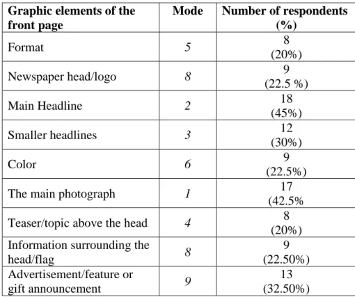
Respondents were then asked to rank graphic elements of the front page in the order in which they are observed on a scale starting from 1 (most visible / important) to 9 (least visible / important element on the front page). For an authoritative presentation of the order of ranking, mode was used as the frequent occurrence of the number in the series, and the share of the most frequent number in the sample. The results (presented in Table 4) show that 17 respondents (42.50%) chose the main photograph as the most visible element of the front page (mode 1). It was followed by the main headline (mode 2, 18 respondents – 45%); smaller headlines (mode 3, 12 respondents – 30%); teaser/topic above the head (mode 4, 8 respondents – 20%
incidence); format (mode 5, 8 respondents – 20% incidence), color (mode 6, 9 respondents – 22.50% share in the total); with information surrounding the head/flag and newspaper head/logo sharing grade 8, as the most common number in the series (9 respondents – 22.50%).
Ranking last was advertisement/feature or gift announcement with grade 9 (13 respondents – 32.50%). The research results are consistent with those from López-Rabadán and Casero- Ripollés (2012) and Kim and Chung (2017) and point to the confirmation of hypothesis H4.
Table 4 – Ranking of the graphic elements of the front page
Graphic elements of the front page
Mode Number of respondents (%)
Format 5 8
(20%)
Newspaper head/logo 8 9
(22.5 %)
Main Headline 2 18
(45%)
Smaller headlines 3 12
(30%)
Color 6 9
(22.5%)
The main photograph 1 17
(42.5%
Teaser/topic above the head 4 8
(20%) Information surrounding the
head/flag 8 9
(22.50%) Advertisement/feature or
gift announcement 9 13
(32.50%)
Conclusion
A successful design of any visual form is based, in the case of a graphic product like the daily newspaper, on the appreciation of the interdisciplinary and complex nature of design and respect for the universal principles of visual organization—Gestalt.
Previous studies on reading habits and perception point to the impact of design elements on the visual behavior of readers. Specifically, isolating and altering the characteristics of mutable and immutable elements of the newspaper page design, due to universal Gestalt principles of visual organization, produce changes in the observation, perception, impression, and understanding of news, as reflected in the changed order of observation and dwell time on the page. The object size, positioning, and axiality foster not only earlier perception but also cognition of the content as well; color has a subliminal emotional appeal and serves as a landmark for orientation in the visual space, with its positioning next to the headlines tripling the chances that the text may be read, etc.
Based on the findings presented on the effect of design elements on perception and their visual impact, with a special emphasis on newspaper design, one may conclude that their meaning and effect are exceptional and should in no case be ignored. Every single element, even the smallest element of a newspaper page can affect the perceptual and cognitive processes as well as the visual impact. The universal design principles, Gestalt, visual communication, and a number of other disciplines result in a generally accepted understanding, awareness, and access to the visual design of daily newspapers. This is also evident from the results of primary research conducted on the Croatian market and described here, which can be considered indicative and serve as a basis for further research on perception and design.
Regarding implications for newspapers’ marketing managers, the findings might (should) form the basis for further and more detailed improvements of the visual ergonomics of newspapers.
Finally, the current situation in the market of print media does not leave much room for halting a decline in circulation and readership. But such a trend can surely be mitigated if strategic thinking is applied. Design is but one factor which may contribute to it.
Research limitations and future research
This research is not without limitations. A convenience sample based on availability was used for the purpose of the research. The size and structure of the sample may be considered to be a limitation of this research and are not directly comparable to the available databases of reader preferences. Therefore, the results obtained by the research cannot be generalized, nor are they representative of the Croatian population. The methodology may be viewed as an additional limitation. The research design and combined method that was used relies heavily on a self- assessment of the respondents' visual experience while the accuracy of the results might best be checked by using a reliable and efficient but expensive eye-tracking method, recording the respondents' eye movements.
The research may be considered as indicative and serve as a basis for further research in the field of perception and design, which it is both desirable and necessary to conduct in a professional and controlled environment, preferably on a representative number of respondents.
Future research using a combination of traditional and neuro-marketing research methods is desirable too.
It is recommended for the purpose of better newspaper preparation and placement on the market to conduct extensive research on the habits and attitudes of target audiences, and to take into account the results of such research since it is obvious that everything in the environment affects the perception, and thereby also the visual impact. Detail is everything, and only such an approach may foster successful business operations, founded on the marketing business philosophy and orientation, in the observed economic activity.
References
Ames, S. E. (1989). Elements of newspaper design. London: Praeger
Archer L.B. (1984). ‘Systematic methods for designers’. In Cross, N.(ed.) Developments in Design Methodology. London: John Wiley, pp. 57-82
Bamford, A. (2003). The visual literacy white paper. Commissioned by Adobe Systems Pty Ltd, Sydney, Australia. Available at: www.adobe.com/uk/education/pdf/
adobe_visual_literacy_paper.pdf [accessed 25 March 2014]
Barnhurst, K. G. and Nerone, J. C. (1995). ‘Visual mapping and cultural authority: design changes in U.S. newspapers, 1920-1940’. Journal of Communication, 45(2): 9-43.
CrossRef
Barnhurst, K. G. and Nerone, J. C. (1991). ‘Design changes in U.S. Front pages 1885-1985’.
Journalism Quarterly, 68(4): 796-804. CrossRef
Bohle, R. and Garcia, M. R. (1986). ‘Reader Reactions to Color in Newspapers’. Paper presented at the Annual Meeting of the Association for Education in Journalism and Mass Communication
Boz, A. (2003). What is the Problem with Visual Culture? Available at
http://www.scritube.com/limba/engleza/various/What-is-the-Problem-with- Visua1811510621.php [accessed 15 November 2013]
Chang, D., Dooley L. and Touvinen J.E. (2002). ‘Gestalt Theory in Visual Screen Design – A New Look at an Old Subject’. In: Selected Papers from the 7th World Conference on Computers in Education (WCCE’01), Copenhagen, Computers in Education 2001: Australian Topics, Volume 8. Melbourne: Australian Computer Society, pp.
5–12.
Cooke, L. (2003) ‘Information Acceleration and Visual Trends in Print, Television, and Web News Sources’. Technical Communication Quarterly 12(2): 155–81. CrossRef De Vries, J. (2008). ‘Newspaper design as cultural change’. Visual Communication, 7(1):5-
25. CrossRef
Foss, S.K. (2005). ‘Theory of Visual Rhetoric’ In Smith, K. L. et al. Handbook of Visual Communication. New Jersey: LEA, pp.141-152.
Funk, D. and Ndubisi, N. O. (2006). ‘Colour and product choice: a study of gender roles’.
Management Research News, 29(1/2): 41-52. CrossRef
Garcia, M. R. (2000). ‘We’ve come a long way’. The American Editor, 808(4): 4-5.
Garcia, M. R. (2004). ‘Rethink, not redesign’. New designs, new formats, World Association of Newspapers, 3(3): 30-32.
Gavranović, A. (2006). ‘Utjecaj komercijalizacije na javne medije’. Medijska istraživanja, 12(1): 111-115.
George-Palilonis, J. (2004). Bridging the gap between visual rhetoric and newspaper design: a case study. Master thesis, Ball State University, Indiana, USA.
Harrower, T. (2008). The newspaper designer’s handbook. New York: McGraw-Hill.
Holmberg, N. (2004). Eye movement patterns and newspaper design factors. An
experimental approach. Master thesis, Lund University Cognitive Science, Sweden.
Available at:
http://www.humlab.lu.se/resources/publications/studentpapers/Holmberg_04.pdf [accessed 12 September 2012];
Holmqvist, K. et al. (2003). ‘Reading or Scanning? A Study of Newspaper and Net Paper Reading’. In Radach, R., Hyona, J. and Deubel, H. (eds.) The Mind's Eye: Cognitive and Applied Aspects of Eye Movement Research. The Netherlands: Elsevier Science, pp. 657-670.
Holmqvist, K. and Wartenberg, C. (2005). The role of local design factors for newspaper behaviour- an eye-tracking perspective. Lund University Cognitive Science, Sweden.
Available at: http://www.lucs.lu.se/LUCS/127/LUCS.127.pdf [accessed 12 September 2011];
Holsanova, J., Holmberg, N. and Holmqvist, K. (2006). ‘Tracing Integration of Text and Pictures in Newspaper Reading’, pp. 1-19. Available at
http://www.lucs.lu.se/LUCS/125/LUCS125.pdf [accessed 15 February 2013]
Holsanova, J., Rahm, H. and Holmquist, K. (2006). ‘Entry points and reading paths on newspaper spreads: comparing a semiotic analysis with eye-tracking measurements’.
Visual Communication, 5 (1): 65-93. CrossRef
Johansson, R. (2004). Eye movements during visualizations of pictures and verbal
descriptions. Master’s Thesis, Lund University Cognitive Science, Sweden.
Available at:
http://www.humlab.lu.se/resources/publications/studentpapers/Johansson_04.pdf [accessed 15 February 2012]
Jurković, V., Jurković, M. and Rončević, S. (2006). ‘Dizajn novinske stranice, slikovni prilozi’. Conference proceedings: Zbornik radova s 10. Međunarodnog savjetovanja
“Blaž Baromić, pp. 111-116.
Kapetanović, Z. (2005). ‘Terminološke odrednice dizajna’. Conference proceedings:
Zbornik radova s 9. Međunarodnog savjetovanja “Blaž Baromić”, pp. 21-24.
Kim, Y. S. and Chung, D. S. (2017). ‘Anatomy of Front Pages: Comparison Between The New York Times and Other U.S. Major Metropolitan Newspapers’. International Journal of Communication, 11:949-966.
Kosić, T. (2008). Grafički proizvod – novine. Teaching/course material. Faculty of Architecture - Design Studies, University of Zagreb, Croatia.
Lester, M. P. (2006). ‘Syntactic Theory of Visual Communication’, University at Fullerton, CA, USA. Available at
http://commfaculty.fullerton.edu/lester/writings/viscomtheory.html
Lidwell, W., Holden, K. and Butler, J. (2006). Univerzalna načela dizajna. Zagreb: Mate, Zagreb.
Lincényi, M. and Fabuš, M. (2017). ‘Economic trends of business actors on daily newspaper market: case of the Slovak Republic’. Enterpreneurship and Sustainability Issues, 5(1):91-104. CrossRef
López-Rabadán, P. and Casero-Ripollés, A. (2012). ‘Evolution of the Spanish media agenda (1980-2010). Longitudinal analysis of the font pages of two of the most important Spanish newspapers’. Revista Latina de Comunicación Social, 67:459-480. CrossRef Messaris, P. and Moriarty, S. (2005). ‘Visual Literacy Theory’. In Smith, K. L. et al.
Handbook of Visual Communication. New Jersey: LEA, pp. 481-502.
Matos, P.A.S. and Delfino, R. (2014). ‘Newspaper Design Contributions for Sustainable Development’. 46th Annual International Conference of the International Circle of Educational Institutes for Graphic Arts: Technology and Management, Athens and Corinthia: Greece.
Middlestadt, S. E. and Barnhurst, K. G. (1999). ‘The influence of layout on the perceived tone of news articles’. Journalism and Mass Communication Quarterly, 76(2): 264- 276. CrossRef
Moriarty, S. and Barbatsis, G. (2005). ‘From an Oak to a Stand of Aspen: Visual
Communication Theory Mapped as Rhizome Analysis’ In Smith, K. L. et al.
Handbook of Visual Communication. New Jersey: LEA, pp. XI-XXI.
Morgan, D. L. (1998). ‘Practical strategies for combining qualitative and quantitative methods: Applications to health research’. Qualitative health research, 8(3):362-376.
CrossRef
Moses, M. (2000). ‘Consumer mentality’. The American Editor [online] 808(4): 6-7.
Available at:
http://asne.org/images/old_site/kiosk/editor/00.april/TAEApril2000small.pdf [accessed 10 December 2011].
O’Connor, Z. (2013). ‘Colour, contrast and gestalt theories of perception: The impact in contemporary visual communications design’. Colour – Research and Application 40(1):85-92. CrossRef
Ozerkan, F., Kartopu, E. and Ayar, H. (2006). ‘The relationship between the Design of Newspaper and Human being perception’. Paper presented on the 4th International Symposium of Media Design, April 28-30, Istanbul, 2006, available at
http://citeseerx.ist.psu.edu/viewdoc/download;jsessionid=2ABCC4D8E995A17278 24EBCF8D0C278A?doi=10.1.1.622.1767&rep=rep1&type=pdf
Parr, J. W. (2003). ‘Aesthetic Intentions in Product Design - Market Driven or Alternative Form’, Norwegian University of Science and Technology, Norway. Available at https://pdfs.semanticscholar.org/d311/5725e6d138b6b66a73690a67c916d7f1dee9.p df
Pibernik, J., Brozović, M. and Šimić, E. (2006). ‘Komunikacija tekstom i slikom: granice
izgleda i značenja’. Conference proceedings: Zbornik radova s 10. Međunarodnog savjetovanja “Blaž Baromić”, pp. 11-14.
Rock, M. and Hovland, P. (1995). The rise of color in media - The News aesthetic. New York: The Cooper Union School of Art.
Samara, T. (2005). Publication Design Workbook. Rockport: Rockport publishers.
Smith, K. (2005). ‘Perception and the Newspaper Page: A Critical Analysis’ In Smith, K. L.
et al. Handbook of Visual Communication. New Jersey: LEA, pp. 81-95.
Utt, S. H. and Pasternack, S. (2003).’Front page design: some trends continue’. Newspaper Research Journal, 24(3): 48-61. CrossRef
Vizcaino-Laorga, R. and Jimenez-Reusta, J. (2018). ‘Rediseño en la prensa impresa espanola del siglo XXI’. El profesional de la informacion, 27(1):124-135. CrossRef
Zappaterra, Y. (2007). Editorial design. London: Laurence King Publishing
Web pages:
http://www.newseum.org/todaysfrontpages/flash/
Sources of photographs on the spreads:
http://media.photobucket.com/image/john%20kennedy/bilyw/John-f-kennedy.jpg?o=47 http://www.uniondocs.org/man-v-
womanwhateverkennedy/2658d71866814d2db5890d3ca87ad014/
Večernji List archives