Case study for the vudc R Package
Csaba Faragó
Department of Software Engineering, University of Szeged, Hungary farago@inf.u-szeged.hu
Submitted February 22, 2016 — Accepted October 11, 2016
Abstract
In this study we present the usage of Cumulative Characteristic Diagram and Quantile Difference Diagram – implemented in thevudc R package – using the results of our research on the connection between version control history data and the related maintainability.
With the help of these diagrams, we illustrate the results of five studies, in which we executed contingency Chi-Squared test, Wilcoxon rank tests and variance test. We were motivated by the question: how did these diagrams support the numeric results?
We found that the diagrams spectacularly supported the results of the statistic tests, furthermore, they revealed other important connections which were left hidden by the tests.
Keywords: univariate data, data visualization, maintainability, Cumulative Characteristic Diagram, Quantile Difference Diagram
1. Introduction
A researcher might run into trouble how to present the promising results. Just writing texts and presenting tables might not be convincing enough. We ran into similar problem in our research. Therefore, we created two diagram types – the cumulative characteristic diagram and the quantile difference diagram – and pre- sented in paperVisualization of Univariate Data for Comparison [1].
In our research we discovered some connections between version controls history data and maintainability of the source code. First, we considered the number of version control operations, i.e. how many Java files have been added, updated and deleted in a certain commit. Then we considered the cumulative code churn
http://ami.ektf.hu
55
of the files in every commit, i.e. the absolute sum of number of lines added and deleted from the beginning of the available revision history. After that, we checked how the code ownership affected maintainability. In this paper we apply the above mentioned diagrams on the already published results.
In Section 1.1, we present how we calculated the maintainability. In Section 1.2, we summarize the results we want to visualize. In Section 1.3, we form research questions. In Section 2, we present the work related to this one. In Section 3, we summarize the already presented vudc package, now with the emphasis on the extended project data. Section 4 is the core of this paper, containing all the diagrams raised in the research questions. In this section, we answer the research questions, one by one. Finally, in Section 5, we summarize the results, and conclude the paper.
1.1. Calculating maintainability
For the measurement of the maintainability of source code, we used the Columbus Quality Model. This model is based on the fact that source code metrics – like logical lines of code, complexity, coding rule violations, or the object-oriented met- rics defined in article by Chidamber and Kemerer [2] – affect the maintainability.
In their study Gyimóthy et al. [3] showed that the higher values of these metrics resulted in higher number of post-release bugs.
Bakota et al. [4] published the Columbus Quality Model. They referred to the ISO/IEC 9126 standard [5], which defines six high-level characteristics that deter- mine the product quality of software: functionality, reliability, usability, efficiency, portability, and maintainability. The model determines relevant source code met- rics, and compares them with the same metrics found in a benchmark. Then it aggregates the results of the comparisons, and as a final result it returns a number indicating the maintainability of the checked source code.
The model we use was implemented to analyze Java source code. Hegedűs [6]
adopted the algorithm to C#. Hegedűs et al. [7] extended the base algorithm to be able to determine the relative maintainability index of every source code element, like class or function.
1.2. Version control history metrics and maintainability
We opened the black box of this research area in work [8]. In that study, we showed that connection between version control operations and maintainability change existed.
Then we analyzed the version control operations (Add, Update, Delete) one by one. First, in study [9] we checked how these version control operations affect the maintainability change. We concluded that file additions improved, or at least less eroded the maintainability than file modifications, the file updates mainly eroded them, while we could not establish the effect of the file deletion. Then in article [10], we checked the version control operations considering how they affect the variance of the maintainability change. We concluded that the file addition and file deletion
increased, while the file update decreased the variance. As the amplitude was much bigger than the absolute change, as a final conclusion we stated that it was recommended to pay special attention to file additions.
In work [11], we checked how code ownership affected the maintainability change of the source code, caused by the actual commit. We concluded that the lack of clean code ownership indicated the future decrease of the maintainability.
In study [12], we checked the effect of the intensity of past code modification intensity on the maintainability change of future commits. As result we gained that intensive past code modifications was likely to cause further code decay, compared to modifying files which had been less intensively modified in the past.
In article [13], we defined the following six version control history metrics: cumu- lative code churn, number of modifications, ownership, ownership with tolerance, code age, and last modification time. For a certain version of the analyzed system we sorted the source files, based on every metrics. We determined the order of files on the relative maintainability index basis; furthermore, as a cross-check, we deter- mined the order based on the number of post-release bugs as well. We determined the correlation between these orders with help of the Spearman’s rank correlation test. As result we got that higher intensity of modifications, the higher number of code modifications and developers (without and with tolerance), the older code and the later last modification date resulted lower maintainability and higher number of post-release bugs.
Putting together the code ownership, code churn and metrics result, we con- cluded that what was already wrong, it was more likely to become even worse, compared to the source code of better maintainability.
1.3. Research questions
In this study, we try to answer the following research questions by visualization:
RQ1: Illustrate the operation and maintainability change based contingency tables – as we presented in article [8] – using cumulative characteristic diagram.
Do the created diagrams support the published results?
RQ2: Consider commits containing file addition on one hand, and commits not containing file additions on the other hand. Create cumulative characteristic diagrams and quantile difference diagrams using the related maintainability change values. Do these diagrams support the results we published in study [9], considering the value of maintainability change?
RQ3:Considering the same data as in case of RQ2, do the mentioned diagrams support the results we published in study [10], about the variance of maintainability change?
RQ4: Create quantile difference diagrams using the cumulative churn val- ues, related to positive and negative maintainability changes, as we described in study [12]. How do these diagrams support the published results?
RQ5:Create quantile difference diagrams using the ownership values, related to positive and negative maintainability changes, as we described in study [11]. How these diagrams support the published results?
2. Related Work
Several diagram types exists for illustrating univariate, bivariate and multivariate data. The book by Chambers et al. [14] provides a summary of the most important possibilities. The book by Murrel [15] focuses on the diagram creating possibilities in R statistical programming language [16].
One of the most frequent diagram type for illustrating univariate numeric data is the box plot. However, as it became very popular, researchers faced its short- comings. Several proposals appeared to make it better.
McGill et al. [17] suggested variable width and notched box plots. Not to forget that those times the computers were expensive and slow, and the diagrams were mostly drawn by hand. Benjamini [18] exploited the capability of the computer.
Frigge et al. [19] dealt mainly with the problem of outliers. Potter et al. [20]
provided a summary of the variations of box plots.
Probably the most important problem with box plot is that it hides the local densities. To overcome this shortcoming in R, the density plot could be a good choice in several cases. Other popular diagram types handling this issue are violin plots (R functionvioplot()in packagevioplot[21], presented by Hintze and Nel- son [22]) and bean plots (R functionbeanplot()in package beanplot, described by Kampstra [23]).
The problem of illustrating bivariate data is also very common. Goldberg and Iglewicz [24] presented an early proposal of a bivariate extension of boxplots. An interesting two dimensional extension of the box plots is the bag plot, as article by Rousseeuw et al. [25] suggests. For the implementation, see R functionbagplot() in packageaplpack[26].
Visualizing multivariate data is even harder. Hornik et al. [27] suggested a framework for visualizing multi-way contingency tables.
The presented R functions are mainly based on base package graphics. An- other basic visualization related package in R is grid. The lattice package is based on grid; it was presented by Sarkar [28].
3. The vudc R package
To recall, in the study [1], we presented the vudc R package [29]. This package contains the implementation of two diagram types: the Cumulative Characteristic Diagram (CCD) and Quantile Difference Diagram (QDD), furthermore, data for the case study presented in this paper.
In this section, we summarize the two diagram types, and the data provided to the package. We have not changed the function since its first version, while we extended the data with information used in recent research.
3.1. Cumulative Characteristic Diagram (CCD)
The input of the base diagram is a set of numbers. In the first step, we sort these numbers non-ascending. Then we calculate cumulatives for every element: the series starts with 0, the next element will be the value of the first element of the sorted array, the second element will be the sum of the first 2 elements, and so on. In the diagrams, the x-coordinate represents the number of elements, and the y-coordinate represents the calculated cumulatives. Instead of drawing each point one by one, we connect these points with straight lines. If the number of elements is high enough, the result will look like a continuous line without bends.
The diagram type is mostly suitable for data of normal distribution with the mean close to 0. The diagram is applicable for quick comparison of several data sets: to illustrate the similarities and differences. It can be used to illustrate quickly two or more – seemingly similar – data sets if they are really similar or not.
A CCD which contains two or more characteristics on the same diagram we call Composite Cumulative Characteristic Diagram.
The R implementation of CCD is the functionccdplot. For detailed usage, we refer the help page of the function. We present examples for CCD in Section 4 in Figures 3, 4, and 5.
3.2. Quantile Difference Diagram (QDD)
The idea behind the Quantile Difference Diagrams is to compare the same quantiles of two sets of numbers. This means the first element of the first set should be compared to the first element of the second one, similarly the 10% to the 10%, the median to the medial, the 90% to the 90%, highest to the highest and so on.
Therefore, the input of the QDD is always two sets of numbers. We determine every centile in both subsets, i.e. the 0% (which is the lowest one), the 1% (e.g.
if the set contains 1000 elements, this is the 10th) etc. This results 101 values in every case, either by omitting values, or taking the same values several times. Then we calculate the differences at every centile. We display these differences on the diagram as a line.
The R implementation of QDD is the functionqddplot, and the detailed usage can be found in the help page. We present examples for QDD in Section 4 in Figures 6, 7, and 8.
3.3. Project data
We attached the data necessary for reproducing the diagrams found in this case study into thevudc R package, to data structureprojectdata. It contains infor- mation about the following software systems:
• Ant – a command line tool for building Java applications (http://ant.
apache.org).
• Gremon – a greenhouse work-flow monitoring system (commercial; http:
//www.gremonsystems.com).
• Struts 2– a framework for creating enterprise-ready java web applications (http://struts.apache.org/).
• Tomcat – an implementation of the Java Servlet and Java Server Pages technologies (http://tomcat.apache.org).
For each project, we provided a data frame containing information of every available commit. The rows of the data frame represent commits, and there are the following columns:
• Revision: the original revision number in the version control system
• MaintainabilityDiff: maintainability difference of the actual and the pre- vious commit
• A: number of added Java files in the commit
• U: number of updated Java files in the commit
• D: number of deleted Java files in the commit
• Churn: a real number representing the code churn value of the commit
• Ownership: a real number representing the ownership of the commit We removed the commits not containing Java files.
In order to be able to identify the commit – especially for the open source systems – we added the revision number to the data, exactly as it is located in the version control system.
The MaintainabilityDiff is the difference of maintainability values of two subsequent revisions. We calculated the maintainability of every revision with the help of Columbus Quality Model [4]. Then we normalized these maintainability values and we calculated the difference as we described in paper [9]. The final result is a real number.
The number of added, updated and deleted files are non-negative integers, con- taining information about Java files.
Cumulative code churn of a file is the absolute sum of the number of added and removed lines of sources, from the beginning of the available revision history, up to the examined revision, but excluding that one. Cumulative code churn of a commit is the average of the actual cumulative code churn values of files appearing in the commit.
Ownership of a file is the number of different contributors, from the beginning of the available revision history, up to the examined revision, but now including.
Ownership of a commit is the geometric mean of the actual ownership values of files appearing in the commit.
Thevudcpackage contains revision related information only, and no file related information.
4. Case study
In this section, we illustrate the usage of the diagrams in our research. The source code of all the diagrams presented in this section, furthermore, the statistic tests are found in the help of the vudcpackage, as follows:
library(vudc)
?projectdata
4.1. Connection between version control operations and quality change of the source code
In the study [8], we divided the commits based on the number of operations into the following 4 disjoint subsets:
• D– commits containing at least one delete,
• A– commits containing at least one add but no delete,
• U+– commits containing neither add nor delete, and containing at least 2 updates,
• U1– commits consisting of exactly one update.
On the other hand, another dimension of the division we performed based on maintainability change values, into 3 subsets: positive (maintainability increase), zero (no traceable maintainability change) and negative (maintainability decrease).
This resulted a table of dimensions 4 and 3, with 12 cells. Each commit belongs to exactly one cell. We counted how many commits a cell contained.
Then we performed the 2 dimensional Contingency Chi-Squared test with the null- hypothesis that the commits were proportionally distributed in the cells, using the chisq.test()R function.
In Table 1, we present the overall p-values of every analyzed systems.
Project p-value Ant 1.60·10−151 Gremon 1.19·10−52 Struts 2 4.47·10−64 Tomcat 4.84·10−33
Table 1: Overall p-values of the contingency Chi-squared tests
To summarize, the results were significant, i.e. there were hardly any cells with no significant deviation from the expected value; furthermore, the values in the same cells of different projects tended to deviate from the null-hypothesis in the
D A U+ U1
−10000500
Gremon
D A U+ U1
−400002000
Ant
D A U+ U1
−20000010000
Struts2
D A U+ U1
−10000−50000
Tomcat
Figure 1: Research data using box plots
same direction. Therefore, we found clear connection between commit operations and maintainability changes.
We wanted to somehow visualize the input data of the tests to make the differ- ences obvious. The most straightforward choice was the box plot diagram; however – as seen in Figure 1 – we found it not really useful.
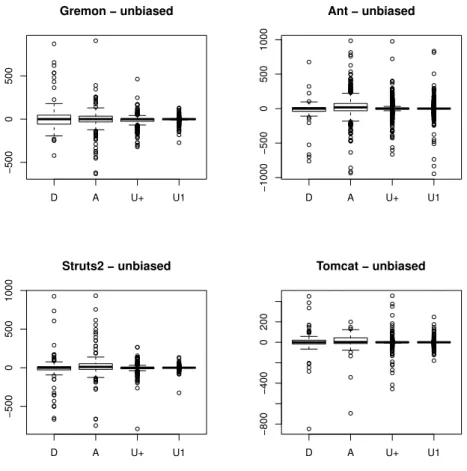
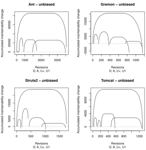
We noticed that the outliers had significant bias on the diagrams. Some unusual commits, like merging a whole branch to the trunk, or renaming files in two steps (first remove, and then in another commit add again) resulted in huge outliers. We removed the effect of these extraordinary commits by removing the huge values (absolute values being higher than 1000.0). The results became slightly better (see Figure 2), but still not spectacular enough.
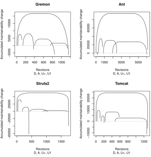
In Figure 3, we illustrate the values as already presented in Figure 1, but now using the Cumulative Characteristic Diagrams.
D A U+ U1
−5000500
Gremon − unbiased
D A U+ U1
−1000−50005001000
Ant − unbiased
D A U+ U1
−50005001000
Struts2 − unbiased
D A U+ U1
−800−4000200
Tomcat − unbiased
Figure 2: Research data using box plots, without outliers
Note that the outliers have significant bias on this diagram as well. See for example the characteristic of operation Add in case of Struts 2. By removing these values we receive more concise diagrams presented in Figure 4.
The curves within diagrams are obviously different, and there are similarities between the diagrams. The following can be deduced from these diagrams after a short analysis.
Overall characteristic
All the characteristics start with a precipitous rising, continuous with a rela- tively long horizontal part and ends with a slightly less precipitous slope. If the right end is located below 0, it means the net effect of all the commits was negative from maintainability point of view; if it is located above 0 then the opposite is true. Based on the difference in the slope of the left and the right part, we can
0 200 400 600 800 1000
−5000500015000
Gremon
D, A, U+, U1 Revisions
Accumulated maintainability change
0 1000 3000 5000
02000060000
Ant
D, A, U+, U1 Revisions
Accumulated maintainability change
0 500 1000 1500
−60000−2000020000
Struts2
D, A, U+, U1 Revisions
Accumulated maintainability change
0 200 400 600 800 1200
−1000001000020000
Tomcat
D, A, U+, U1 Revisions
Accumulated maintainability change
Figure 3: Composite cumulative characteristic diagrams about maintainability
conclude that the maintainability increase is rather caused by smaller number of bigger steps, while maintainability decrease is caused by a bit higher number of a bit less steps. Note that this result was not identified with the help of statistical tests.
Commits containing Delete
The number of elements of this type of commits is relatively small. In case of Ant, it is practically negligible. But the relative height is very big; the magnitude of its height on the CCD diagram is similar to those of other types with much higher number of commits. This indicates that the variance caused by operation delete is much higher than those commits not containing this operation, as shown later in Section 4.3. On the other hand, the right end seems to be hectic, therefore
0 1000 3000 5000
02000060000
Ant − unbiased
D, A, U+, U1 Revisions
Accumulated maintainability change
0 200 400 600 800 1000
−5000500015000
Gremon − unbiased
D, A, U+, U1 Revisions
Accumulated maintainability change
0 500 1000 1500
0500015000
Struts2 − unbiased
D, A, U+, U1 Revisions
Accumulated maintainability change
0 200 400 600 800 1200
040008000
Tomcat − unbiased
D, A, U+, U1 Revisions
Accumulated maintainability change
Figure 4: Composite cumulative characteristic with removed out- liers
we cannot form clear statement about this operation.
Commits containing Add without any Delete
There are some spectacularly similar properties of the second characteristic in all projects. First of all – considering the characteristics without outliers – the right end of this characteristics is located above the composite one, or those containing exclusively file updates. In 3 out of the 4 cases it was positive as well. This implies that the operation Add has a good, or at least better effect on the maintainability than the others. The other spectacular property is – similarly to operation Delete – the relative height of the characteristic. Despite of its small width it is high; in 3 out of the 4 cases it is higher than the much wider Update related characteristic.
Again, this visually represents the high variance of the maintainability caused by
operation Add. Finally, the horizontal part in the middle is negligible in all of the cases, meaning that Add had some traceable effect on maintainability in most of the cases.
Commits consisting of several Updates
Commits consisting of several Updates (these are typically smaller feature de- velopments or bigger bug fixes) have some typical characteristics. Probably the most obvious common attribute of them is that their width is relatively large;
greater than the joint width of operation Delete and Add. The right end is always located lower than the right end of the common characteristic, meaning that this type of commit tends to decrease the overall maintainability (as was confirmed with the help of statistical tests). Also the horizontal part in the middle is signifi- cant, meaning the number of commits with no traceable maintainability change is relatively high in this category. Finally, the relative height is smaller than in the case of the first two curves, but bigger than the fourth one.
Commits consisting of exactly one Update
This is the most frequent commit type, this fact is very spectacular in 3 out of the 4 cases. These commits are typically smaller bug fixes. The relative height is small, i.e. the variance caused by this type of commit is low. The horizontal part in the middle is very long in all of the 4 cases, again meaning that the proportion of commits with no traceable maintainability change caused by this type of commit is high. It is also important that the right end is located below 0 in all of the cases, meaning that the net effect of this commit type is always negative.
Answer to RQ1
Figure 3 contains the cumulative characteristic diagram related to study [8].
This diagram lead to the conclusion that the data contain outliers which have drastic impact of the results. This fact led us to the decision later not to perform t-test but Wilcoxon-test. Figure 4 contains the CCD of the data without outliers.
The cumulative lines related to subsets differ, and therefore this diagram support the published results. Furthermore, the curves related to the same category resem- ble to each other.
4.2. The impact of version control operations on the quality change of the source code
The results presented in study [8] and outlined in Section 4.1 convinced us that it was worth to perform detailed analysis on all the 3 occurring version control operation: Add, Update and Delete. We performed the analysis and presented the results [9]. In the analysis. we divided the commits based on the number or proportion of occurrences of the actually analyzed operation, in each analyzed system, and performed Wilcoxon test to compare the maintainability change values related to those commits of these two subsets.
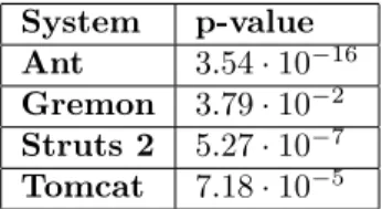
Here we present the following check: we divided all the commits into two based on the existence of operation Add. The first subset contained commits where at least one new source file was added, and the second one contained the remain- ing commits. We considered the related maintainability changes, performed the Wilcoxon test on the mentioned sets of numbers, and concluded that the main- tainability change of commits containing file addition was significantly higher than those of not containing file addition.
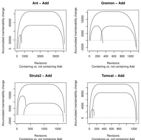
Table 2 contains the resulting p-values, Figure 5 contains the CCD of the same values, and Figure 6 contains the related QDD.
System p-value Ant 3.54·10−16 Gremon 3.79·10−2 Struts 2 5.27·10−7 Tomcat 7.18·10−5
Table 2: Difference in maintainability change values of commits containing and not containing file addition
In the Cumulative Characteristic Diagram the right end of the curves for com- mits containing Add are located spectacularly higher than these of the other curve, which supports the results of the Wilcoxon test.
The Quantile Difference Diagrams revealed some more important details. The territory above x-coordinate is spectacularly higher in case of Ant, Struts 2 and Tomcat. The Wilcoxon test resulted that it is true also in case of Gremon, but with weaker significance.
Indeed, the diagrams support the findings based just on the Wilcoxon test, furthermore, it revealed such details which we analyzed further and present in Section 4.3.
Answer to RQ2
We presented the cumulative characteristic diagram in Figure 5, and the quan- tile difference diagram in Figure 6, related to the impact of operation add on maintainability. On the CCDs the right end of the left hand side curve is located higher than the right end of the right hand side curve, and this supports the result presented in study [9]. It is important to note that the line is located below the x-axis for the leftmost 30-50%, and it means the operation add is present in the commits causing big code decay as well. On the QDDs the territory above the x-axis is higher than the territory below the x-axis which also supports the result presented in study [9].
0 1000 3000 5000
02000060000
Ant − Add
Containing vs. not containing Add Revisions
Accumulated maintainability change
0 200 400 600 800 1000
−5000500015000
Gremon − Add
Containing vs. not containing Add Revisions
Accumulated maintainability change
0 500 1000 1500
−5000500015000
Struts2 − Add
Containing vs. not containing Add Revisions
Accumulated maintainability change
0 200 400 600 800 1200
040008000
Tomcat − Add
Containing vs. not containing Add Revisions
Accumulated maintainability change
Figure 5: CCD about maintainability changes of commits with and without file additions
4.3. Variance of source code quality change caused by version control operations
One of the results presented in study [9] was that commits containing file additions have significantly higher maintainability change compared to those of not contain- ing file additions at all. This result we might imagine as follows: this statement is true in all the magnitudes of maintainability changes. However, based on the diagrams in Figure 5 and especially in Figure 6, this is not true. In case of low values (high maintainability decreases), the values are much lower in case of com- mits containing file additions on the same quantile, compared to the commits not containing file additions.
The most important thing to see is it is not true – as one would expect just
−150−50050150
Ant − Add
Containing vs. not containing Add Quantile
Difference
0.1 0.3 0.5 0.7 0.9
−60−202060
Gremon − Add
Containing vs. not containing Add Quantile
Difference
0.1 0.3 0.5 0.7 0.9
−50050
Struts2 − Add
Containing vs. not containing Add Quantile
Difference
0.1 0.3 0.5 0.7 0.9
−50050
Tomcat − Add
Containing vs. not containing Add Quantile
Difference
0.1 0.3 0.5 0.7 0.9
Figure 6: QDD about maintainability changes of commits with and without file additions
based on the preliminary test results – that the maintainability change values are higher in case of all magnitude of values. This means file additions really do their bits of the code erosion, and if it erodes, its erosion is much higher than the erosion caused by other commits. Without the QDD, just using the results of Wilcoxon test, this would not have been revealed.
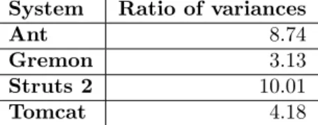
We decided to analyze this phenomena further, and we presented our findings in paper [10]. In this study we took the similar divisions as in the earlier study, and performed the comparison of variances.
Table 3 contains the ratio of variances of maintainability change values, not containing the outliers. The p-values in these cases were so low, that the R rounded down to 0, meaning the value were less than10−350 in all the cases.
Based on the CCD the difference in variance is indicated by the following: the
System Ratio of variances
Ant 8.74
Gremon 3.13
Struts 2 10.01
Tomcat 4.18
Table 3: Ratio of variances of maintainability change values of commits containing and not containing file addition
ratio of the horizontal width (i.e. the number of observations) and the vertical width are different. This is especially apparent in Figure 5 at project Gremon: the heights of the two lower curves are similar, but the width of the left one is spectacularly lower than the width of the right one. Considering the QDD (Figure 6) it is apparent in all the four cases that the lines have significant slopes, and their main shapes are not horizontal.
Answer to RQ3
In Figure 5, the relative height of the left hand side curve is bigger than the relative height of the right hand side one, which supports the results published in article [10]. Considering the Figure 6, the fact that the tendency of the line is slant, also supports the results presented in article [10].
4.4. Cumulative code churn: impact on maintainability
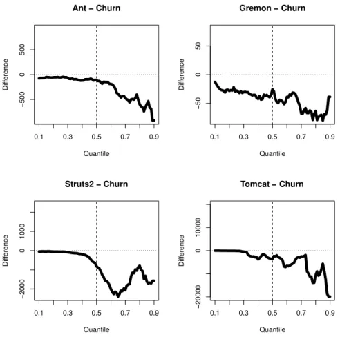
In study [12], we presented how the intensity of past modifications influenced the maintainability change of the future commits.
We calculated for each file and revision from the very beginning, how many lines had been added and deleted all together. On a certain commit we averaged these values. We divided these values into two subsets, based on the maintainability change of the related commit, if it decreased or increased it; we omitted the commits related to neutral maintainability changes. Finally we compared the values using Wilcoxon test.
Table 4 contains the p-values of the Wilcoxon test results.
System p-value
Ant 0.00235
Gremon 0.00436 Struts 2 0.00018 Tomcat 0.03616
Table 4: Cumulative code churn analysis results
−5000500
Ant − Churn
Quantile
Difference
0.1 0.3 0.5 0.7 0.9
−50050
Gremon − Churn
Quantile
Difference
0.1 0.3 0.5 0.7 0.9
−200001000
Struts2 − Churn
Quantile
Difference
0.1 0.3 0.5 0.7 0.9
−20000010000
Tomcat − Churn
Quantile
Difference
0.1 0.3 0.5 0.7 0.9
Figure 7: Quantile difference diagrams of cumulative code churns
Figure 7 illustrates the cumulative code churn comparisons using Quantile Dif- ference Diagrams. The cumulative churn values are less, or at most equal on every quantile, for the commits related to maintainability increase, compared to those of maintainability decrease. The tendency of the line is negative: at higher values the line is located lower. At higher values – from about 0.7 – the amplitude is also higher than in case of lower values.
Answer to RQ4
We present the cumulative code churn related Quantile Difference Diagrams in Figure 7. Here the complete line is located below, or at most on the x-axis, meaning that the results presented in study [12] is valid for every quantile. The lines have a slight declining tendency, indicating the differences in the variance. We have not investigated this aspect yet, therefore this is a good candidate for a future work,
revealed by the QDD.
4.5. Code ownership: impact on maintainability
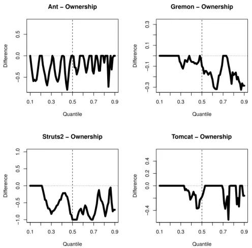
In paper [11], we checked how code ownership influenced the maintainability change of the future commits. We calculated how many different developer had contributed to the file, and at certain commit we took their geometric mean. We performed similar division as presented is Section 4.4, and here also we performed the Wilcoxon test.
Table 5 contains the p-values of the statistic test results. These values are somewhat less significant than the cumulative code churn comparison.
System p-value
Ant 0.033728
Gremon 0.059604 Struts 2 0.000014 Tomcat 0.213841
Table 5: Code ownership analysis results
We illustrate these results using Quantile Difference Diagrams in Figure 8. All the differences are non-positive, however, there are much more zeros, compared to the cumulative code churn related diagrams. Furthermore, the values on the y-axis (the differences) are lower in absolute, compared to the other diagram’s (Figure 7) values. We find the greatest difference in case of Struts 2, which is not surprising according to the statistic test results.
Answer to RQ5
We present the ownership related Quantile Difference Diagrams in Figure 8.
The complete lines are located below of the x-axis, or at most on it, which support the results presented in paper [11]. On the other hand, there are some spectacular differences between this and the previous diagram. Unlike in case of code churn analysis, here the line touches the x-axis several times. The difference represented by the line is not so big; it is always at most 1 (see the y-coordinate). The right hand side part of the line is more likely to be below the x-axis, compared to the left hand side, however, there is no a clear slope in the line.
5. Conclusions
In this paper we presented a case study of applying the Cumulative Characteristic Diagram and Quantile Difference Diagram on the already published results of find- ing various connections between version control history data and maintainability of the source code.
−0.50.00.5
Ant − Ownership
Quantile
Difference
0.1 0.3 0.5 0.7 0.9
−0.3−0.10.10.3
Gremon − Ownership
Quantile
Difference
0.1 0.3 0.5 0.7 0.9
−1.0−0.50.00.51.0
Struts2 − Ownership
Quantile
Difference
0.1 0.3 0.5 0.7 0.9
−0.40.00.20.4
Tomcat − Ownership
Quantile
Difference
0.1 0.3 0.5 0.7 0.9
Figure 8: Quantile difference diagrams of code ownerships
First, we presented the motivating example of displaying the data using box plot diagrams. Then we presented the data with help of Cumulative Characteristic Diagrams, and performed a thorough analysis of them.
After that we considered operation Add, and illustrated the input data of the study related to the impact of version control operations on the value and the variance of the maintainability change, using both Cumulative Characteristic Dia- grams and Quantile Difference Diagrams. Finally, we illustrated the data related to cumulative code churn and code ownership analysis, using Quantile Difference Diagrams.
As a final conclusion we can state that it was worthwhile to create the diagrams and apply them on the related studies. They spectacularly illustrate the statistic results, furthermore, they mostly reveal unknown connections, indicating the way for the future studies.
Acknowledgments
The author would like to thank Rudolf Ferenc and Péter Hegedűs for providing advices on this article.
References
[1] C. Faragó, “Visualization of univariate data for comparison,” Annales Mathematicae et Informaticae, vol. 45, pp. 39–53, 2015.
[2] S. R. Chidamber and C. F. Kemerer, “A Metrics Suite for Object Oriented Design,”
Transactions on Software Engineering, vol. 20, no. 6, pp. 476–493, 1994.
[3] T. Gyimóthy, R. Ferenc, and I. Siket, “Empirical validation of object-oriented metrics on open source software for fault prediction,”Transactions on Software Engineering, vol. 31, no. 10, pp. 897–910, 2005.
[4] T. Bakota, P. Hegedűs, P. Körtvélyesi, R. Ferenc, and T. Gyimóthy, “A probabilis- tic software quality model,” in Proceedings of the 27th International Conference on Software Maintenance (ICSM). IEEE Computer Society, 2011, pp. 243–252.
[5] ISO/IEC,ISO/IEC 9126. Software Engineering – Product quality 6.5. ISO/IEC, 2001.
[6] P. Hegedűs, “A probabilistic quality model for C# – an industrial case study,” Acta Cybernetica, vol. 21, no. 1, pp. 135–147, 2013.
[7] P. Hegedűs, T. Bakota, G. Ladányi, C. Faragó, and R. Ferenc, “A drill-down approach for measuring maintainability at source code element level,” Electronic Communica- tions of the EASST, vol. 60, pp. 1–21, 2013.
[8] C. Faragó, P. Hegedűs, Á. Z. Végh, and R. Ferenc, “Connection between version control operations and quality change of the source code,” Acta Cybernetica, vol. 21, no. 4, pp. 585–607, 2014.
[9] C. Faragó, P. Hegedűs, and R. Ferenc, “The impact of version control operations on the quality change of the source code,” inProceedings of the 14th International Con- ference on Computational Science and Its Applications (ICCSA), vol. 8583 Lecture Notes in Computer Science (LNCS), no. PART 5. Springer International Publishing, 2014, pp. 353–369.
[10] C. Faragó, “Variance of source code quality change caused by version control opera- tions,” Acta Cybernetica, vol. 22, no. 1, pp. 35–56, 2015.
[11] C. Faragó, P. Hegedűs, and R. Ferenc, “Code ownership: Impact on maintainability,”
inProceedings of the 15th International Conference on Computational Science and Its Applications (ICCSA), vol. 9159 Lecture Notes in Computer Science (LNCS), no.
PART 5. Springer International Publishing, 2015, pp. 3–19.
[12] ——, “Cumulative code churn: Impact on maintainability,” in Proceedings of the 15th International Working Conference on Source Code Analysis and Manipulation (SCAM). IEEE Computer Society, 2015, pp. 141–150.
[13] C. Faragó, P. Hegedűs, G. Ladányi, and R. Ferenc, “Impact of version history metrics on maintainability,” inProceedings of the 8th International Conference on Advanced
Software Engineering & Its Applications (ASEA). IEEE Computer Society, 2015, pp. 30–35.
[14] J. M. Chambers, W. S. Cleveland, B. Kleiner, and P. A. Tukey, “Graphical methods for data analysis,” Wadsworth, Belmont, CA, 1983.
[15] P. Murrell,R Graphics. CRC Press, 2005.
[16] R Core Team, R: A Language and Environment for Statistical Computing, R Foundation for Statistical Computing, Vienna, Austria, 2015. [Online]. Available:
http://www.R-project.org/
[17] R. McGill, J. W. Tukey, and W. A. Larsen, “Variations of box plots,”The American Statistician, vol. 32, no. 1, pp. 12–16, 1978.
[18] Y. Benjamini, “Opening the box of a boxplot,” The American Statistician, vol. 42, no. 4, pp. 257–262, 1988.
[19] M. Frigge, D. C. Hoaglin, and B. Iglewicz, “Some implementations of the boxplot,”
The American Statistician, vol. 43, no. 1, pp. 50–54, 1989.
[20] K. Potter, H. Hagen, A. Kerren, and P. Dannenmann, “Methods for presenting sta- tistical information: The box plot,” Visualization of Large and Unstructured Data Sets, s, vol. 4, pp. 97–106, 2006.
[21] D. Adler,vioplot: Violin plot, 2005, R package version 0.2.
[22] J. L. Hintze and R. D. Nelson, “Violin plots: a box plot-density trace synergism,”
The American Statistician, vol. 52, no. 2, pp. 181–184, 1998.
[23] P. Kampstra, “Beanplot: A boxplot alternative for visual comparison of distribu- tions,” Journal of Statistical Software, vol. 28, no. 1, pp. 1–9, 2008.
[24] K. M. Goldberg and B. Iglewicz, “Bivariate extensions of the boxplot,”Technometrics, vol. 34, no. 3, pp. 307–320, 1992.
[25] P. J. Rousseeuw, I. Ruts, and J. W. Tukey, “The bagplot: a bivariate boxplot,” The American Statistician, vol. 53, no. 4, pp. 382–387, 1999.
[26] H. P. Wolf and U. Bielefeld, aplpack: Another Plot PACKage: stem.leaf, bagplot, faces, spin3R, plotsummary, plothulls, and some slider functions, 2014, R package version 1.3.0.
[27] K. Hornik, A. Zeileis, and D. Meyer, “The strucplot framework: Visualizing multi- way contingency tables with vcd,” Journal of Statistical Software, vol. 17, no. 3, pp.
1–48, 2006.
[28] D. Sarkar,Lattice: Multivariate Data Visualization with R. Springer International Publishing, 2008.
[29] C. Faragó,vudc: Visualization of Univariate Data for Comparison, 2016, R package version 1.1.